Screen types and elements
The different screen types and elements found in DynamicWeb 10.
The DynamicWeb 10 interface consists of a fixed set of screen types and elements used to create them. In this article we will go through them one by one.
List Screens
A list screen is a screen which lists something - users, products, emails, etc.
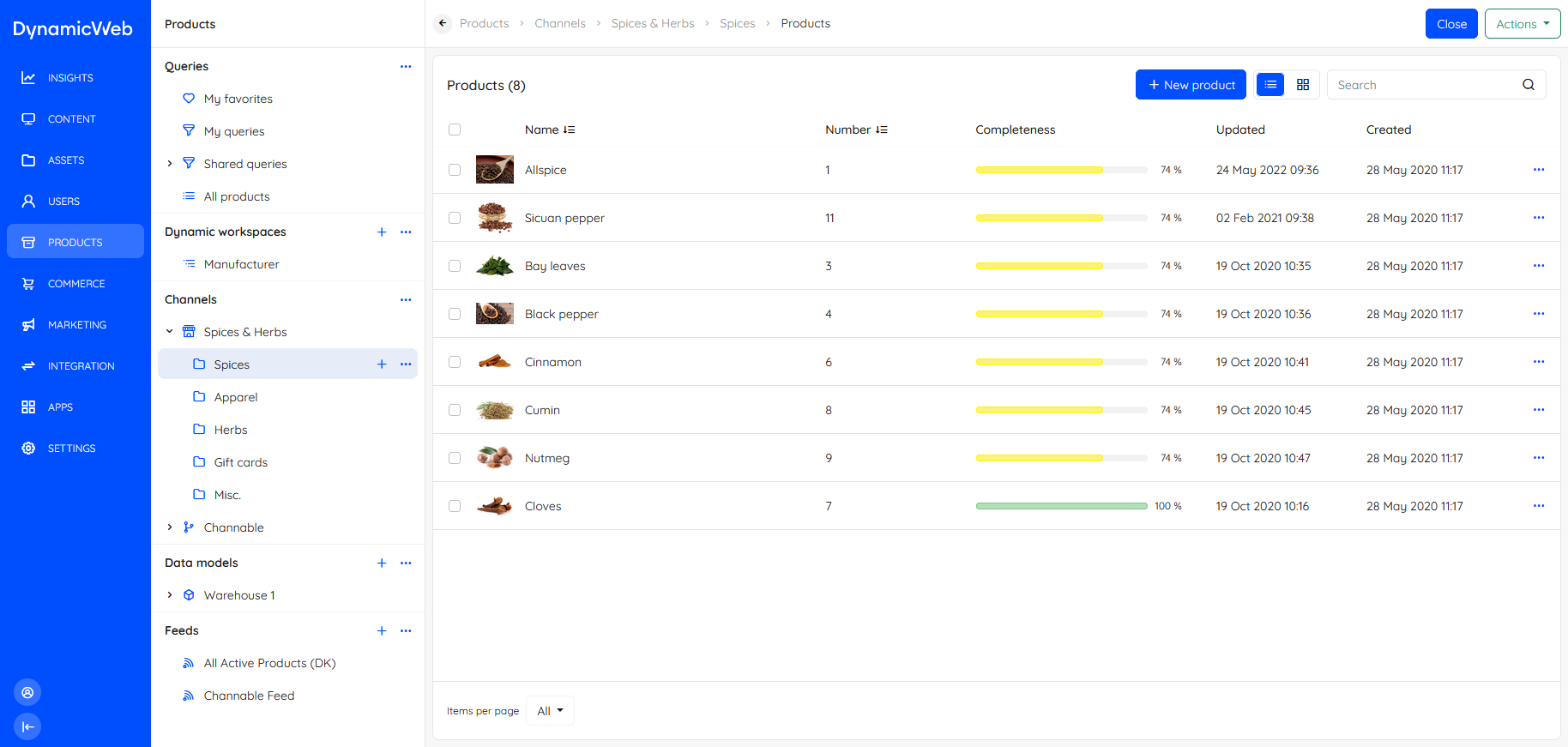 Lists screens typically have fairly extensive action menu options related to the type of content listed. Each list item will also have a context menu with actions related to the list item.
Overview Screens
An overview screen is a screen type which is typically used to show, well, an overview of specific object or feature - in this screenshot a product.
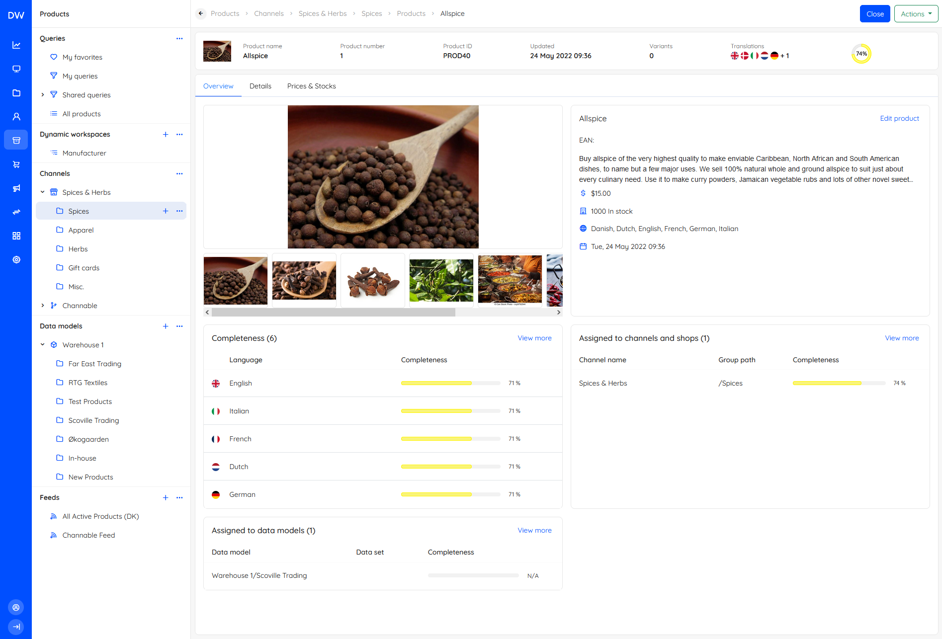 Overview screens consist of a number of widgets - you can click View more or Manage... to access whichever feature or list the widget references. Some overview screens have an action menu, others only a Close-button for returning to a list view.
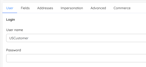
Edit screens
An Edit screen is a screen for editing something - a product, a user, anything at all really.
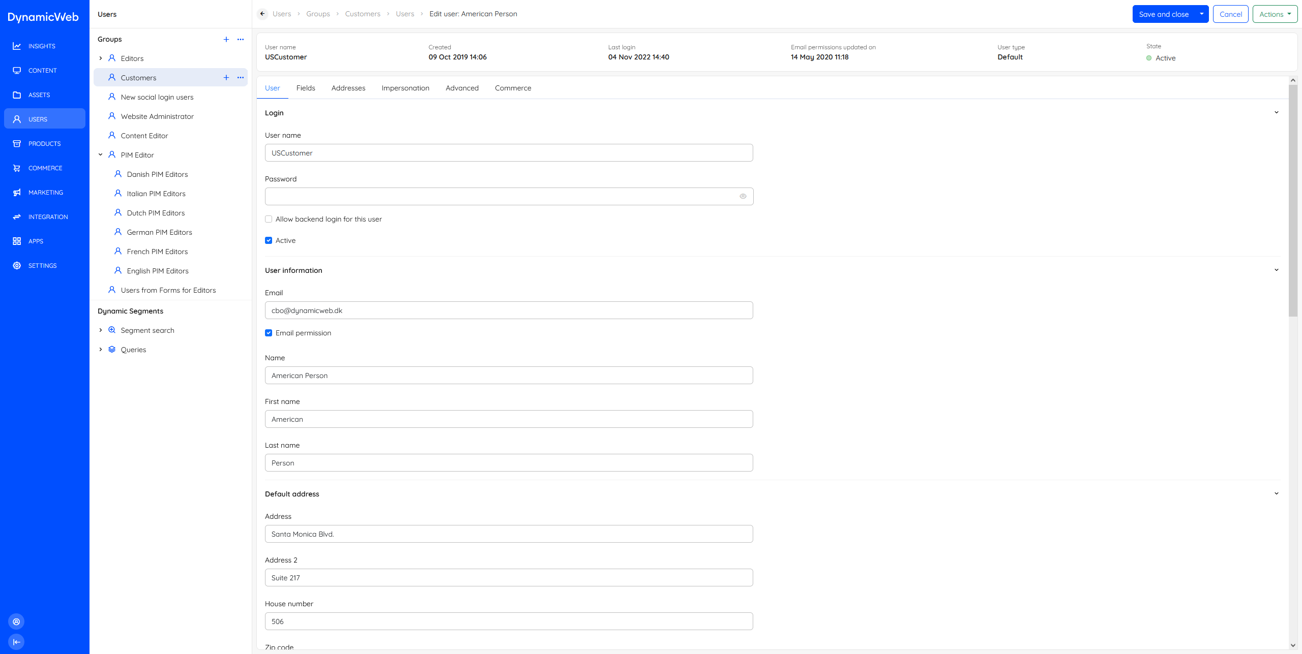 Edit screens typically feature an info bar and often also tabs, as well as a save-button.
Elements
While we only really have three screen types, each screen type can be constructed using a variety of elements depending on the task at hand. Below you will find a list of the elements used to construc our screens.
Tabs
Tabs are used on overview screens and edit screens. They are typically used to group related input fields or widgets together for screens with a lot of information.
Topbar
A topbar is used for two things; to show where in the system the user is located by displaying a breadcrumb, and to contain buttons like the action menu button, save buttons, and so on.

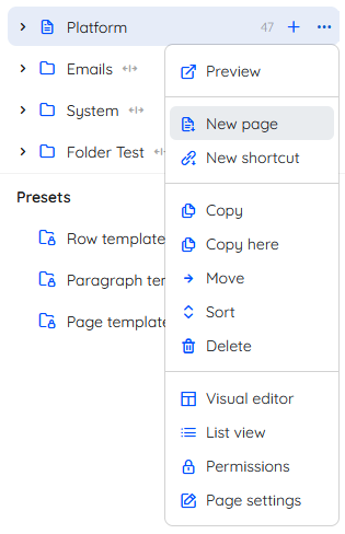
Navigation tree
A navigation tree is used to enable the user to navigate between features or content for an area. Depending on the area, navigation trees may have several sections with a group of nodes under a label.
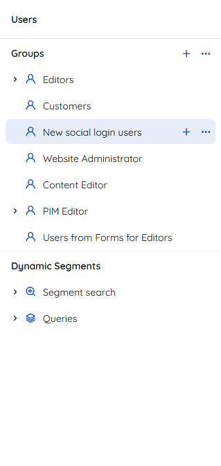 Often, individual nodes will allow you to create new content using a +-icon - and access more features or settings using a context menu.
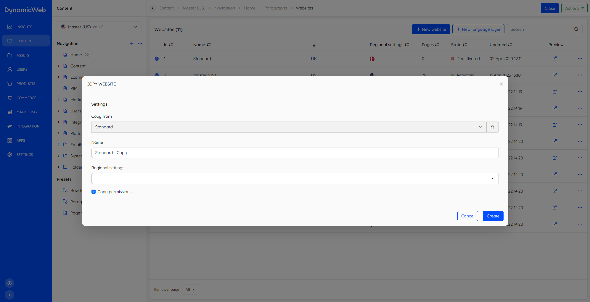
Modals
Modals or dialogues are occasionally employed when we want to allow the user to create or edit content without leaving the current view.
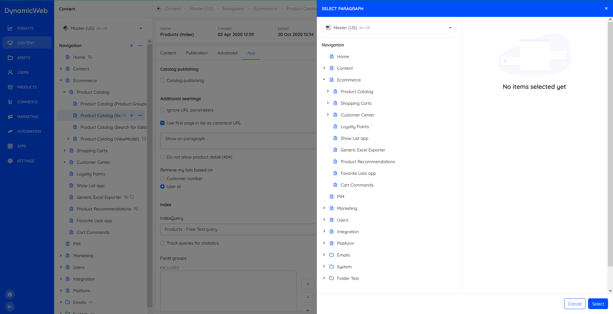
Slideover panel
A slideover panel is a panel which appears as, well, a slide over on top of the current view. It is typically employed when the user is prompted to select an asset, a page/paragraph, and so on.
Action menu
An action menu is a menu launched from an action-button on a list screen or an overview screen.
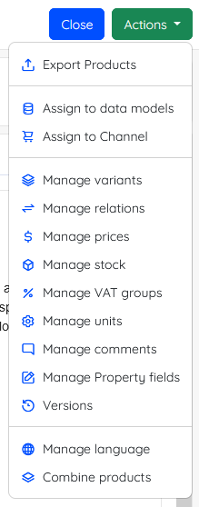
Action menus are different from context menus in that they have scope over the whole view; on lists you can select any number of list items and use the action menu options to do stuff.
One option which is always available for list screens is the manage columns action, which allows you to customize what columns are shown in a list. This is extremely useful during daily use.
Context menu
Context menus are collections of context-sensitive actions available by clicking a ...-button. Context menus are always present for list items and often for nodes in a navigation tree.
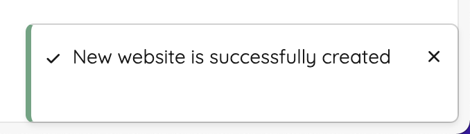
Toasts
A toast is a small notification providing the user with feedback at certain times, e.g. something goes right (or wrong).
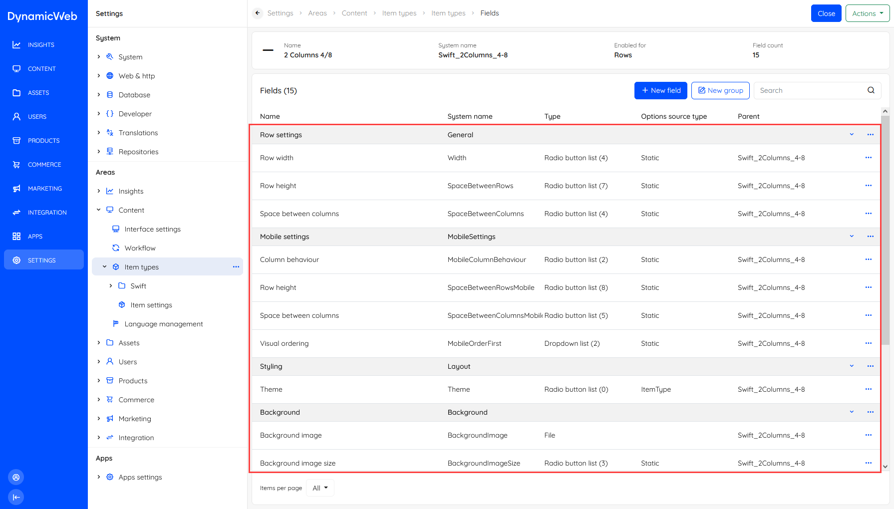
Collapsible rows
Collapsible rows are used for certain lists-within-lists - most importantly for item types and paragraph containers. Most collapsible rows feature a context menu for the whole row as well as for the list item.
Info bar
The Info bar element is used whenever we need to show key information in a prominent manner, e.g. on pages.

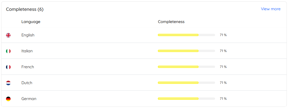
Widgets
Widgets are elements on an overview screen highlighting something and providing the user with the option of viewing more or managing the type of content shown.