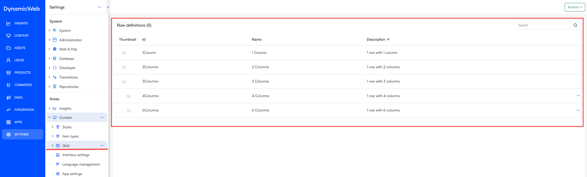
The Grid area in Settings allows you to enrich your solution with a grid-based design. Here, you can configure the various rows you intend to use within your solution.
Row definitions file
When creating the RowDefinitions.json file, there are two available methods:
Manually: You can manually create the RowDefinitions.json file by navigating to \Templates\Designs\Your design\Grid\Page and creating the RowDefinitions.json file and adding the necessary definitions directly within the file.
Settings-Based: Alternatively, you can define rows within the settings interface by going to Settings > Areas > Content > Grid > [Your Design] > Page. Here, you can select “+ New Row Definition” to create the RowDefinitions.json files more interactively.
Note that, regardless of the approach, you will also need to create the row template files to accompany the row definitions.
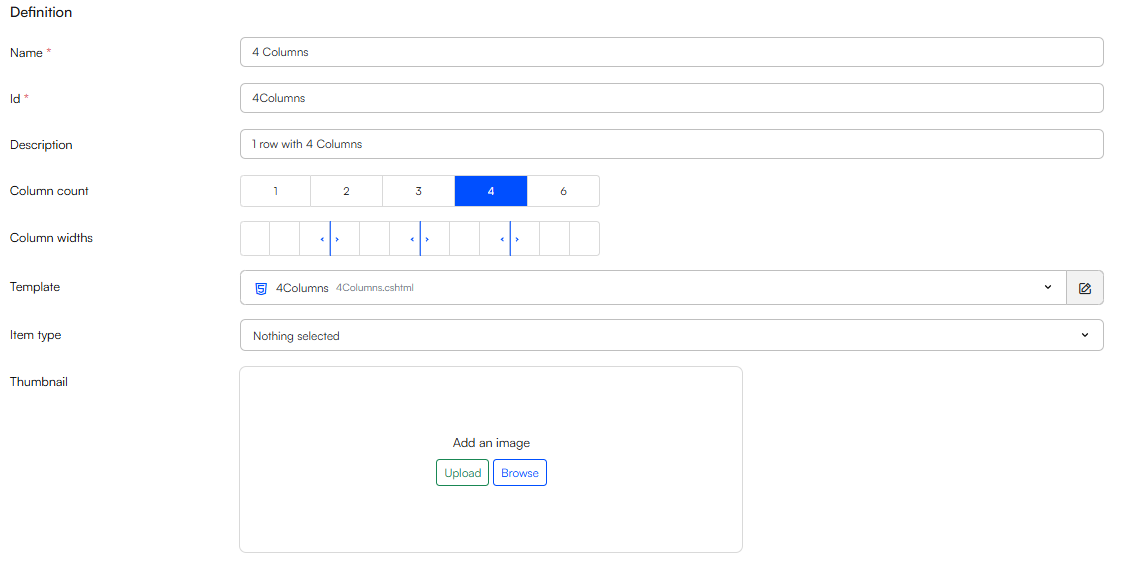
As shown above, the rows are easily adjustable, allowing you to create custom rows for your specific design needs. You can connect an item type with a row, allowing you to have extra configurations, like row height or width.
Row features
When creating row definitions certain row features are available such as spacing, width, desktop- and mobile layout etc.. To make use of the row features on your row definitions check the different features you want the row to support.
If a row feature is enabled a Defaults-section will appear where if needed you can set a default value for the row feature:
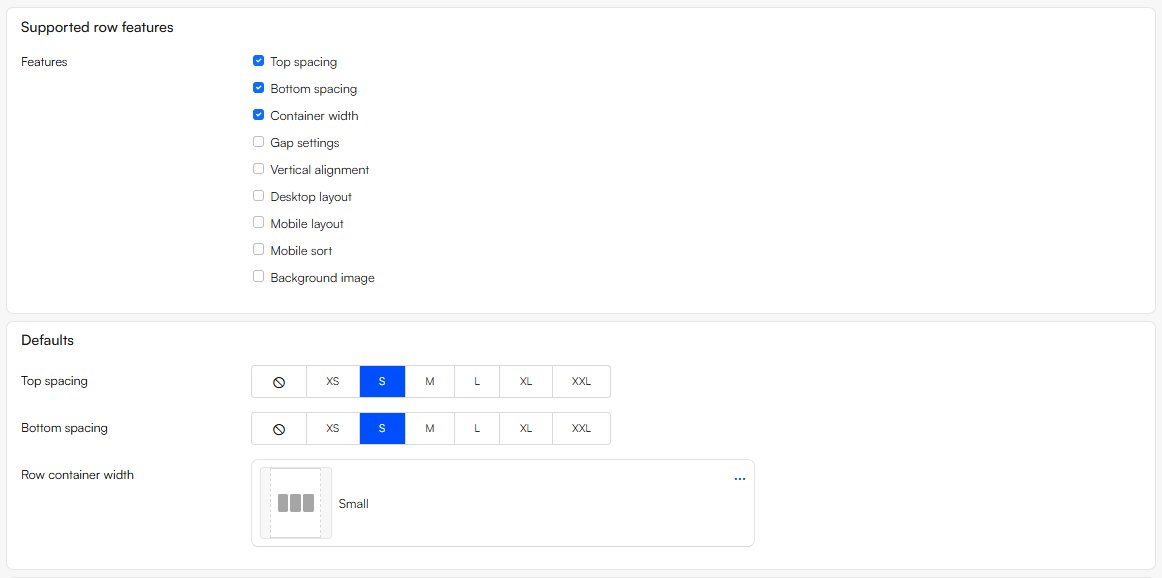
The default value can be overridden when editing the row in Visual Editor, and if the default values are changed in the row definition it will only affect new rows - not existing rows.
Important
To use row features a Swift 2 design is required. As of now email rows do not support row features on Swift 2.