Your visitors should be presented with good looking content whether they are on a mobile, tablet or desktop device. You may have planned out the site’s desktop design first, and then had less focus on the mobile interface, this may result in losing traffic because of an unresponsive design.
We have different tools, you can make use of to ensure responsiveness:
- Different mobile layouts
- Hide paragraph types, rows and pages for mobiles, tablets or desktop
Working in Visual Editor
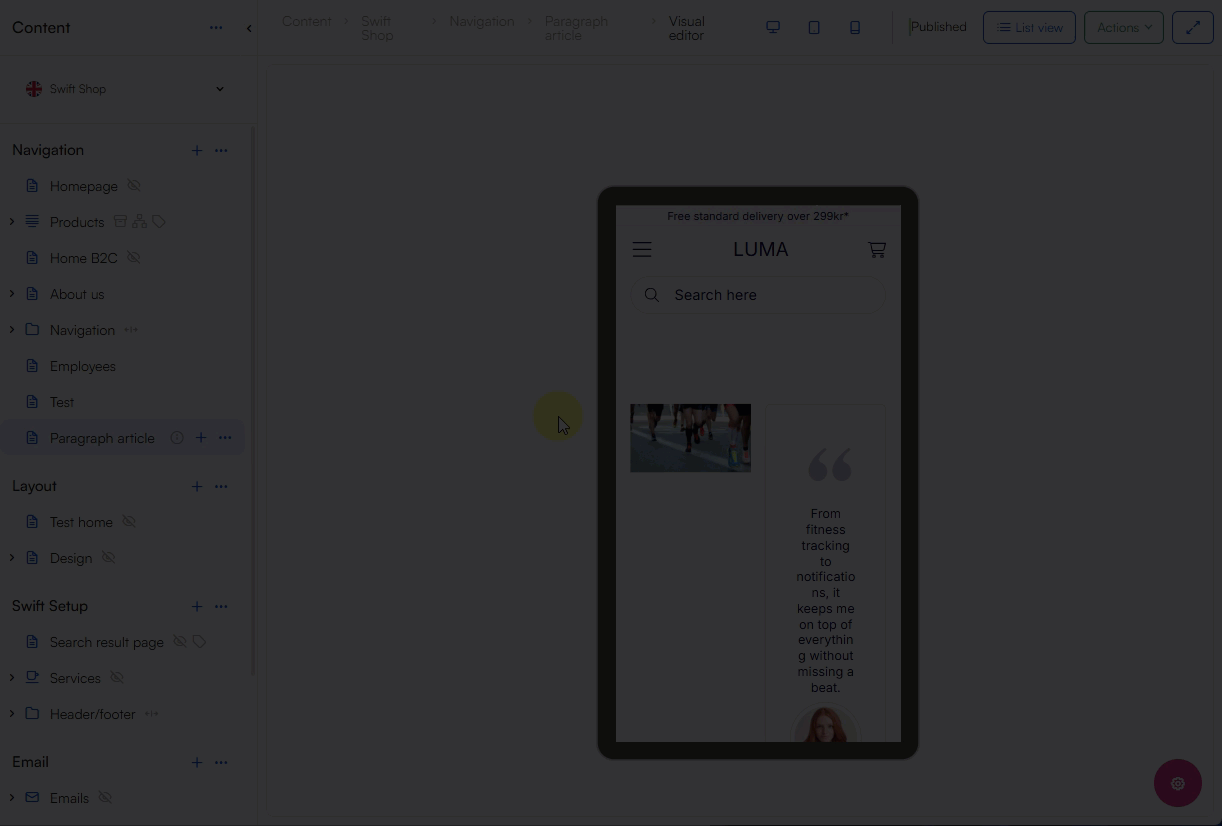
Creating and testing content across devices can be done from the Visual Editor, where you choose either desktop, tablet or mobile view:

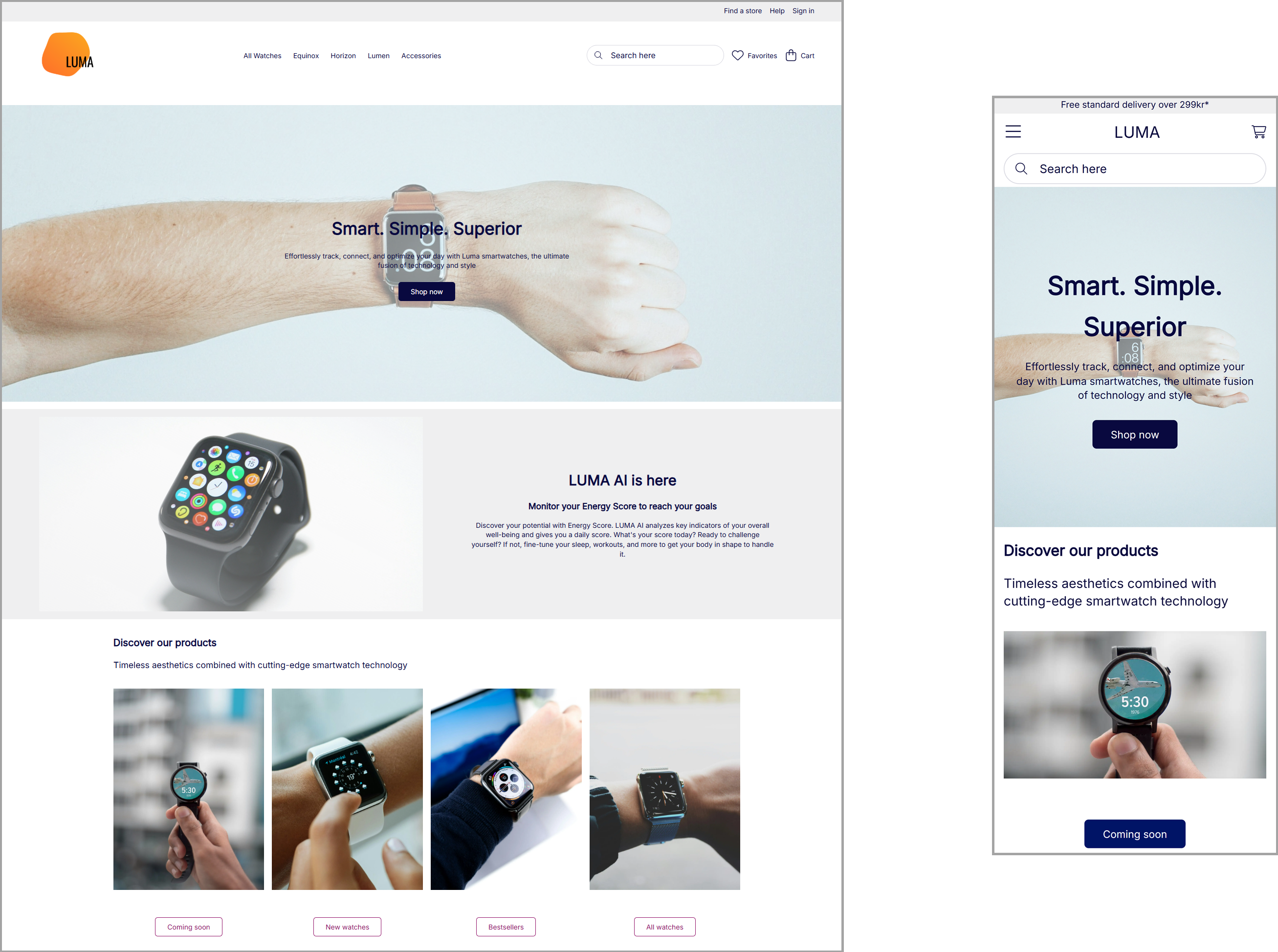
Mobile layout
Some content may not fit appropriately on different devices when you e.g. go from desktop to mobile view. Use the mobile layout to solve most layout issues, here going from a side-by-side to a stacked layout solves the problem:

Prioritize information
To prevent overloading mobile users with all the content of your page you can prioritize essential information to avoid long, hard-to-read pages. Use our hide tool to hide content on mobile pages:
Tip
If you have selected hide on content for different devices, the content will still be visible in the Visual Editor on all devices - to see how your page will be presented for e.g. a mobile user, click preview from the page's context menu. Now inspect the page and use the toggle device-tool where you can select different device dimensions.