Welcome to the tenth in the Swift Design Tutorial, which aims to get you familiar with using Swift and its features to create beautiful websites.
In these guides we focus on what is possible to do with Swift without any customizations, as we believe this is the best way to learn what Swift is all about; simplifying the process of website-building to the point where you can create high-quality prototypes in the fraction of the time it usually takes.
In this guide we will create emails using Swift's built-in email features, which allows you to create several types of emails using the Visual Editor. Like regular pages, the emails in Swift use a common headers and footers, making it easier to have a consistent theme across emails, but with different content.
In this guide we will cover:
- Setting up the environment
- Designing header and footer
- Designing the email page
Exercise 1: Setting up the environment
Before we start building the email pages, it's important to set up your 'email-environment' properly. This will prevent chaos and confusion if you want to building various types of emails. Having a well-organized environment will facilitate the categorization of emails, such as separating newsletters from user-related emails, making it more manageable in the long run.
First step is therefor to add an Email folder to your navigation. This is done by clicking the '+'-sign next to Navigation and selecting 'Email folder' as the item type. This Email folder will function as the overall folder for all your email related stuff, which we will go into detail on now.
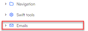
Inside the newly created email folder, is where we will create the email settings pages.
The email settings pages are pages that will help sort the emails. For instance, if you have two types of newsletters, one with a dark theme and one with a light theme, it would be beneficial to separate them into two different email settings pages.
Building an email settings page for header and footer
We will start by building a email settings page for the header and footer, we are going to use later on. Here are the steps to do that:
- Right-click your email folder
- Select 'New page'
- Select 'Email Settings' as the item type
- Click the pink gear icon in the lower right corner
- Give the email settings page a title

- Click 'save'

The settings page is now prepared for the addition of headers, footers and emails. As previously mentioned, this settings page will only be used for the standard footer and header. Here is how to add these:
- Right-click the newly created settings page and select 'new page'
- Select email header as the item type
- Repeat step one
- Select email footer as the item type
- Rename the pages in page settings if you like
You should now have a settings page with an empty header and footer, like shown in the image below.
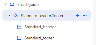
It is considered a best practice to place all email items in different setting pages than the header and footer to maintain a tidy and organized structure. Email pages can inherit headers and footers across all setting pages, so it's not essential for the header and footer to reside within the same page as the email content.
Building an email settings page for email items
The next step is to create a separate Email Settings page only for email items. The process to do this is identical to that of constructing a email settings page for the header and footer items. However, instead of adding header and footer items, we will add email items. Here is how to add email items to your email settings page.
- Right-click your email settings page and select 'new page'
- Select Email as the item type
- Enter the email settings page again and click the pink gear icon in the lower right corner
- Scroll down to the 'Components' section
- Link the header and footer to the header and footer items we created earlier

- Click 'Save and close'
- Go to the email page you created earlier
You should now be left with an empty page, ready to be designed to our liking
Your structure could now look something like this:
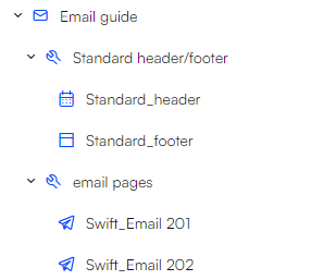 With our environment now configured, we are prepared to proceed to Exercise 2, which involves designing a email header and footer.
Exercise 2: Designing header and footer
The possibilities for creating headers and footers are virtually limitless. However, for simplicity, we will now walk through a straightforward example to get started.
Designing the header
We will start with the header:
The header, positioned at the top of the page, typically includes information about the who the sender is and maybe a tagline. Headers tend to remain relatively simple, allowing the emails to contain diverse content. For specific occasions like Christmas, you can build customize headers with themed elements or related text.
To create a basic header, follow these steps:
- Add two one-column rows
- Add a Heading item to each rows, and perform steps 3-5 for both rows
- Specify the title
- Set the alignment to centered
- Select the font size
- In styling, you have the option to change and padding and applying a theme
Your header could now look something like this:

If you want to build a more complex header, you have a wide array of items to add to your header, this includes items such as images, menus, icons, and more. Try playing around with these items to get more familiar with them.
Designing the footer
Moving on to building the footer. While the footer typically contains more content than the header, we will still begin with a straightforward design, where we get around the many built-in features.
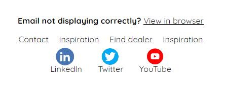
This is the design we are remaking:
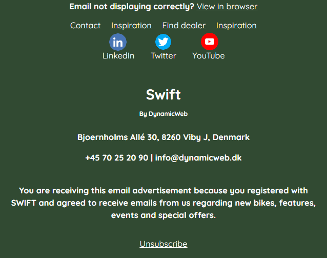
Follow these steps to achieve this design:
- Add a one-column row to the empty page
- Add a view in browser item to that row
- set the 'Link text' to 'View in browser'
- Set alignment to centered
- open the 'optional' tab and set the Leading text to "Email not displaying correctly?"

- Add a new one-column row
- Add a menu item to the row
- Add menu items by clicking '+ Add' and selecting the pages you want to link to
- In this example, 'Contact', 'Inspiration', 'Find dealer', and 'Inspiration' pages have been selected, which can be located in the Navigation/Tools folder. In a real-world scenario, you would naturally choose the appropriate pages for your website

- Add an new one-column row
- Add an icon item to the row
- Click '+ Add'
- Click the '+' icon and select the icon you want to display
- Click ok
- (Optional) Set the title to the name of the media you are linking to
- Repeat for all 'icons' you want to add
- Set alignment to centered
- Click 'Save'
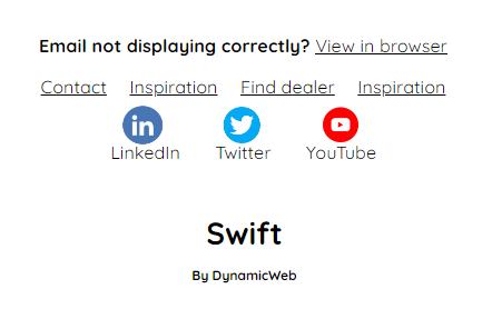
- Add a one-column row
- Add a header item to the row
- Set title to 'Swift'
- Set font style to 'Display'
- Set alignment to 'centered'
- Add a one-column row
- Add a header item to the row
- Set title to 'By DynamicWeb'
- Set font style to 'Header'
- Set alignment to 'centered'
- Set padding to minimal
- Make font size smaller
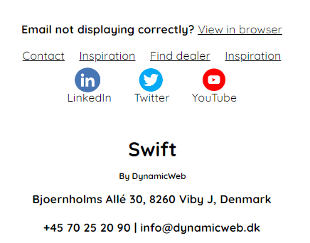
- Add a one-column row
- Add a text item to the row
- This text item will provide some contact information, here we will add: "Bjoernholms Allé 30, 8260 Viby J, Denmark +45 70 25 20 90 | info@dynamicweb.dk"

- Set the alignment to 'centered'
- This text item will provide some contact information, here we will add: "Bjoernholms Allé 30, 8260 Viby J, Denmark +45 70 25 20 90 | info@dynamicweb.dk"
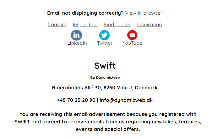
- Add a one-column row
- Add a text item to the row
- Add some text that gives a brief explanation on why the person is receiving the email
- Set the alignment to 'centered'
- The user also need to be able to unsubscribe to newsletters, so we will add a unsubscribe link
- Add a one-column row
- Add a Unsubscribe link item to the row
- Set link text to 'Unsubscribe'
- Set alignment to 'centered'
- Remove Leading text
- Click save
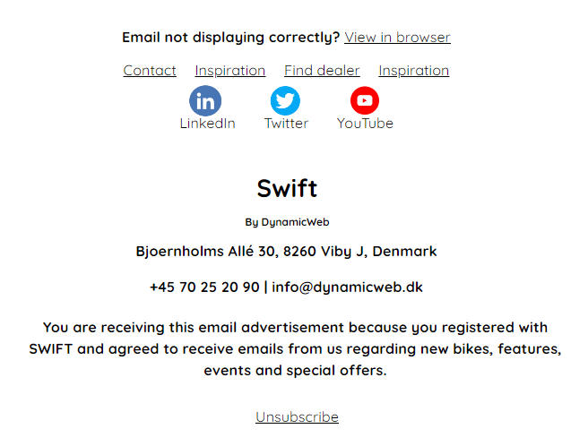
The footer content now looks very similar to the original, but we still need to apply a different theme. In this case, I will select the 'dark green' theme. Feel free to create your own theme to apply.
The footer should now look something like this:
 Footers can be designed in countless ways, and the example provided here is just one of many possibilities.
With the header and footer in place, we can proceed to develop the primary content of the email in the next exercise.
Exercise 3: Designing the email page
In this exercise, we will delve into the process of designing the content of an email.
When you enter the email page you created earlier in exercise 1, it will now look something like this:
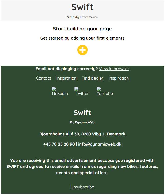 As you can see, the email page has adapted the previously created header and footer, as the email folder inherits the header and footer we created earlier. All email pages added into this email settings page, will inherit the same header and footer.
Step-by-step example
The example we will be following is a simple newsletter email, showcasing a newly launched electric bike.
Here are the steps to build the email page:
- Begin by adding a one-column row
- Add an header item
- Set the title to "introducing". Feel free to add another title, if you like
- Set the alignment to centered
- Set the font style to "Header"
- Repeat the process for the second row
- Set the title to "eOne Sixty"
- Set the font style to "Display"

- Add a one-column row
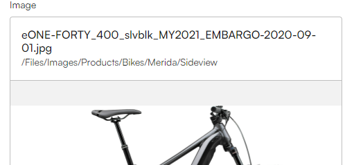
- Add an image item
- Click the '+'-icon, choose the wanted image, and click "select"
- Finally, click "Save"
- While adding an image, take advantage of the opportunity to make it function as a link. For instance, you could link to the general electric bikes category or directly to that specific bike on the website. This can be achieved by using the "Link" and "Product Group Link" sections in settings
- Add a one-column row
- Add a text item
- This text should provide information about the bike; for instance, you can use the following: "Our multiple award-winning electric bikes. Get the power to go further and go faster," split into two lines.
- Set the alignment to centered

- Add a one-column row
- Add a button item
- Set the link label as "Shop now"
- Specify the product group or product you wish to link to. For this example, select 'product group', and add E-bikes' to the product group link.
- Click "Save"
 To make the button looks exactly the same, apply the 'Light Transparent' theme
- Add a one-column row
- Insert a header item
- Set the title to "Why it's amazing"
- Set the alignment to centered
- Set the font style to "Display"
- Select the biggest font size
- Apply the 'Dark' theme
- Insert a two-column row
- Place an image item in each column
- set the image aspect ratio to 16:9
- Set the font style as 'header'
- Apply the 'Dark' theme
- Supply each image with a title
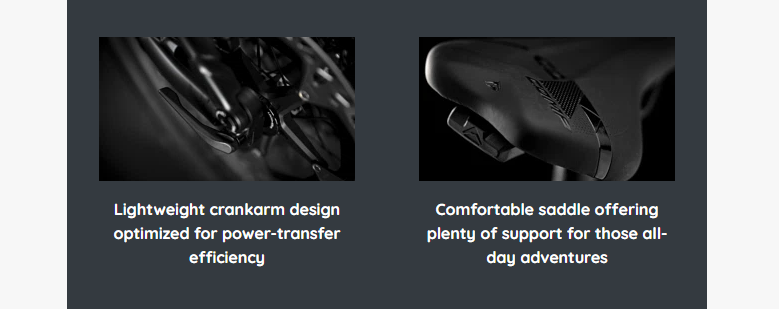
- Repeat step 7, with different images and titles
- Repeat step 5, but with these changes:
- Apply the 'Dark theme' to the button
- Configure the link label as "Learn more"

- Insert a one-column row
- Add an article item
- Set the title to 'eONE Sixty collection'
- Set font style to 'display'
- Set the font to the biggest font size.
- Set the text to 'Experience the thrill ride through the dense forest'. Feel free to modify the text to better suit your needs.

- Insert a one-column row
- Add an product catalog item
- Add products by clicking the '+ Add' and selecting the products you want to display
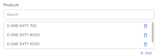
- Click 'Save'
You should now be left with a complete email with header, content and footer. In order to get more familiar with the email concept we encourage you to experimenting with different themes, font styles, and item types. This will not only familiarize you with various design elements but also contribute to enhancing the visual presentation of your email page.
Additionally, consider using spacers strategically. These can be inserted between other items to create breathing space, preventing the page from appearing cluttered and giving it a more open and airy feel. Utilizing spacers is a great way to optimize the overall layout of your email, ensuring a clean and organized presentation.