Branding is one of the key steps in designing a good-looking website. Branding is your visual identity and a reflection of who you are as a brand and how you want to communicate. The Swift branding settings control:
- Typography - which is to say fonts and all related settings
- Button design - primary and secondary
Together with themes this makes it easy for you to create brand uniqueness and consistency across the whole website.
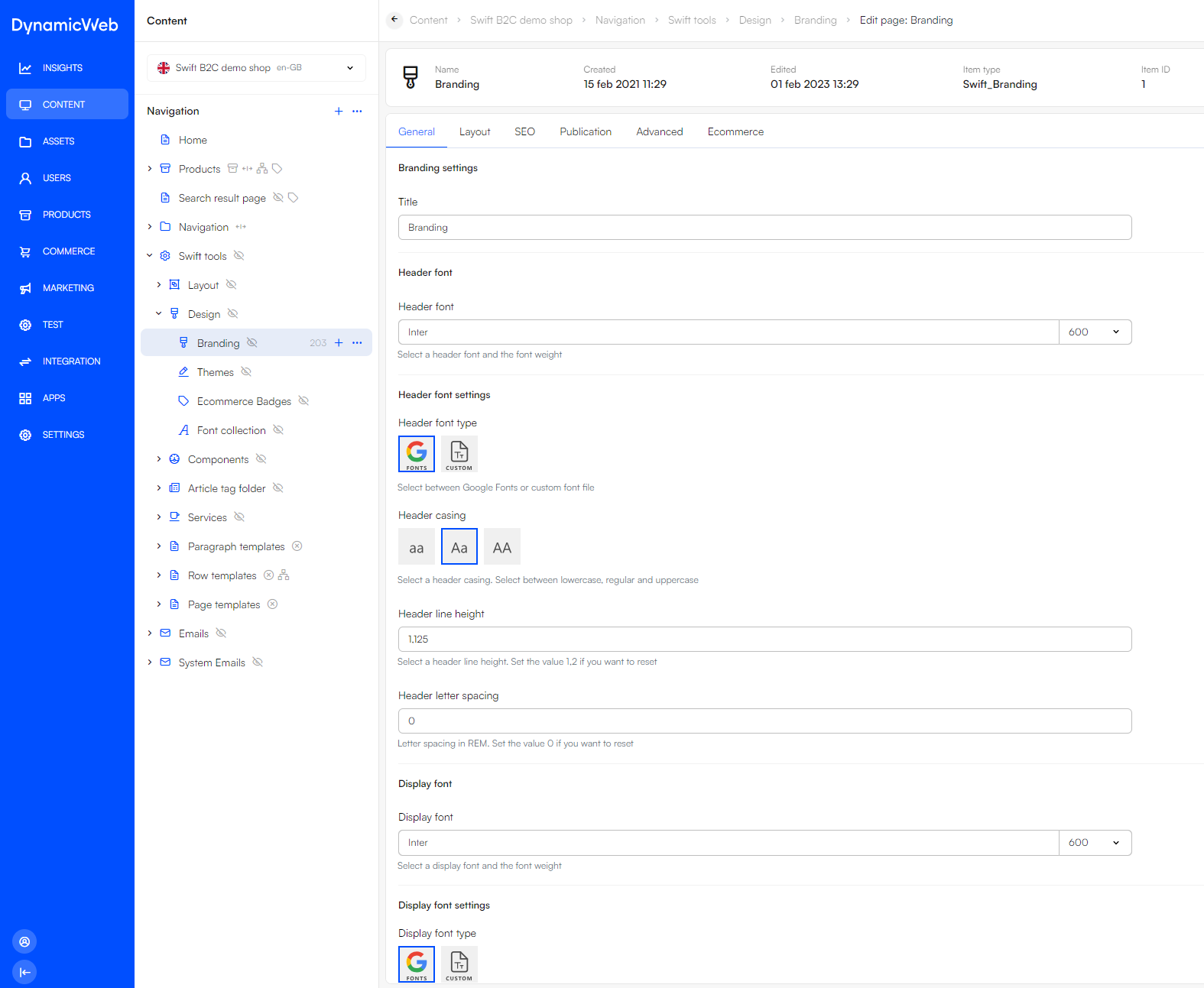
To acess the Branding settings navitage to Content > Swift tools > Design > Branding.

When making changes on the Branding page or after a deployment to a Staging site or a Live site you always need to preview the Branding page in frontend. Otherwise, the changes will not be loaded as the CSS changes will not be saved.
- Go to Swift tools > Design > Branding
- Click on show page to view the Branding page in frontend
- Do a hard refresh (Ctrl + F5 + Shift + R) OBS! ANDERLEDES i DW10 SKAL ÆNDRES
Locally stored fonts
As of Swift 1.14.0 Google fonts are downloaded locally. When the branding page is previewed as explained above, the fonts are downloaded to the folder located at Templates/Designs/Swift/Assets/css/Fonts. This means that the branding css is written with relative paths to local files instead of google font URLs.
Please note that manual cleanup is needed from time to time. As the font folders are stored locally, they are not deleted from the folder when not used. This means that the website designer needs to manually delete a font folder if the font is not in use anymore.
Font settings
You have the following fonts available:
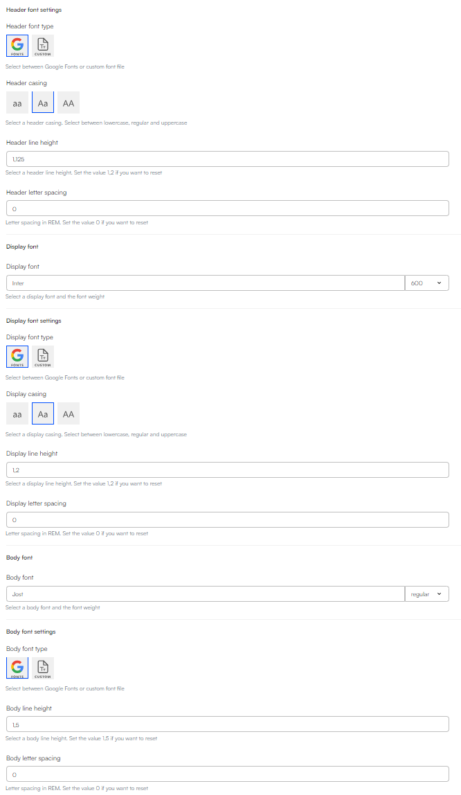
- Header font: Your usual heading.
- Display font: A larger and opinionated heading style.
- Body font: A font for paragraph text, and more.
First, you make a font and then make your preferred adjustments using the settings related to the font.

For each font you have the following settings available:
- Font weight: Select one of the available weights for the selected font.
- Casing: Select how you want the letters to visually appear. This setting is only available for header and display.
- Line height: Select the preferred distance between lines of text.
- Letter spacing: Select the preferred distance between letters.
Button settings
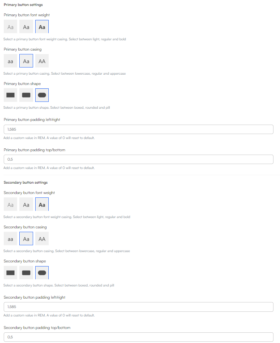
Next, you set up your buttons' visual appearance. Our goal is to make it easy for you to create visually consistent buttons styles and distinguishable primary and secondary buttons. The available button settings are following:
- Button font-weight: Select between light, regular, and bold font-weight.
- Button casing: Select between lowercase, regular and uppercase.
- Button shape: Select between boxed, rounded, and pill.
- Button padding left/right and top/bottom: Set X(left/right) and Y(top/bottom) padding of the buttons.

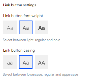
The settings of the link buttons are controlled in the Link Button Settings section. Here you can choose:
- Link button font weight: Select between light, regular, and bold font-weight.
- Link button casing: Select between lowercase, reagular, and uppercase.
