Headers and footers are important elements of any website, serving as anchors for navigation, branding, and essential information. In Swift, headers and footers can be configured and managed with flexibility, allowing your website to have a consistent and visually appealing appearance.
Header and footer configuration
To start working with your header and footer for your website, locate them in the Swift Setup section. Swift comes with a standard header and footer for desktop and for mobile, which can be configured and changed or you chan create new ones entirely. The flexibility to create a specific desktop- and mobile view ensures that customers on the site have a great user experience when using different platforms.
Overall, both headers and footers consist of rows containing column(s), and inside the columns we add paragraph types that have content. An overview of the paragraph types available for header and footer can be found under here.
You have the possibility of styling the appearance of the rows and on the paragraph types with multiple tools like top and bottom spacing, vertical alignment, color schemes, layout etc.
A demonstration on how to create a header:
Remember to navigate to the website settings and select the header and footer you want to be used.
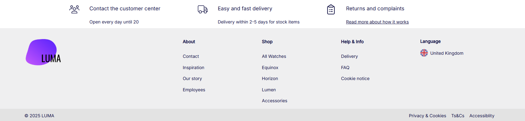
Header examples
Here we have created some examples of what headers for desktop and mobile could look like:
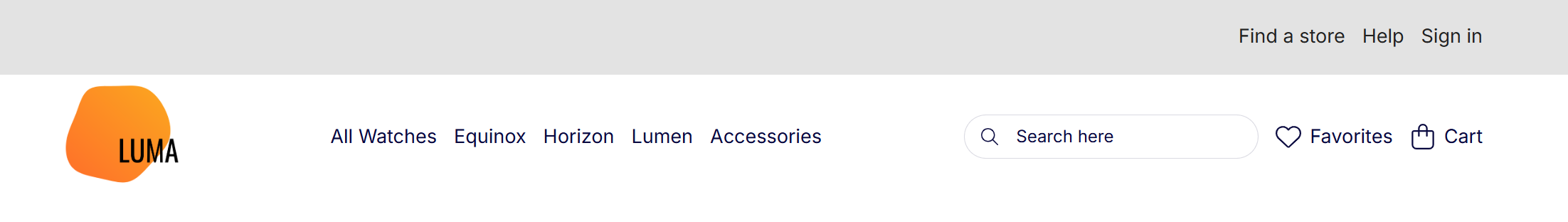
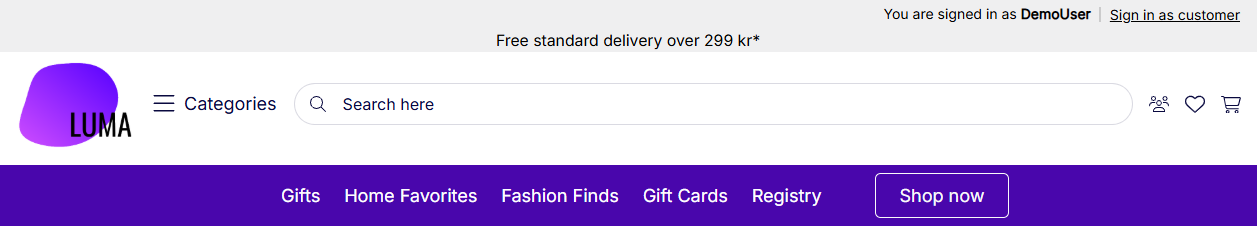
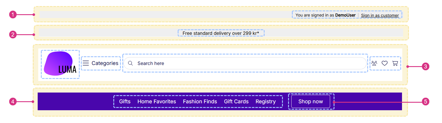
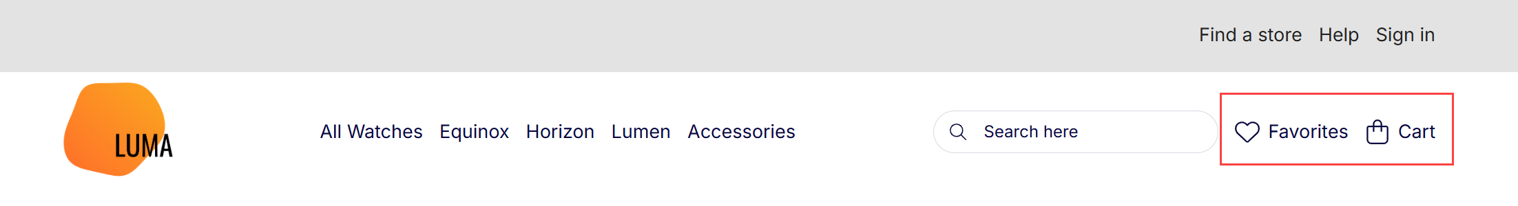
Desktop: Simple two-tiered header
This header consists of two rows that with the help of a contrasting color scheme presents several navigational options without overwhelming a customer:
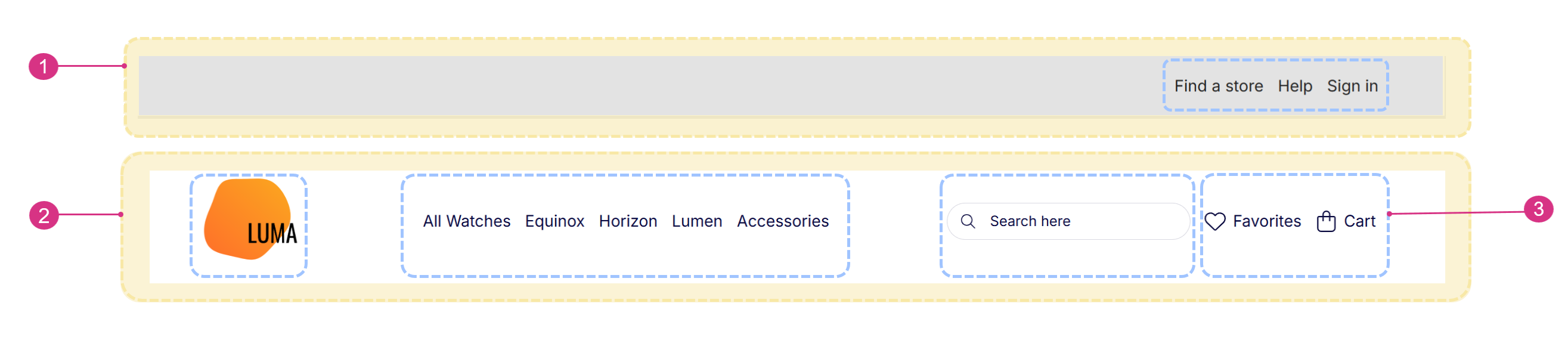
| # | Description |
|---|---|
| 1 | A row with a single column in a contrasting color scheme. Top and bottom spacing is minimal |
| 2 | A row with four columns where the second column is set to fill more space. Vertical alignment is centered |
| 3 | Top row consists of a single paragraph containing a Navigation with a horizontal right layout. Bottom row consists of four paragraphs with a Logo, Menu: Ecom with Product Group Images, Search Field, and Navigation |
Desktop: Elaborate header
The header consists of four rows that has a lot of information presented with an impersonation bar at the top, text field and with a large search bar prioritized. The menu beside the search bar opens up in an off-canvas for easy access to multiple categories without it taking up space in the header:
| # | Description |
|---|---|
| 1 | A row with a single column in a contrasting color scheme. Top and bottom spacing is minimal. Row container width is set to full |
| 2 | A row with a single column in a contrasting color scheme. Top and bottom spacing is minimal |
| 3 | A row with four columns. Medium spacing on both top and bottom. Vertical alignment is centered. All columns but the third is set to take up minimal space. Row container width is set to full |
| 4 | A row with two columns in a contrasting color scheme. Top and bottom spacing is small. Vertical alignment is centered. Row container width is set to readability |
| 5 | Top row consists of a single paragraph containing an Impersonation bar. Second row consists of a single paragraph with a centered Text. Third row consists of four paragraphs with a Logo, Off-canvas navigation, Search Field, and Navigation. Bottom row consists of two paragraphs with a Navigation and Button |
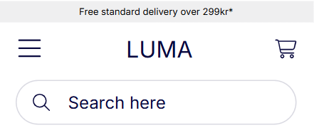
Mobile header
A mobile header that uses simple visual elements such as icons for off-canvas navigation and cart, text banner, text logo and a larger search field:
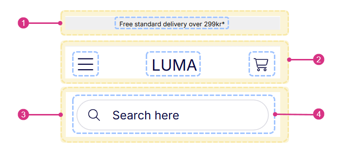
| # | Description |
|---|---|
| 1 | A row with a single column in a contrasting color scheme. Top and bottom spacing is minimal |
| 2 | A row with three columns where the outer columns are set to take up minimal space. Vertical alignment is centered |
| 3 | A row with a single column |
| 4 | Top row consists of a single paragraph containing a centered Text. Middle row consists of three paragraphs with an Off-canvas navigation, Logo, and Navigation. Bottom row consists of one paragraph with a Search Field |
Footer examples
We have created two examples of what a footer for respectively desktop and mobile could look like:
Desktop footer
A desktop footer with navigation nodes, logo, and features:
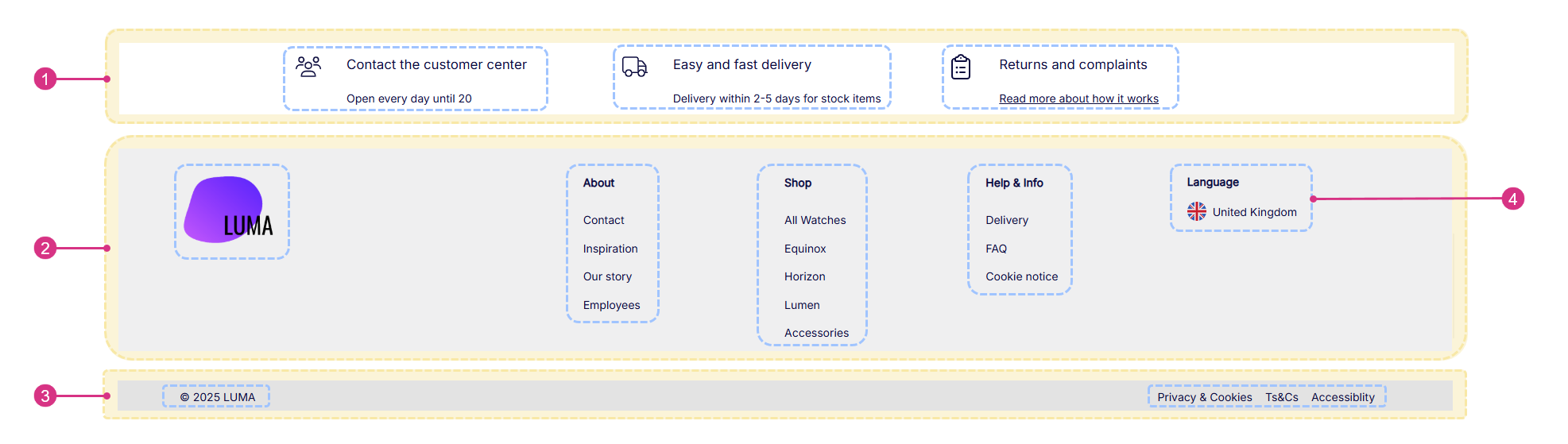
| # | Description |
|---|---|
| 1 | A row with three columns. Top and bottom spacing is small. Vertical alignment is centered. Row container width is small |
| 2 | A row with six columns in a contrasting color scheme. Vertical alignment is top |
| 3 | A row with two columns in a contrasting color scheme. Top and bottom spacing is extra small. Vertical alignment is centered |
| 4 | Top row consists of three paragraphs all containing a Feature. Middle row consists of six paragraphs with a Logo and three Navigation, the second column has been left empty as to create a bigger space between logo and navigation. Bottom row consists of two paragraphs with a Text and Navigation, the text layout is left aligned and navigation is horizontal right aligned |
Mobile footer
A simple mobile footer with horizontal and vertical oriented navigation, and a newsletter text field:
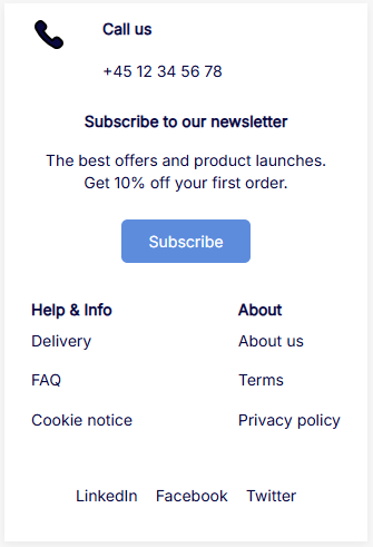
| # | Description |
|---|---|
| 1 | A row with a single column |
| 2 | A row with a single column |
| 3 | A row with two columns |
| 4 | A row with a single column |
| 5 | Top row consists of a single paragraph containing a Feature with an icon and text. Second row consists of a Text with a title, text and a button. Third row consists of two paragraphs with two Navigation which both have a title and vertical layout. Bottom row consists of one paragraph with a Navigation with a horizontal layout |
Navigation
Often your header and footer consist of a combination of navigation lists. In Swift, the shown links in navigation lists are based on folders containing different pages. These can be found in the content tree. If you want to change the displayed links in the navigation list, you locate the folder in the content tree and either create or remove pages in the folder containing these pages.
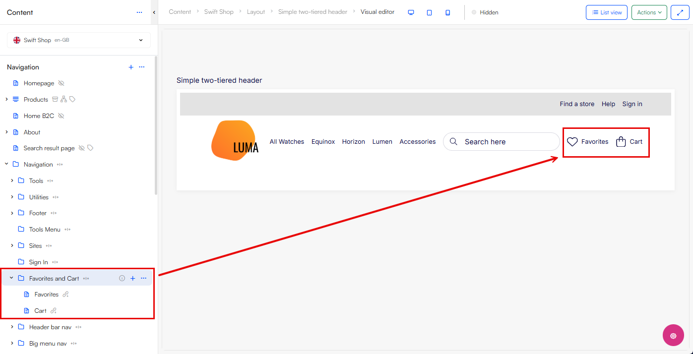
You can also make use of the header and footer paragraph types that allows you to easily link to your favorites-, sign in-, account- and cart page.
Shortcuts
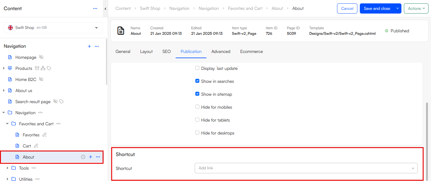
Now, you do not have to create four "About us" pages with identical content if you need them in four different navigation lists, for these scenarios we will create shortcuts. A shortcut is a page that holds no content, but is linked to another page which holds all the content e.g. an "About us" page. When you update the "About us" page with new content, the shortcut page linked to it also automatically updates.
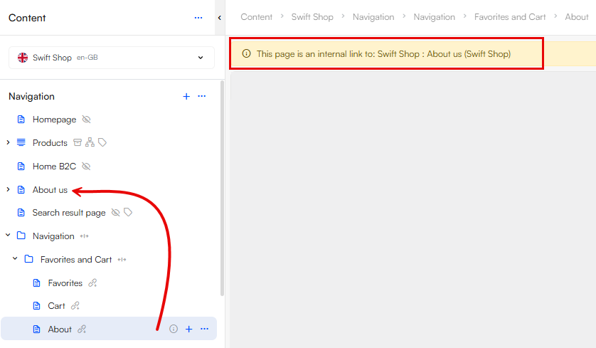
To create a shortcut, create a new page under the designated navigation folder. Then you edit the page and in the Publication tab you find the field Shortcut, here you have the option to link to a page or create an external link. Click on Page and select the page you want to create a shortcut to.
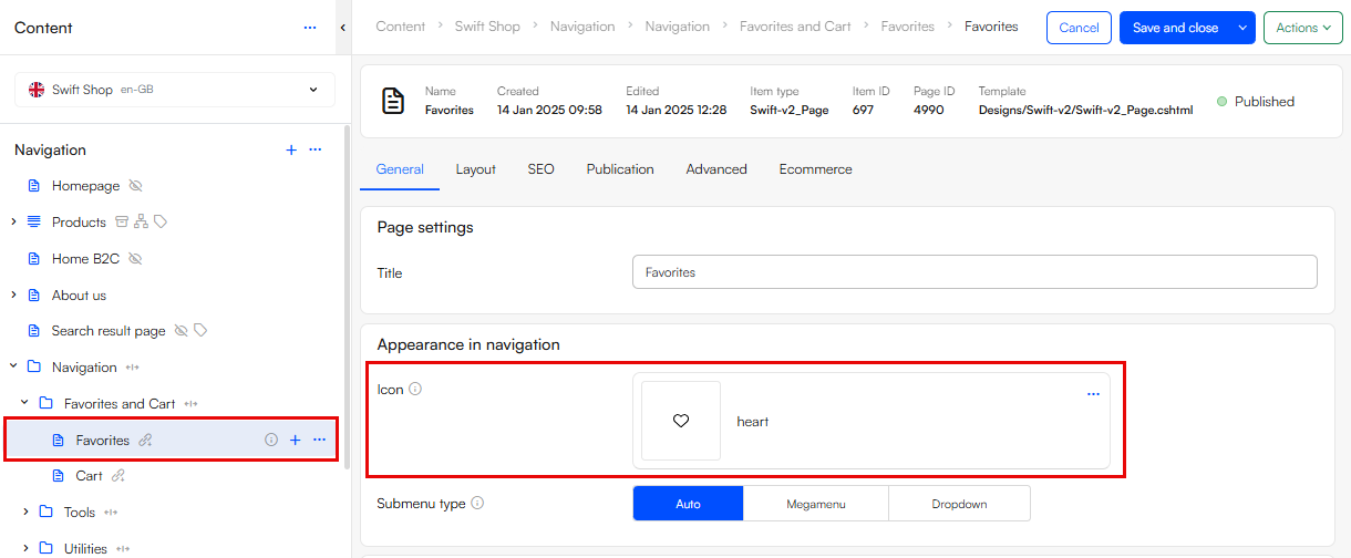
Icons
To show icons for pages in the navigation, select an icon on the page by editing the page, and in the General tab find the field Icon and select an icon in a svg file format. Now your page in the navigation will be shown with an icon alongside the title:
Ecom menus
Two available paragraph types are the Ecom menus which on hover show an enlarged menu, and are very useful for complex product catalogs with many subcategories.
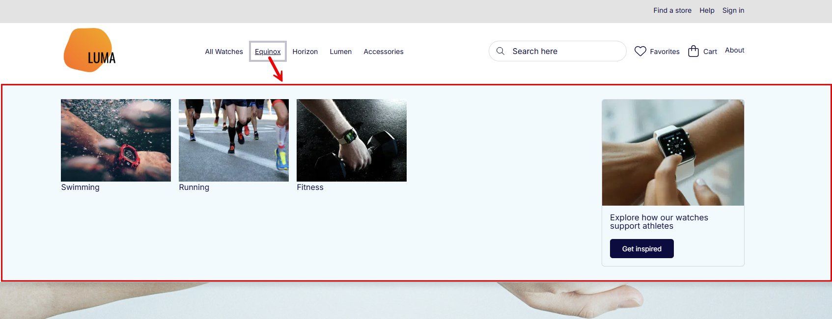
For the menus to work properly you link to a navigation root that should be your Ecommerce Navigation that shows specific product groups or a channel. Read more about setting up Ecommerce Navigation here.
Menu: Ecom with Product Group Images supports showing product group images and related content which are defined on the product group in the Products area: