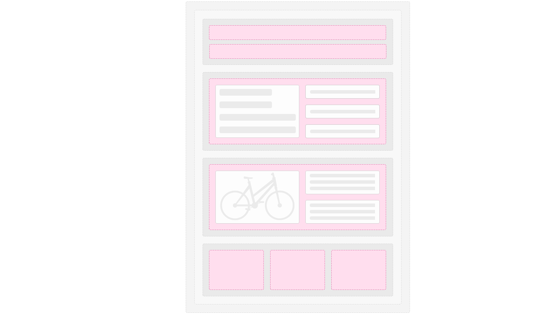
In Swift, paragraph types are fundamental building blocks for creating structured and flexible web pages. Each paragraph type represents a specific type of content or functionality, such as text, images, buttons, or custom features like sliders and video players.
Paragraph types are added to a column on a row as a way to add content to a page type.
Location of files
A paragraph type is associated with:
- An item type which controls the fields available for input (e.g. text, images, links, buttons)
- A folder with Razor templates and other resources which control how the input is shown in frontend
They are located in the System/Items/ and Templates/Designs/Swift-v2/Paragraph/ folders:
/Files/
├── Images/
├── System/
│   ├── Items/ <----------- This folder
├── Templates/
│   ├── Designs/
│   │   ├── Swift-v2/
│   │   │    ├── Paragraph/ <----------- This folder
How paragraph types works
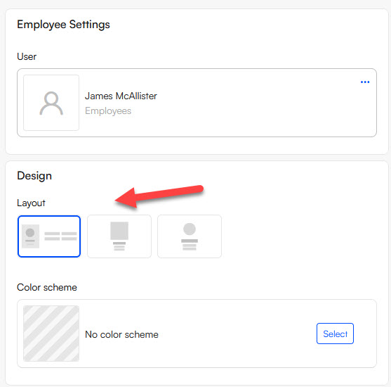
Each paragraph type is identified by the system name of the item type - for example, the Swift-v2_Employee paragraph type consists of:
- The
Swift-v2_Employeeitem type with settings and a fields field of the type User which allows you to select a single user registered on the DynamicWeb solution. - The
Swift-v2_Employee-folder under/Files/Templates/Designs/Swift-v2/Paragraph/with the following content:- ImageLeftCircle.cshtml
- ImageLeftCircle.svg
- ImageTop.cshtml
- ImageTop.svg
- ImageTopCircle.cshtml
- ImageTopCircle.svg
When you use the paragraph type in the backend, each paragraph template & icon is automatically presented to the editor as a layout option they can select:
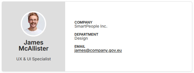
 The user you select, and the design options you select, are then reflected in the frontend when the page with this paragraph is rendered:
Content paragraph types
The following paragraph types are available for content pages:
| Paragraph Type | Purpose | Item Type |
|---|---|---|
| Accordion | Organize content into expandable/collapsible sections | Swift-v2_Accordion |
| Blockquote | Highlight quotes or testimonials with styled text and citation support. | Swift-v2_Blockquote |
| Breadcrumb Navigation | Provide navigational breadcrumbs for better UX and site structure. | Swift-v2_BreadcrumbNavigation |
| Button | Add call-to-action buttons following the button styles defined for the solution | Swift-v2_Button |
| Card | Display content in a structured card format, including images, text, buttons, etc. | Swift-v2_Card |
| Cookie notice | Renders a list of cookie categories and the associated cookies | Swift-v2_CookieNotice |
| Employee | Showcase employee profiles with details like name, title, and contact info. | Swift-v2_Employee |
| Feature | Highlight key features or benefits with icons, headings, and descriptions. | Swift-v2_Feature |
| Image | Display single images with optional captions or overlays. | Swift-v2_Image |
| Locations map | Render a map with markers based on a selected user group | Swift-v2_LocationsMap |
| Poster | Display visually impactful banners with text and buttons. | Swift-v2_Poster |
| Post list | Display posts in a card or list format with filtering and categorization | Swift-v2_PostList |
| Search Field | Include a search input field for site-wide or section-specific search. | Swift-v2_SearchField |
| Simple map | Renders a map with a single marker based on an address specified | Swift-v2_SimpleMap |
| Slider | Display content in a slider or carousel format. | Swift-v2_Slider |
| Text | Display blocks of text content with optional formatting and alignment. | Swift-v2_Text |
| Text and Image | Combine text and images in a structured layout. | Swift-v2_TextAndImage |
| Vertical Navigation | Add vertical navigation elements to pages. | Swift-v2_VerticalNavigation |
| Video Player | Embed videos with custom player controls. | Swift-v2_VideoPlayer |
| Video Poster | Combine a video with a poster overlay for interactive visuals. | Swift-v2_VideoPoster |
Header/Footer paragraph types
The following paragraph types are available for header and footer pages:
| Paragraph Type | Purpose | Item Type |
|---|---|---|
| Button | Add call-to-action buttons following the button styles defined for the solution | Swift-v2_Button |
| Favorites | Navigation element for the Favorites page | Swift-V2_Favorites |
| Impersonation Bar | Add user impersonation or administrative tool functionality. | Swift-v2_ImpersonationBar |
| Logo | Display a company logo or partner logos in a structured layout. | Swift-v2_Logo |
| Menu Product Group Images | Add an images-based menus (mega menu) for visual navigation. | Swift-v2_MenuProductGroupImages |
| Menu Related Content | Display related content links within a menu for cross-promotion. | Swift-v2_MenuRelatedContent |
| Mini cart | Navigation element for the Cart page, further behavioural settings possible | Swift-v2_MiniCart |
| My account | Navigation element for the My account page with layout options | Swift-v2_MyAccount |
| Navigation | Create custom navigation elements. | Swift-v2_Navigation |
| Off-Canvas Navigation | Add off-canvas menus for mobile-friendly navigation. | Swift-v2_OffCanvasNavigation |
| Preferences | Tool for the user to set up preferences for language, country and currency | Swift-v2_Preferences |
| Search Field | Include a search input field for site-wide or section-specific search. | Swift-v2_SearchField |
| Sign in | Navigation element for the Sing in page | Swift-v2_SignIn |
| Text | Display blocks of text content with optional formatting and alignment. | Swift-v2_Text |