Welcome to the third guide in the Swift Design Tutorial, which aims to get you familiar with using Swift and its features to create beautiful websites.
In these guides we focus on what is possible to do with Swift without any customizations, as we believe this is the best way to learn what Swift is all about; simplifying the process of website-building to the point where you can create high-quality prototypes in the fraction of the time it usually takes.
In this guide we cover:
- Creating body content using Swift item types
As you may know, the body of a website is where all the important content is located and all the interactive stuff that makes a website come to life. This is where we tell our story, share information, and engage our visitors.
Exercise: Recreating the Homepage
Below is a detailed walkthrough for remaking Nelly.com homepage using Swift. This includes the process of adjusting colors, fonts, and images to align with the appearance of the original website.
Let’s start from the top:
Adding a poster
The first item we encounter is a poster:
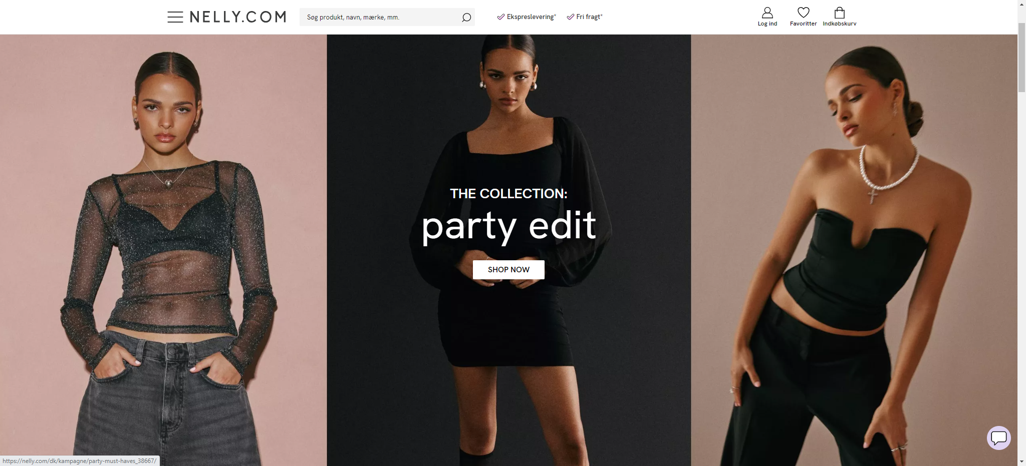
Here are the steps to adding a poster to your website:
Upload the image, you want to use, to your assets:
- Create a folder in assets and give it a relevant name
- Right click on your folder select upload files
- Select your file/files and upload
Go to the home page and add a one column row on your front page

Click the '+' icon on the empty row and select the poster as the item type.
Go to the posters settings
Select the imported image as the poster image
Set the title to "THE COLLECTION"
Set the subtitle to "party edit"
Set the layout to centered
Set the poster height to original
Set the button 1 label to SHOP NOW
Set the button link. If the button doesn't contain a link, it won't show up on the website. You can choose an internal link to one of your products.
Click save
Go to the rows settings page and set row width to wide. This will make sure your poster fills up the whole width of the page

Experiment with the sizes of the title and subtitle until they match the original website. In this example, the title is set to headline 4, while the subtitle is set to subtitle 1. Ideally, the subtitle should be larger.
Change the button design in branding settings.
 Head to the primary button settings and experiment with adjusting the settings.
In this example, the primary button settings are as follows:
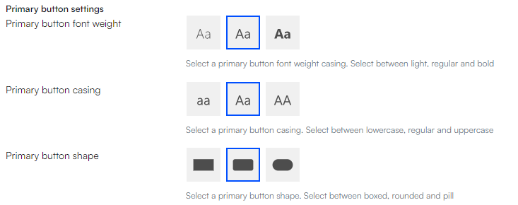 Your poster should now be very similar to the poster on the original website.

Adding an additional poster
The next item on the front page is another poster, but it differs in terms of the space it takes up on the page. As shown in the image below, the second poster doesn't extend all the way to the edge of the website.
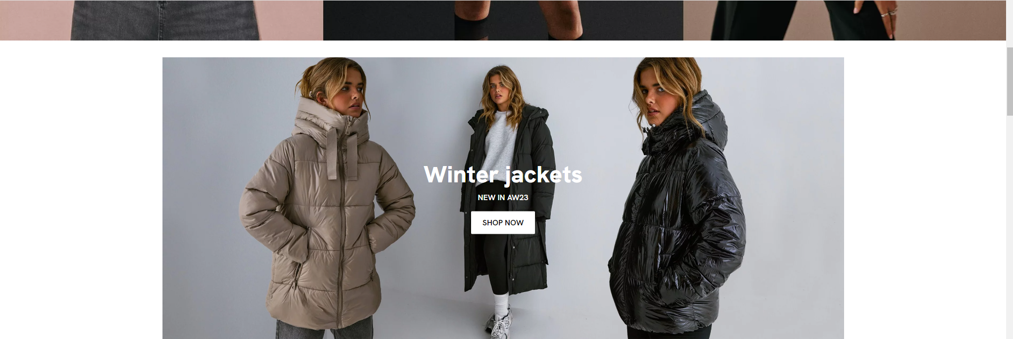
This means the process is identical to the first poster, with the only variation being the need to adjust the row width in the row settings to avoid the poster from taking up the entire page width.

After following these steps, you should be left with something like this:

Building a product slider
The next step in creating the homepage involves adding is a product slider that showcases various clothing categories.

To implement this feature, it's important to have created a shop and item folders. This tutorial will not go in depth about this, however you can use the shop and folders created in guide 2.
Assuming you have the folders from guide 2, we will now continue adding images to these folder.
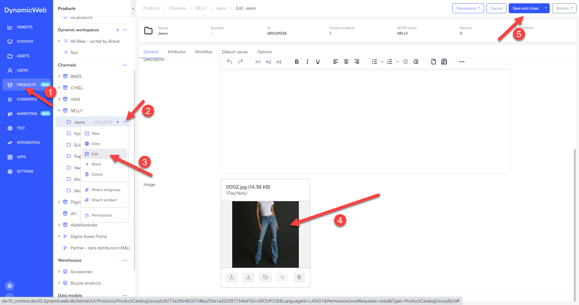
- Import the images you want to use in "Assets"
- Go to Products -> 'Name of your shop'
- Click the three dots next to each folder and select edit
- Scroll down to the button of the folders general settings page and select the image for the folder
- click 'save and close'
- follow these step for all folders
Next we need to add the product slider to the homepage:
- Go to content -> Home
- insert a one-column row underneath the posters
- Click insert paragraph on the empty row and select Products group slider as the item type
- Enter the Products group slider settings
- leave title and subtitle empty
- set type to Get selected groups
- click 'add' under selected groups. this will open new tab, where you can select the groups you want to show
- When you are done selecting groups, click select and then save
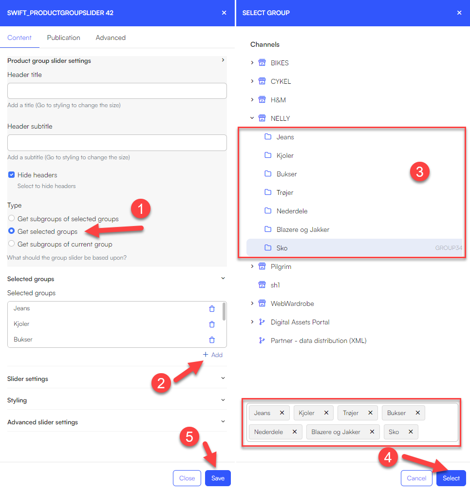
Your group slider should now contain all necessary elements. the final step is to fine-tune it to resemble the original
Adding a row with three posters
Next up is a row with three images, which link to different product types.
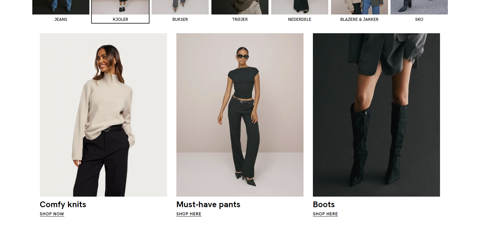
To get as close as possible to the original design, you can achieve this by creating a three-column row and placing a poster item inside each column. Here are the steps to achieve that:
- Upload the images you want to use as posters
- Add a three-column row to your webpage
- Add a poster item inside each column
- Inside each Poster item, add the poster image you want and set the poster height to 3:4
Since the poster item doesn't have the feature to place text underneath it, we'll need to add a new three-column row beneath the three posters for that purpose
- Within each column, insert a text item. Set the title and provide a link for the button
- The poster and the text currently have slightly more spacing compared to the original website. To change this, go into the rows settings. Set the row height for the posters to have no space underneath, and set the row height for the text row to have no space above

Your posters should now look something like this:
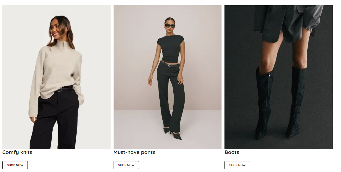
The only noticeable difference now is the button design. One approach to make the buttons more alike is to apply a theme where the button doesn't feature a border.
If we do that, the design will now look like this:

The distance between the text and the button is still slightly bigger than the original. As a solution, you may want to think about dividing the text and the button into two separate rows.
Adding text with a button
Next on the page is a text item with a button.

Here are the step to achieve this:
- Add a one-column row to your page
- Add a text item to that same row
- Set the title to 'BRANDS WE LOVE'
- Set the Layout to centered
- Set the button 1 label to 'VIEW ALL'
Your page should now look something like this:
 (A theme has been selected, meaning that the button design might look slightly different than yours)
Adding images
Next, we'll create a row where various brands are displayed and clickable.
![]()
- Start by creating a column row for the number of brands you want to display.
- Inside each column, insert an image-item and select the appropriate brand image for each
- Set the image aspect ratio to 'original' for each image
- Save the changes
This should leave you with something very similar to the original website.
 To create lines on the website, follow these steps:
- Upload the lines as images
- Add one-column rows both above and below the brands section
- Within each row, insert an image item
- Choose the line-image as the image for each image item
- Ensure that you set the image aspect ratio to 'fill'

Adding posters with text overlay
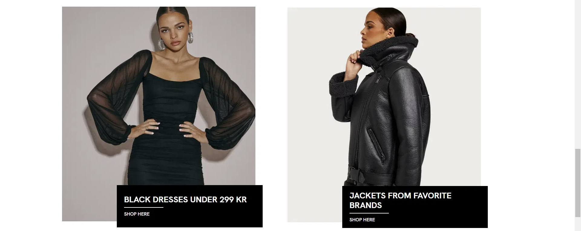
Next on the website, are two posters with a textbox overlay. To add two posters with a textbox overlay on the website, you have two approaches.
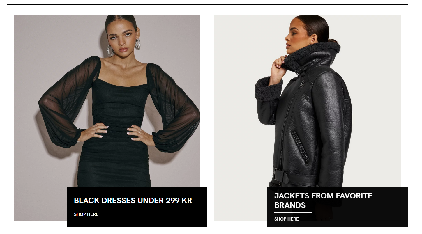
Approach 1: Uploading the entire poster including the text as an image and using it as a poster.
Approach 2: Uploading the image without the text overlay. Then using the Swift features to make something similar.
Approach 1 will more closely replicate the original design, and given that the original poster also functions as a big button link, we will proceed with this approach.
- find the images you would like to use and upload them in 'Assets'
- Add a two-column row to your page
- Add a poster-item within each column
- Set the poster image to the image you uploaded
- Set the Poster height to 'original'
Adding two lines of text and a button
Next up is a section with two lines of text and a button.
 This is easily achieve by adding a text item. Here are the steps:
- Add a one-column row to your webpage
- inside that row, add a text-item
- Set the title
- Set the subtitle
- Set the layout to centered
- Set the button text
- Provide the button with a link
- Experiment with the styling, until it looks like the original

Adding a slider with links to articles
Next, we'll be working on a section featuring various images, each linking to different articles.

For this, we need to make two rows, one for the slider and one for the button. The first step is therefor to add two one-column rows to your webpage.
Let's focus on the row with images first:
- Add a slider item to the row
- Enter the sliders general settings
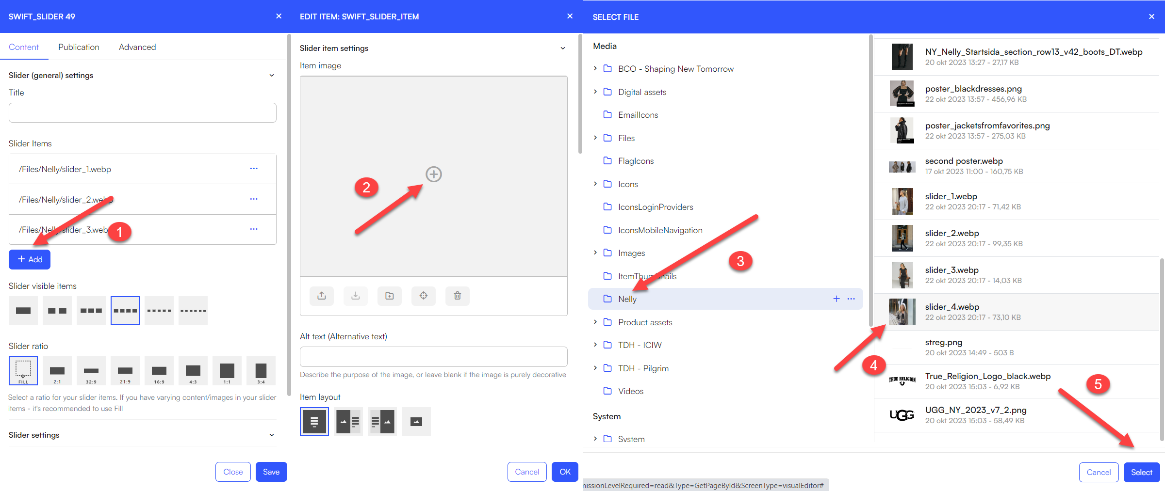
- Click "+Add" under slider items
- Click the '+'-icon and select the image you want displayed on your slider
- repeat these step 4 for all images
When all images have been added, we just need to make some final adjustments
- Set slider visible items to four items
- Change the arrow style

- Set the slider ratio to 1:1

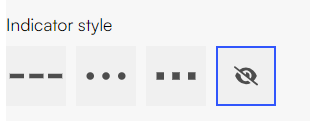
- Set the indicator style to hidden
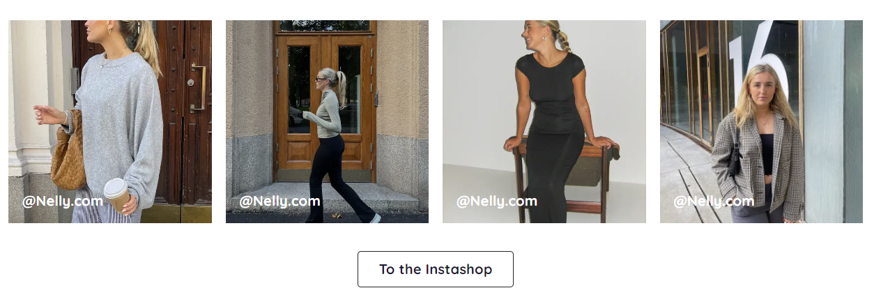
The final adjustment we need to make is to add the small '@Nelly.com' tag in the bottom left corner of each slider image:
- Enter each slider item by choosing this in the slider items list
- In the text field, write @Nelly.com

- Set the Content alignment to lower left corner
- Go to the styling tab and set the theme to Dark transparent
The slider should now look something like this:

Now we can add the button beneath the slider.
- Add a text item to the empty column beneath the slider
- leave title, subtile and text empty
- Set layout to centered
- Set button 1 label to 'To the Instashop'
- Provide the button with a link
- Set the theme to Light and 'Button style - button 1' to 'light'
The page should now look something like this:
Placing a slider with new products
Next on the page is a column, where various new products are placed.

Here is how to achieve this with Swift:
First we need to create the Products we want to display. Below are the steps to accomplish this:
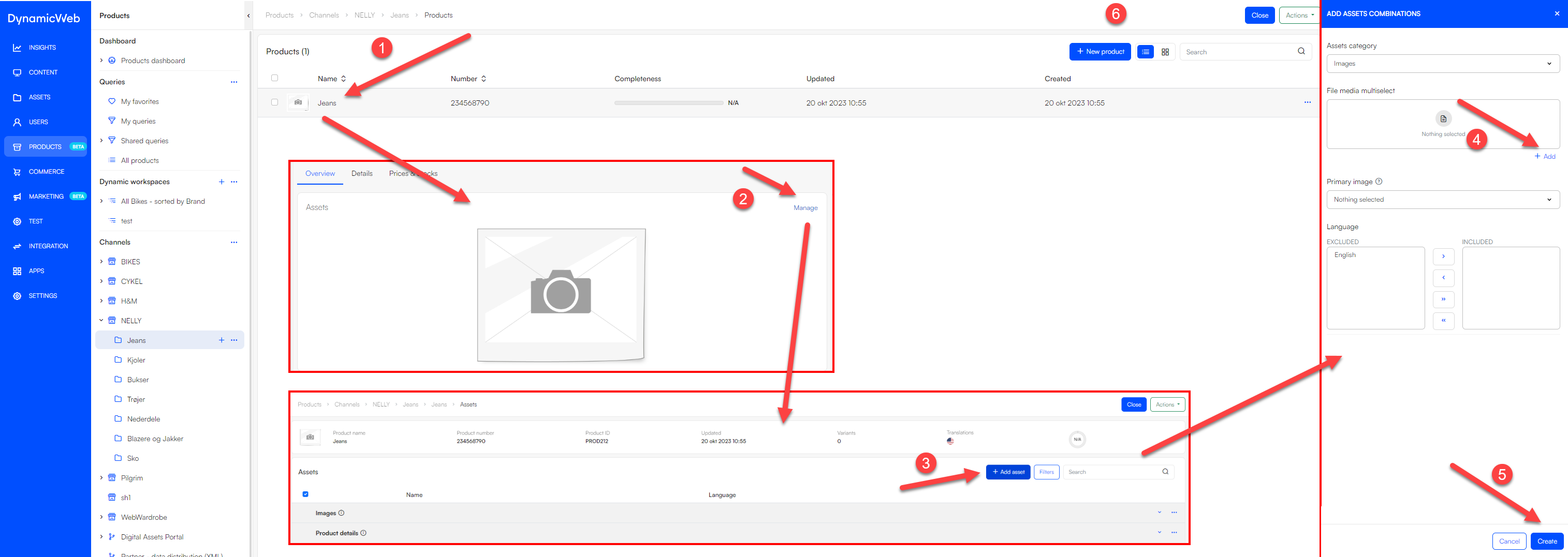
- Go to Products > Channels > 'Your shop' > ' your folder'
- Click '+ New product'
- Provide the product with a name and other relevant details
- Click 'Save and close'

- Click on the product you just created
- Click 'Manage'
- Click '+ Add assets' and then '+ Add'
- Select the images you want to add to the product
- Set the primary image to the one you want displayed first
- Click 'Create'
 Repeat these steps for all product you want to create
Now we are ready to use these products on our homepage:
- Go to Content > Home
- Add a one-column row to the page
- Add a Product slider/grid view item to the empty row
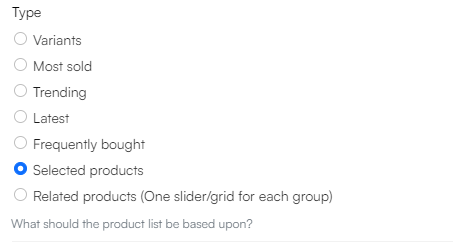
- Set type to 'Selected products'
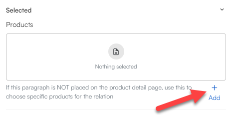
- Add the products, you just created, to the products slider
- Set the 'Arrow style'
- Set the 'Arrow placement'
- Click 'save'
Your should now be left with a product slider, that look similar to the original one.
Adding row with features
The last thing on the front page is a row with four features.

Here are the steps to creating this with Swift:
- Import the icons you want to use in Assets
- Go to Content > Home
- Create a new 4-column row underneath the slider
- Add a feature item to each column
- Within each feature item:
- Click the '+' icon within 'upload new icon'
- Find the icon you imported and click 'Select'
- Write the text you want underneath your icon in the 'Text' field
- Set the layout to centred
- Click 'save'
Your features should now look something like this:

To get them more closely aligned with the original, try experimenting with fonts, branding settings and themes.
In this guide, we've covered the essential steps to create a websites body content using Swift. By following these steps, you can design and customize various elements like posters, product sliders, text sections, brand showcases, and more.