Welcome to the second guide in the Swift Design Tutorial, which aims to get you familiar with using Swift and its features to create beautiful websites.
In these guides we focus on what is possible to do with Swift without any customizations, as we believe this is the best way to learn what Swift is all about; simplifying the process of website-building to the point where you can create high-quality prototypes in the fraction of the time it usually takes.
In this guide we cover:
- Creating a website
- Building a header
- Building a footer
Together, these elements provide structure, navigation, and consistency to a website.
To enhance your understanding, we strongly recommend actively participating in the tutorial by building your own version as you progress through each exercise. This hands-on approach will deepen your understanding and empower you to apply it in real-world scenarios.
When successfully installing Swift, you’ll notice a standard Swift demo shop. Don’t worry about that for now – In this guide, we’ll skip over it and jump right into the first step: creating a website.
Exercise 1: Creating a website
This initial exercise will serve as the foundation for the subsequent exercises, as we require a website as a starting point for all the others. So, the very first thing you need to do is create the website. To do this, head over to Content and click the menu dots and select "Websites." You can see exactly how this is done in the image below.
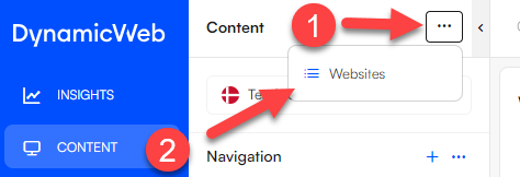
For simplicity, we’ll be copying the demo website, which comes with Swift.
You can see how to make a copy in the image below.
 You should now be left with a demo website for a bike shop, which you can edit as you like. Be patient as the website is generated; it may take a few minutes. If you encounter an error, try waiting for a few moments before trying again.
Exercise 2: Building a header
The header, as the name suggests, is the top part of the webpage. It typically contains clickable elements like the logo, login buttons, navigation menus, and more. The appearance and content of headers can differ from one website to another, based on the website's purpose and design.
- The header can be found under Swift tools > Layout > Header > Desktop - the desktop and mobile headers are essentially the same, the only difference is the width of the screen
- Make sure to delete the old header rows before building new ones

Header Example
In this exercise, we will use the H&M header as an example and follow a step-by-step approach.

- The first step is to figure out how many rows and columns you need. In this example we need three rows with 5, 3 and 1 columns respectively, with empty rows to center the logo:

- Add empty rows to the header

Import the images you need - In this example, we need the H&M logo and the three dots:
- Go to Assets > Images
- Create a new folder
- Click on the new folder and upload the images
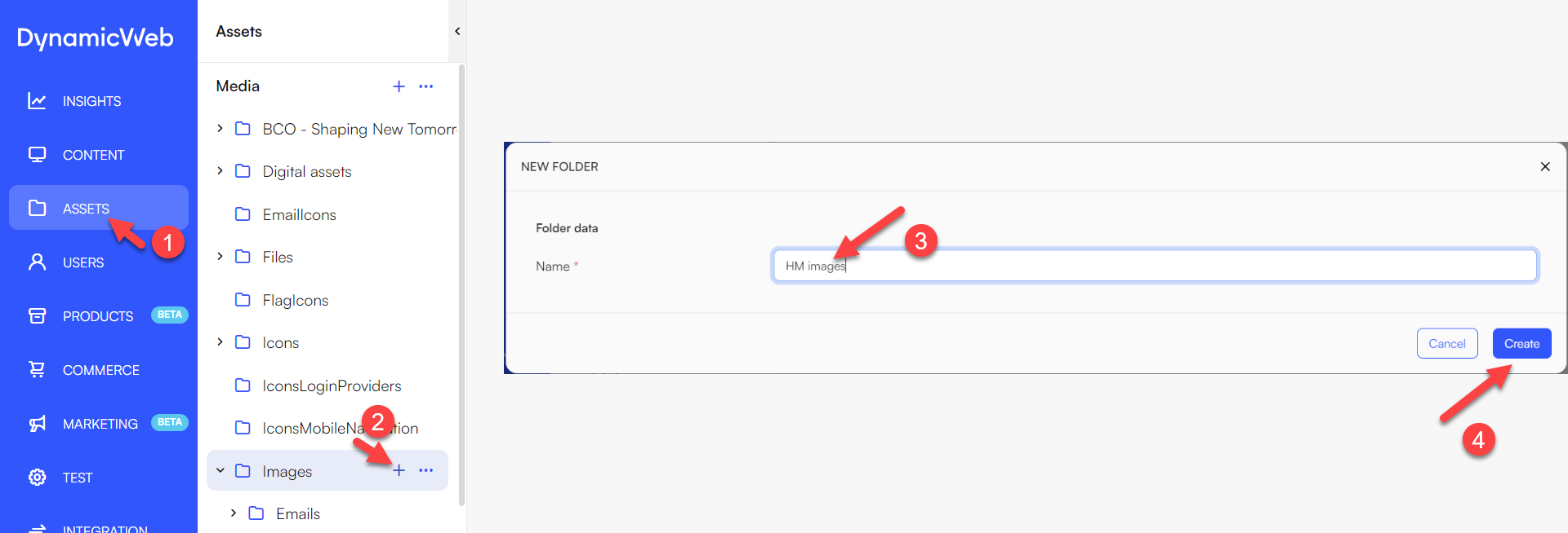 When an image has been uploaded, it should look like the image below and the images are now ready to be used.

The upper left corner of the header should provide links to Customer service, store locator and newsletter pages. before we can add these to the header, we need to create these pages:
- Go to the Navigation folder in content
- Create a new subfolder by right-clicking the Navigation folder and selecting New folder. Remember to give the folder a relevant name
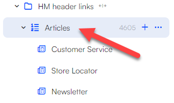
- Inside the new subfolder, generate an article list by right-clicking on the newly created folder and selecting New page. Choose Article list page as the item type
- Within the article list page, add the individual articles by right-clicking and selecting New page. Choose Article as the item type for all articles
- The articles should now look something like the image below
Head back to the header section: Content > Swift tools > Layout > header > Desktop. You should now be able to add the navigation item in the top-left corner of the header:
- Hover the mouse over the upper left column and click on the green insert paragraph icon
- Select Navigation as the paragraph type
- Give the navigation item a title
- Set the navigation root as the newly created article list
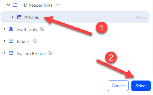 It should now look like the image below.

The three dots located next to the top-left navigation should have their own column, as they function as icons. Here is how you do that:
- Add logo item to column
- Choose the image to display
- Choose the logo width. Usually, you need to adjust it a few times for it to align with the original website
It should now look something like the image below.

Continuing, we’ll add the H&M logo using the same method as with the three dots.

Next is the sign in, favorites and shopping bag navigation items:
- Create the pages. Usually these are placed in Navigation > Utilities folder, but it is entirely up to you
It could look like this when you’re done:
 In this case two sign in and one Ecommerce folder pages have been added.
 - Set the icon for each page, in settings. E.g., The Sign in page icon should be a person

Head back to the header section: Content > Swift tools > Layout > header > Desktop. You should now be able to add the navigation item and link to your pages.
- Add a navigation item to the upper-right column
- Set the navigation root to the Utilities folder (if that is where you placed your pages)
- Change the layout of the navigation item to include the icons

- The header should now look something like this:
 TIP! It is possible to upload new icons, if the ones available aren’t suitable.
Building a shop
In order to get the correct headings in the mega menu, we need to build a shop. Here is how to do that:
- Go to the Settings > Products > Channels > Channel
- Click '+ New Channel structure'
- Give the channel a relevant name, it could e.g. be the name of the website
- Click 'save and close'
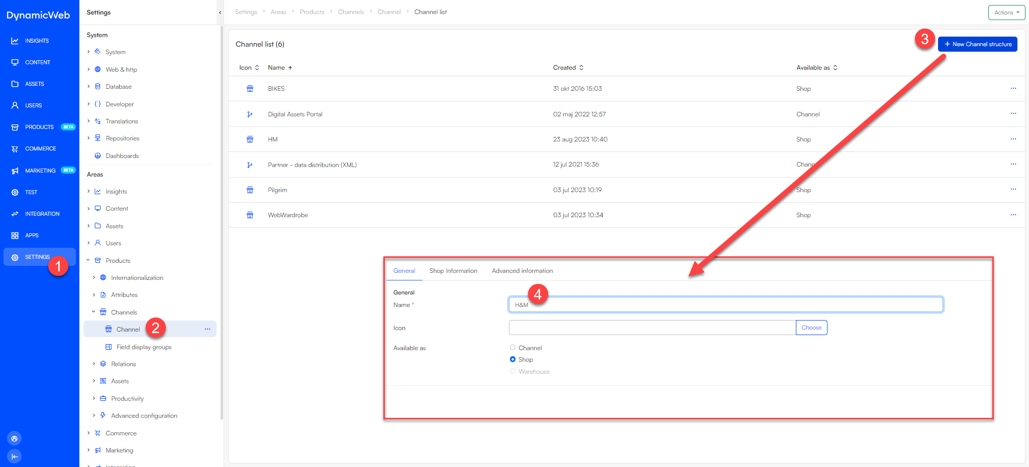 You should now be able to see the new shop in the Channel list.
The shop is currently empty. The next step is to make the folders:
- Go to Products
- Find the Channel, you just created
- Click the '+' symbol
- Set the name for the category (example: Women)
- Click 'Save and close'
The new category should now be visible under the H&M channel
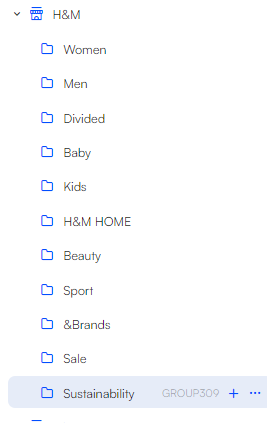
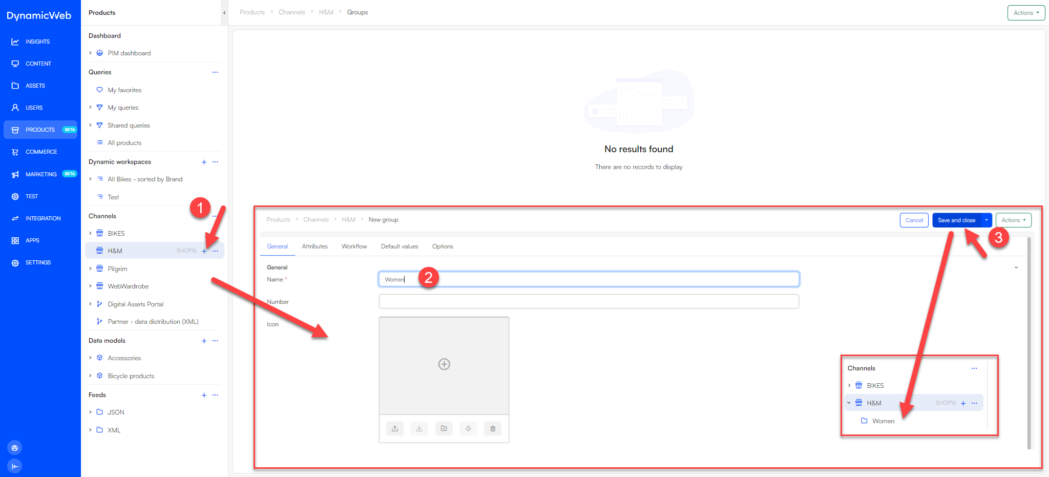 Do the same for the other categories. You should be left with something like the image below.
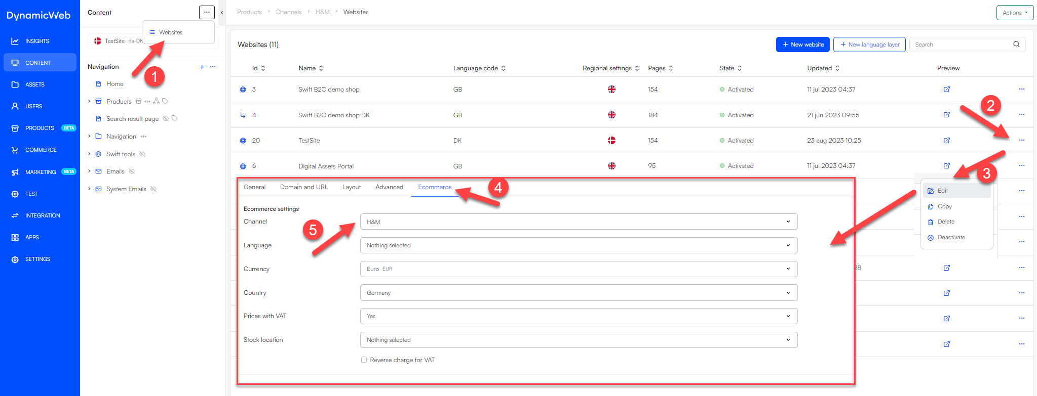
The website needs to be connected to the new shop. Here is how to do that:
- Go to Content
- Click the three dots in the upper left corner and select Websites
- Click the website you created earlier
- Go to the Ecommerce tab and set the channel to your shop
- Click 'Save and close'
The products also need to be connected to the new shop
- Go to Content
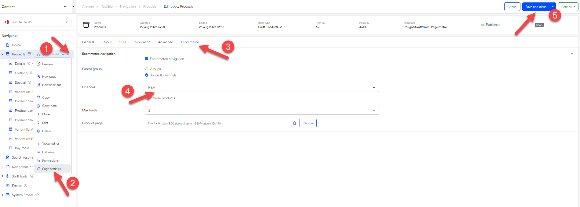
- Right click Products and select Page settings
- Go to the Ecommerce tab
- Set the channel to the shop you created
- Click Save and close
Continuing building the header
Now we need to add the mega menu to the header. We leave the first column empty, to make the mega menu centered.
- Add a mega menu item to the column.
- Enter the mega menus settings
- Set navigation root to Products
- Click Save
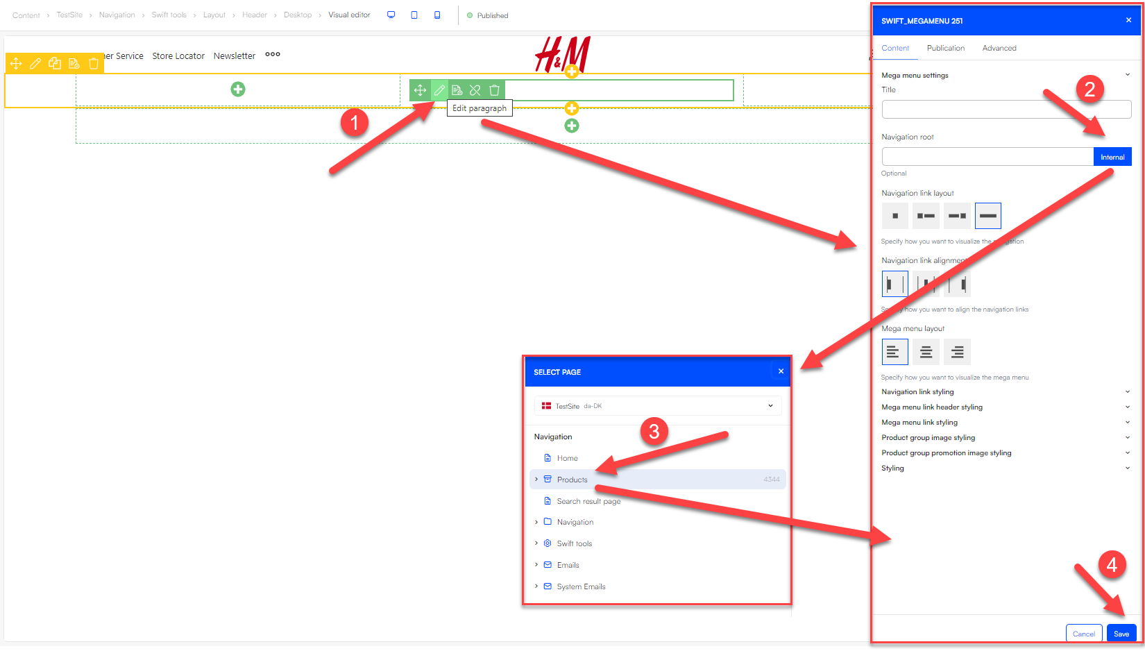 The mega menu should now look something like this:

Next up is to add the search function. Swift offers a single standard search field, so we will have to use that.
 To read more about the search function, go to our search field documentation
The last thing to add is a text banner in the third row.
- Set the text banners text to “Members get free delivery over £30 and free returns.”
- Set the layout to centered
The header should now look like this in the visual editor:

We should now have a header that looks very similar to the original website. We just need to make some adjustments, like changing the font, color, sizes etc.
All the necessary details for creating a theme and adjusting branding are described in Guide 1. If you are in doubt about how to proceed, feel free to go back to guide 1 for further assistance.
After some adjustment, the Swift website should look very similar to the H&M website.
The swift website
 The original website

Header position
Another important header feature is the header position-property, which can be accessed in the headers page settings. You can choose to make the header sticky to top, causing it to hide when scrolling, or you can opt to keep it fixed above the content, ensuring it remains visible while scrolling.
It's important to remember that if you select the fixed above position for your header, you should have a background color applied to your header. Without it, the text might overlay your content as shown in the image below:

Exercise 3: Building a footer
The footer of a website serves as a closing statement, giving the costumer critical information, navigation and functionality. Key elements often found in a footer include contact information, links to important pages like the privacy policy and terms of service, customer service and social media.
Overall, the footer enhances website usability, strengthens branding, and ensures accessibility to essential resources.
The process of building a footer is very similar to building a header. Therefore, you will find references to steps outlines in the header exercise.
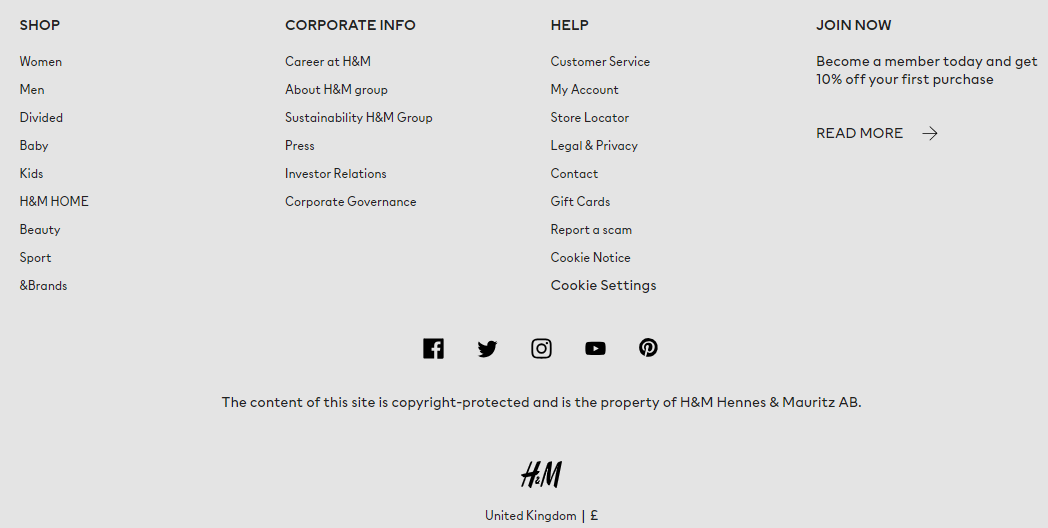
Just like in the header guide, we'll use the H&M website as our reference.
You can view a screenshot of the H&M footer in the image below:
Building a base for the Footer
Like with the header, the initial step involves identifying the rows and columns of the footer:
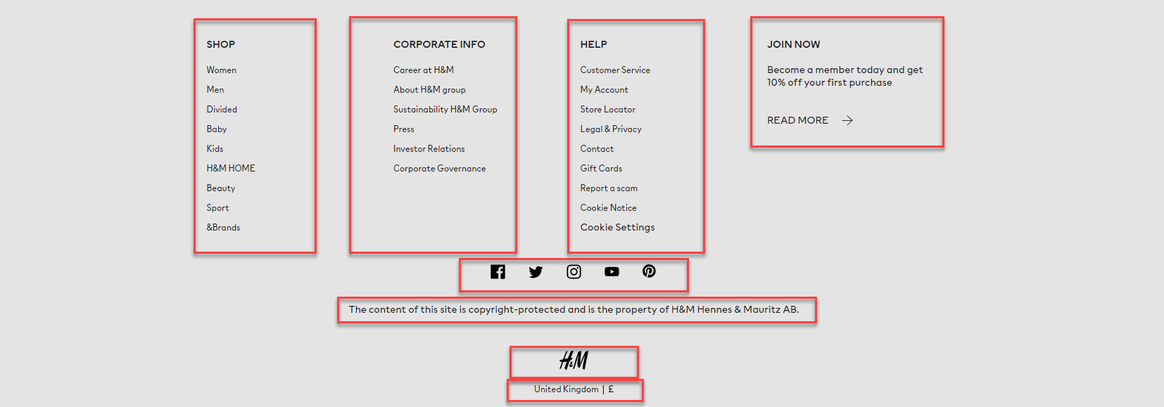 In this scenario, we need 5 rows with 4, 1, 1, 1 and 1 columns respectively.
Add these rows to the footer, which can be found in Content > Swift tools > Layout > Footer > Desktop

Adding items to the footer
The first row consists of navigation items. The first step is therefore to make the pages to link to. Here are the steps to achieve that:
- Go to Content > Navigation and create a new folder. Remember to give it a relevant name.

- Inside the folder, you create one folder for each column you need. In this case there are three (Corporate info, Help and Join now). The shop navigation is not part of the folder, as it just links to our products folder, which is already created in the header exercise.
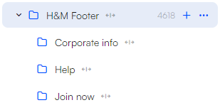
- Enrich these three folders with the required pages. For instance, within the “Help” folder, create pages like “Costumer service”, “My Account”, “Store locator” and so forth. Once all pages have been added to your folder, your structure should look something like this:
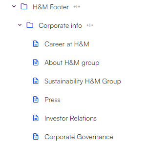
We can now add the navigation items to the footer as follows:
- Click on the respective column
- Add a navigation paragraph
- Set the navigation root as your folder (e.g., “corporate info”)
- For the shop navigation, set the navigation root to “Products”
- Set the navigation direction to "vertical"
- Set the rows vertical alignment to "top"
 The row should now look like this:
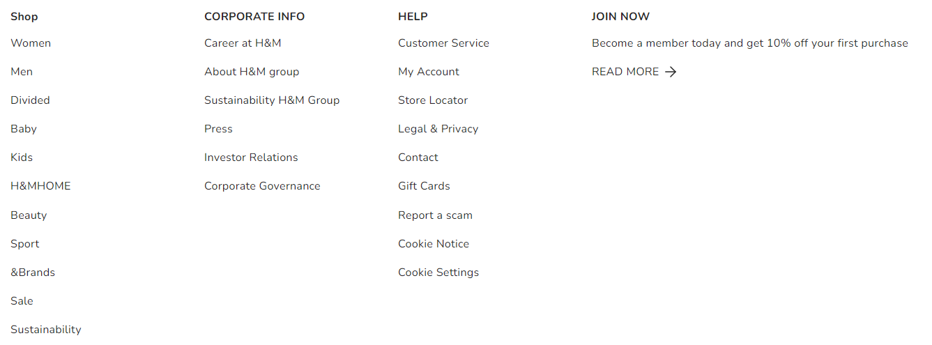
Next up are the social links in the second row of the footer. You should create the necessary pages first
- Create a folder. Preferably somewhere that makes sense, such as inside the footer folder
- Create the individual pages inside the folder
- Provide each page with a name and an icon
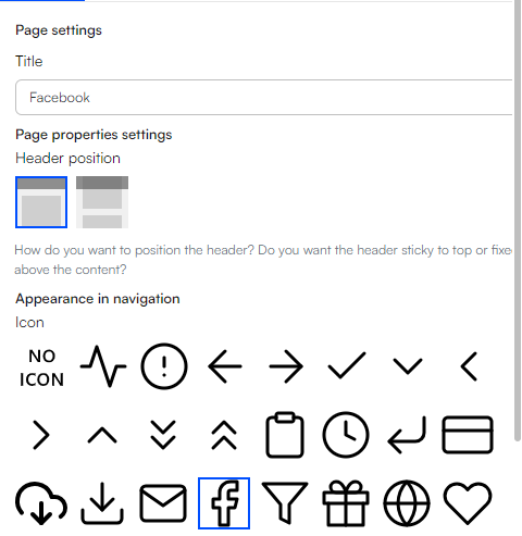 If you cannot find the specific icon you need, you have the option to upload your own in the Assets > icons section. Ensure that the uploaded icon is a .svg file for it to function correctly.
 - After creating the pages, the structure should look something like this:
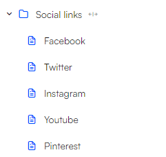
Now we can add a navigation item to the second row in the footer and set the navigation root to the folder containing the social links. Here are some other adjustments that need to be done:
- Set the navigation direction to horizontal.

- Set the Navigation alignment to center

- Set the layout to only include the icon
 It should now look something like this:

The third row in the footer contains a text item:
- Add a text item to the row
- Write the text in the Subtitle
- Set the layout to centered
It should look like this:

The fourth row in the footer contains the logo
- Import the logo to your assets
- Add a logo item to the fourth row
- Select the recently imported logo as the image for this row
- Set the horizontal alignment to centered
- fine tune the logo’s width, until it matches the original

The fifth row is also a text field, so follow the steps from the previous text item.
Your footer should now look something like this:
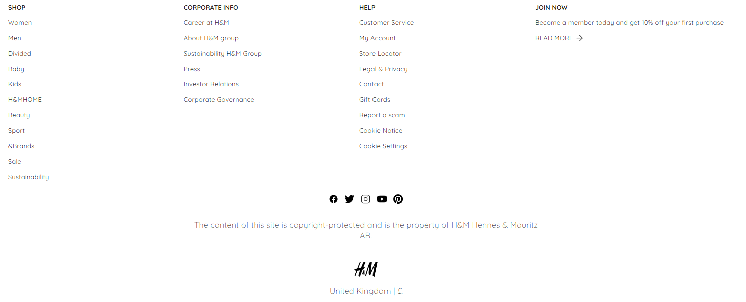
The footer now includes everything like the original. The final step involves adjusting the theme, font, sizes etc. How to adjust themes and branding can be found in guide 1.
When you are finished with adjusting themes, font etc. you could be left with something like this:
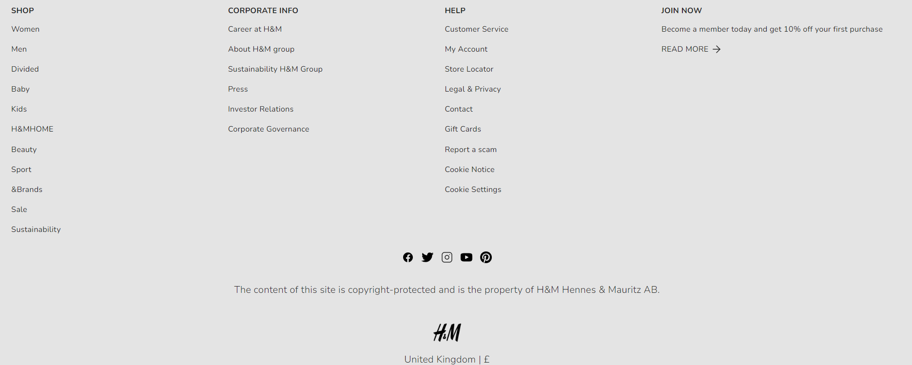
That's it for this guide. In brief, we can conclude that footers and headers are essential for providing information, navigation, and functionality to users. However, their content can vary widely, making it challenging to create a one-size-fits-all tutorial.