The various ScreenTypes you can inherit from when constructing a custom workspace make use of various standard ui elements depending on the task at hand. In this article we will list each standard UI element you have access to - and what they're typically used for.
Tabs
Tabs are used on overview screens and edit screens. They are typically used to group related input fields or widgets together for screens with a lot of information.
Topbar
A topbar is used for two things; to show where in the system the user is located by displaying a breadcrumb, and to contain buttons like the action menu button, save buttons, and so on.

Navigation tree
A navigation tree is used to enable the user to navigate between features or content for an area. Depending on the area, navigation trees may have several sections with a group of nodes under a label.
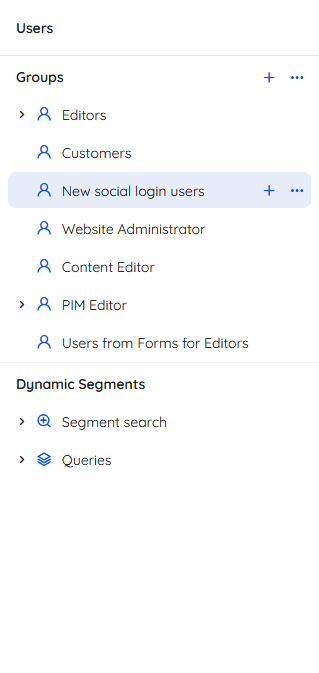 Often, individual nodes will allow you to create new content using a +-icon - and access more features or settings using a context menu.
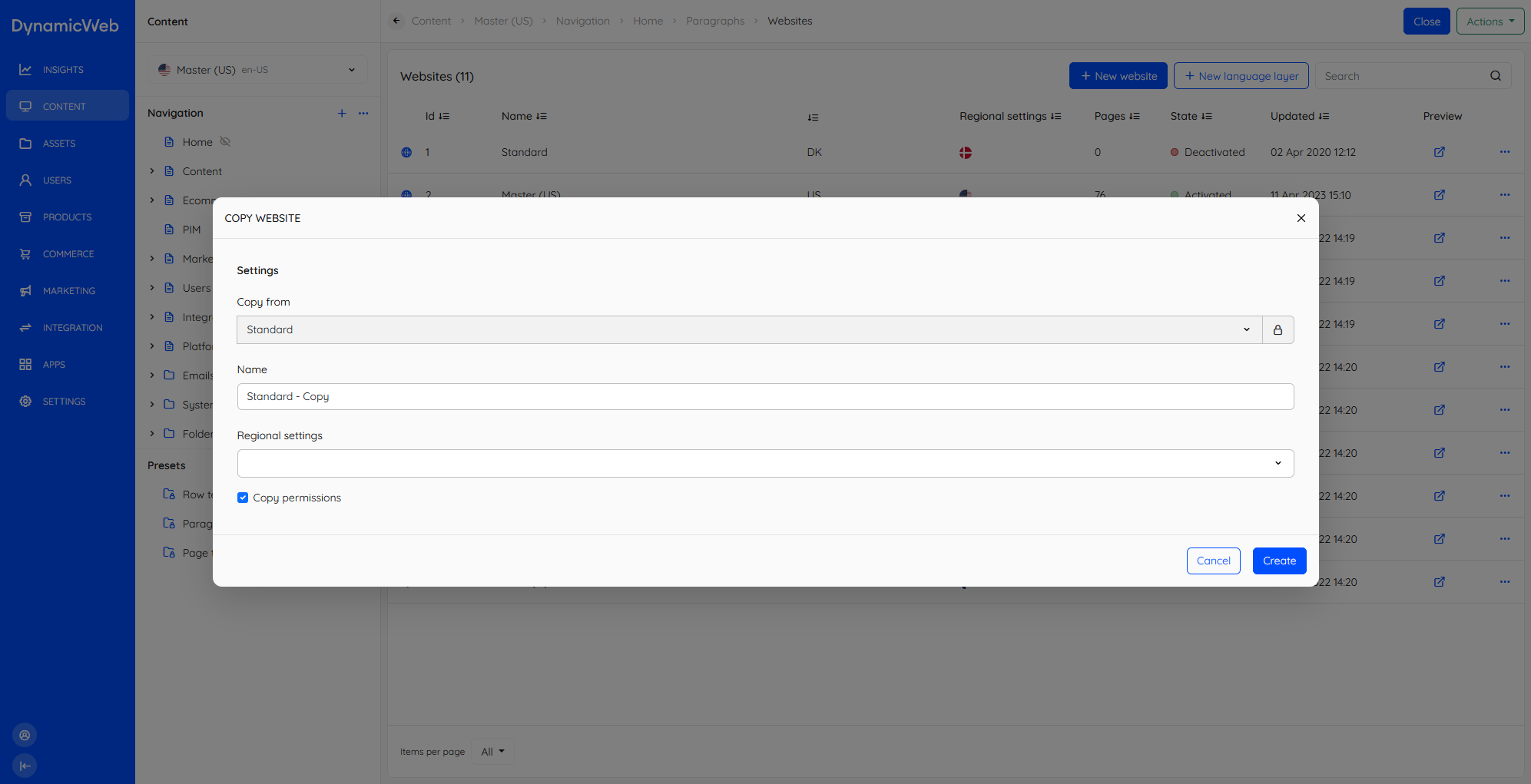
Modals
Modals, or dialogues, are occasionally employed when we want to allow the user to create or edit content without leaving the current view.
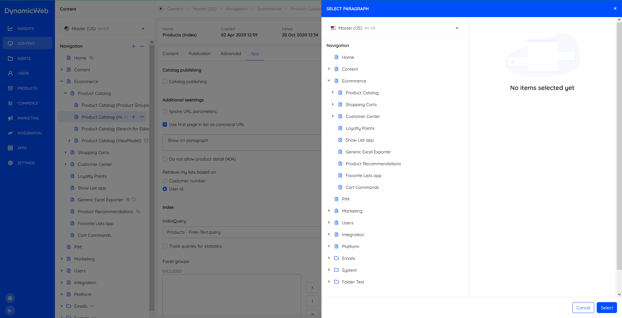
Slideover panel
A slideover panel is a panel which appears as, well, a slide over on top of the current view. It is typically employed when the user is prompted to select an asset, a page/paragraph, and so on.
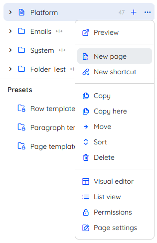
Context menu
Context menus are collections of context-sensitive actions available by clicking a ...-button. Context menus are always present for list items and often for nodes in a navigation tree.
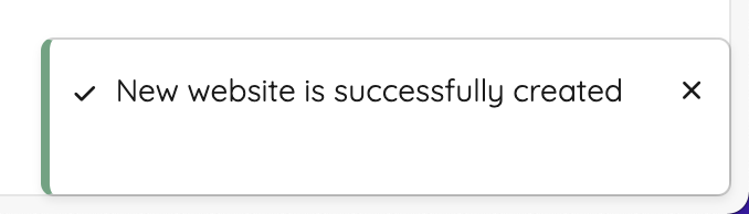
Toasts
A toast is a small notification providing the user with feedback at certain times, e.g. when something goes right (or wrong).
Collapsible rows
Collapsible rows are used for certain lists-within-lists - most importantly for item types and paragraph containers. Most collapsible rows feature a context menu for the whole row as well as for the list item.
Info bar
The Info bar element is used whenever we need to show key information in a prominent manner, e.g. on pages.

Widgets
Widgets are elements on an overview screen highlighting something and providing the user with the option of viewing more or managing the type of content shown.
Implementing the UI Elements
The edit screen is a common screen type in DynamicWeb 10, and here it will help us illustrate the different UI elements and how they fit together. An edit screen typically contains common UI elements that you'll see reused across the platform.
When you inherit from the EditScreenBase you can override the default implementation of the BuildEditScreen method to add the elements you need. The EditScreenBase class provides a lot of functionality out of the box, so you can focus on the specifics of your screen.
Below is an example of how you might set up a screen for editing a user's address. You can see in the BuildEditScreen method we have set the info bar with a widget that displays the user's information, and we've created two separate tabs - Address and Fields.
The GetEditor method allows us to customize how specific input fields are displayed. If you don't explicitly get an editor for a property here, it will default to the editor of that property type. In the below example we don't get an editor for the UserAddressModel.Name property, which is of type string, so this will default to a simple text editor.
    public sealed class UserAddressEditScreen : EditScreenBase<UserAddressModel>
    {
        protected override string GetScreenName() => Model?.Id > 0 ? $"{Model.Name}" : "New address";

        protected override void BuildEditScreen()
        {
            var model = Model;
            if (model is null)
                return;

            SetInfobar(UsersComponentsHelper.GetUserInfoWidget(model.UserId));

            CreateUserTab();
            CreateFieldsTab();
        }

        private void CreateUserTab()
        {
            AddComponents("Address", new LayoutWrapper[]
            {
                new LayoutWrapper("Address", new[]
                {
                    EditorFor(m => m.Name),
                    EditorFor(m => m.Email),
                    EditorFor(m => m.Address),
                    EditorFor(m => m.Address2),
                    EditorFor(m => m.HouseNumber),
                    EditorFor(m => m.Zip),
                    EditorFor(m => m.City),
                    EditorFor(m => m.State),
                    EditorFor(m => m.CustomerNumber),
                    EditorFor(m => m.CountryCode),
                    EditorFor(m => m.IsDefault),
                }),
                new LayoutWrapper("Phone", new[]
                {
                    EditorFor(m => m.Phone),
                    EditorFor(m => m.Cell),
                    EditorFor(m => m.Fax),
                }),
                new LayoutWrapper("Work", new[]
                {
                    EditorFor(m => m.Company),
                    EditorFor(m => m.PhoneBusiness),
                }),
            });
        }

        private void CreateFieldsTab()
        {
            AddDynamicFields("Fields", m => m.CustomFields);
        }

        protected override EditorBase? GetEditor(string property) => property switch
        {
            nameof(Model.CountryCode) => EditorsHelper.CreateRegionCodeSelect(),
            _ => null,
        };

        protected override CommandBase<UserAddressModel> GetSaveCommand() => new UserAddressSaveCommand();
    }
This screen will be rendered like this in the frontend:
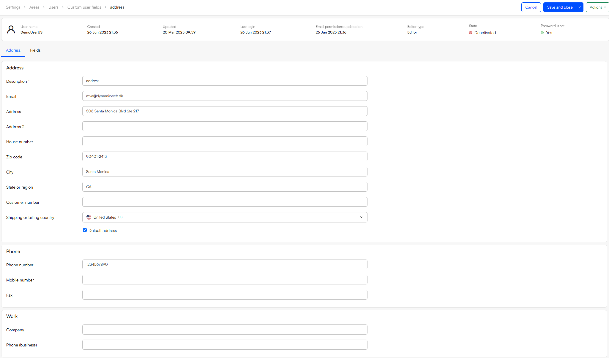
This UserAddressEditScreen contains a few different UI elements:
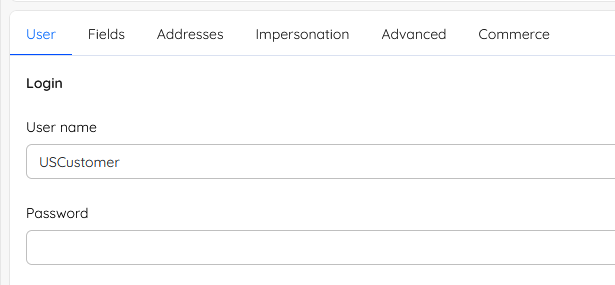
Top Bar - Up top, you'll find the breadcrumb (so users always know where they are) that also contains the Cancel, Save and Close, and Actions buttons.
Info Bar - Just below the topbar, the info bar shows some important information about the user at a glance.
Tabs - The screen has been split into Address and Fields tabs for simplicity.
Input Fields - These make up the core of the screen - forms, checkboxes, dropdowns - whatever the user needs to interact with.
Edit screens are a great example of how the different UI elements fit together to create something flexible, familiar, and easy to use.