Welcome to the first guide in the Swift Design Tutorial, which aims to get you familiar with using Swift and its features to create beautiful websites.
In these guides, we focus on what is possible to do with Swift without any customizations, as we believe this is the best way to learn what Swift is all about; simplifying the process of website-building to the point where you can create high-quality prototypes in the fraction of the time it usually takes.
In this guide, we cover:
- Use rows and columns to manage website layout
- Configure the branding settings
- Create and apply themes to a Swift solution
To enhance your understanding, we strongly recommend actively participating in the tutorial by building your own version as you progress through each exercise. This hands-on approach will deepen your understanding and empower you to apply it in real-world scenarios.
Exercise 1: Page layout, rows and columns
Swift offers a toolkit of essential elements: rows and item-based paragraphs, which serve as the building blocks for diverse design possibilities. The concept behind these presets is to empower users to:
- Create content faster
- Keep new content aligned with the design
- Focus on creating great content instead of fiddling with design details
In this exercise, we will explore the world of rows and columns. Our primary focus will be on building columns and rows to suit your specific needs, and we will also explore some clever “hacks” to help you achieve your desired website appearance.
While you'll encounter examples, consider this more as a handy reference for future use—these are fundamental tips that will prove valuable as you progress. We've divided this exercise into building rows and building columns.
Building Rows
Rows are the building blocks of Swift and knowing how to use them is essential in the process of building a website.
When adding a row to your website, select the number of columns you need, ranging from 1 to 6 flex columns. Flex meaning that they can be fitted to the content within them. When you first add these to your site, it shows up with a placeholder for each column.
Here is how to add rows to your website:
Click insert row. The yellow icon will appear when you hover over it

Select the required number of columns; in this example, we have chosen three columns.

If you want to change the layout of the row, Hover over the row and click the pencil-button to open the row settings.

within these row settings you can:
- Change the row width
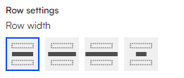
Typically used to control how much space the content occupies on the page. This can often be observed on websites featuring full-width posters that span the entire page width as illustrative examples.

- Change the row height

Changing the row height is used to place the row a certain way relative to the other rows. This is very useful when making the space between rows bigger.
- Set the theme for the row
Setting the theme for a certain row can be useful, particularly when you want to customize the background or font color exclusively for that particular row. When selecting a theme for a specific row, it is only applied to that specific section of the page.
- Configure mobile settings

When configuring mobile settings, you are adjusting how the page appears when viewed on a mobile device. Typically, items are arranged differently and may even vary compared to the standard desktop view. Usually the preselected auto properties will manage this.
- Select the background image
The background image feature is used when you wish to replace the background assigned by the theme with a specific image, filling the entire background of a row.
NOTE:
If you want the space between rows to be even bigger than the row height allows, you can add an empty row to the site. This will just act as an empty space.
Building Columns
Columns or Content columns are what define the type of content on your page. The type of columns available depends on whether you are creating your header, footer or landing pager.
There are many different item types for the columns. If you want to read more about the different types, you can find the documentation here
Flex columns
All columns in Swift are flex, meaning that they have the ability to fit to your content. This is especially useful, when you need your items to fill different amounts on the row.
We will take a look at the ShapingNewTomorrow website, which utilizes flex columns.

As seen on the image displayed above, the three columns on the page don't fill equally as much on the row. This is due to the columns ability to flex. To make the columns take up only the required width of the item, click "edit row" and set your columns width to small.

Setting the space between columns
Another widely used feature is the ability to adjust the space between columns. For this, you have three variants: no space, small space apart, and further apart.

If you want even more space between two columns, you can leave an empty column between them.
You can read more about the different types of content columns here
Exercise 2: Branding
In this exercise, we will explore some of the more general branding settings. Branding is one of the key steps in designing a good-looking and streamlined website as it will become the default setting. It consists of:
- Typography - Fonts and related settings
- Button design - Primary and secondary
To access the branding settings, navigate to Content > Swift tools > Design > Branding. This should give you direct access to the branding general settings. Within this section, you can edit:
- The header font, casing, line height, letter spacing
- The display font, casing, line height, letter spacing
- The body font, casing, line height, letter spacing
- The buttons font weight, casing, shape, padding
- Set the header to show/hide on scroll
- Set the overall website theme
When making changes on the branding page, you need to preview it before the changes show in frontend. To do this, right click on branding and choose preview. This will open a new window, where you will be able preview of your branding settings. If everything looks fine, you can just close the window.
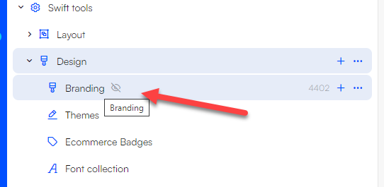
Branding example
Let’s look at an example:
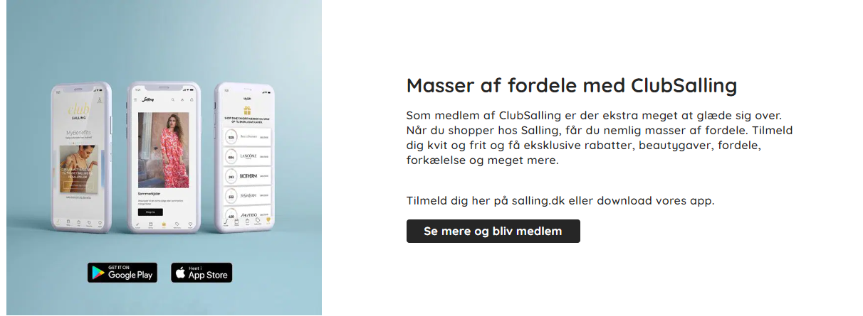
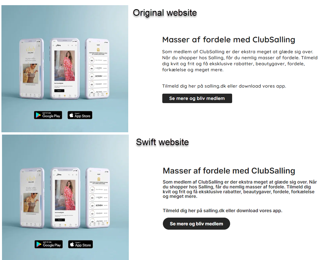 The original website displayed at the top and the Swift solution positioned at the bottom. The Swift website on the image remains unaltered, with no adjustments made; the item type has been placed and the text has been added as is.
To align the Swift solution more closely with the original website's design, a few additional adjustments are needed:
- The font type and weight
- The button needs to be larger and have rounded edges
- The line height should be smaller
Step 1: The font type and weight
The first step is to identify the font used on the original website or find a similar font if it's not available. Upon recognizing that the Google font 'Inter' closely matched the one used on the Salling.dk website, the header, display, and body fonts were all switched to 'Inter' with a weight of 600 within the branding settings.

Step 2: The button needs to be larger and have rounded edges
In this example, we need to increase the button's size slightly, round its edges, and include padding both above and around the button.
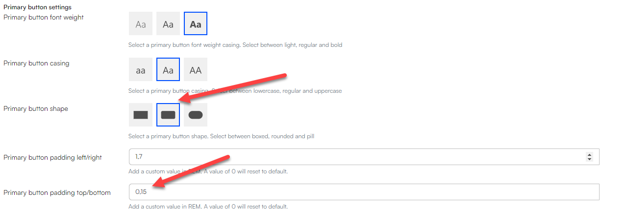
To determine the right amount of padding, you may need to experiment and adjust until you find the right amount.
Step 3: The line height should be smaller
The line height can be adjusted separately for the header, display and body text. In this example, we aim to adjust both the header and body line height, which is easily accomplished using the header line height and body line height settings.

After making these adjustments in the branding settings, your design should closely resemble the original website. With some trial and error, you can get even closer to the original look by identifying and using the exact font employed on the original website.
The standard Swift solution includes all Google Fonts. However, if none of these are suitable, you can import your own fonts in the Font Collection. To learn more about branding, go to our Branding documentation
Exercise 3: Themes
In this exercise we will explore the great world of themes. Themes are widely used in Swift and in general on websites, as they are used to define color schemes used for decoration, communication, highlighting important information and so on.
In order to understand themes, you must know that themes can be applied at four different levels.
- Website
- Pages
- Rows
- Columns
In the settings for each of these, you will find the theme selector.
The themes are nested, meaning that when you select a theme for a page, the rows and columns within that page will automatically adopt the same theme. However, if you've manually chosen themes for the elements on the page, the page theme will not override them, and they will retain their individual themes.
To access the themes - Go to Content > Swift tools > Design > Themes
Creating your own theme
When building a website, you would usually need to make your own themes. This is done by clicking + new paragraph inside the themes page and choose theme.

Inside the new theme page, you can:
- Give your theme a name and CSS class name (these are the only mandatory fields)
- Change the background colors
- Change the foreground colors
- Change the button colors
- Etc.
Once a theme has been created, you need to preview it for it to take effect. Previewing a theme also makes it easier to identify any potential mistakes.

You can read more about themes here.
Themes example
Let’s take a look at a real-life example: Pilgrim

The Pilgrim website uses two different themes on its front page: One for the main body of the page and another for the footer and header. This is a commonly used approach for creating visual divisions and distinctions within a website's layout. The steps to achieve this could be as follows:
Step 1: Creating the Theme
Navigate to Content > Swift tools > Design > Themes. Click the “+ new paragraph” button and select “Theme” as the paragraph type.
This will direct you to the settings window for your newly created theme. The only essential modifications required are to provide your theme with a name and a CSS class name. However, the rest of the settings are what makes the theme unique.
When attempting to replicate a website, here is what to look out for:
- The background colors
- The foreground colors (font colors)
- Button colors, Identify the colors used for buttons, links, and interactive elements
- Boarders, While not always relevant, check if borders or outlines are used to separate or highlight certain elements.
Another great feature is the color picker, which makes it possible to find exact color copies and apply these to the selected field.
For the Pilgrim footer theme, we need to select a grey background color. To accomplish this, we use the previously mentioned color picker tool to find the right shade.

You can also use the color picker tool to find the color of the font. This is accomplished by zooming in on the text on the website and then using the color picker to select the precise color.
Once you have selected the colors for the various sections, click “Save and close”. To preview your theme, right-click “Themes” and select “preview”. The newly created theme will appear at the bottom of the preview page. If everything looks fine, just close the preview window.

Step 2: Apply the theme
Applying the theme is quick and easy. Go to the section you want to apply the theme, enter the settings and set the theme to your chosen theme.
In the Pilgrim example, follow these steps:
- right-click the footer folder (Swift tools > Layout > Footer)
- Select “page settings”
- Scroll to the bottom of the settings page to find the theme selector
- Choose the “Pilgrim” theme for your footer
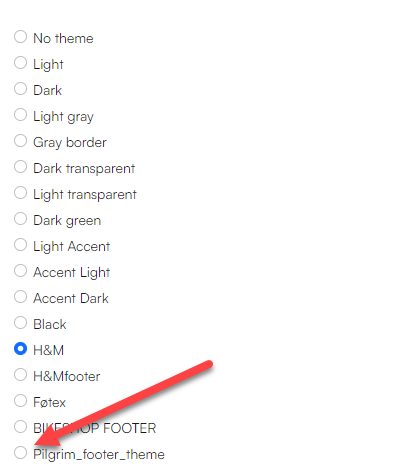
Your footer should now look like this:

That's it for themes, if you want to learn more about themes and how to use them, go to our documentation on themes