Paragraphs are default building blocks used for two things:
- To act as containers for content on pages
- To act as anchors for paragraph apps
How they are ordered also typically defines the content structure on the page they are on.
In Visual Editor mode, paragraphs are outlined in green and placed inside a row:
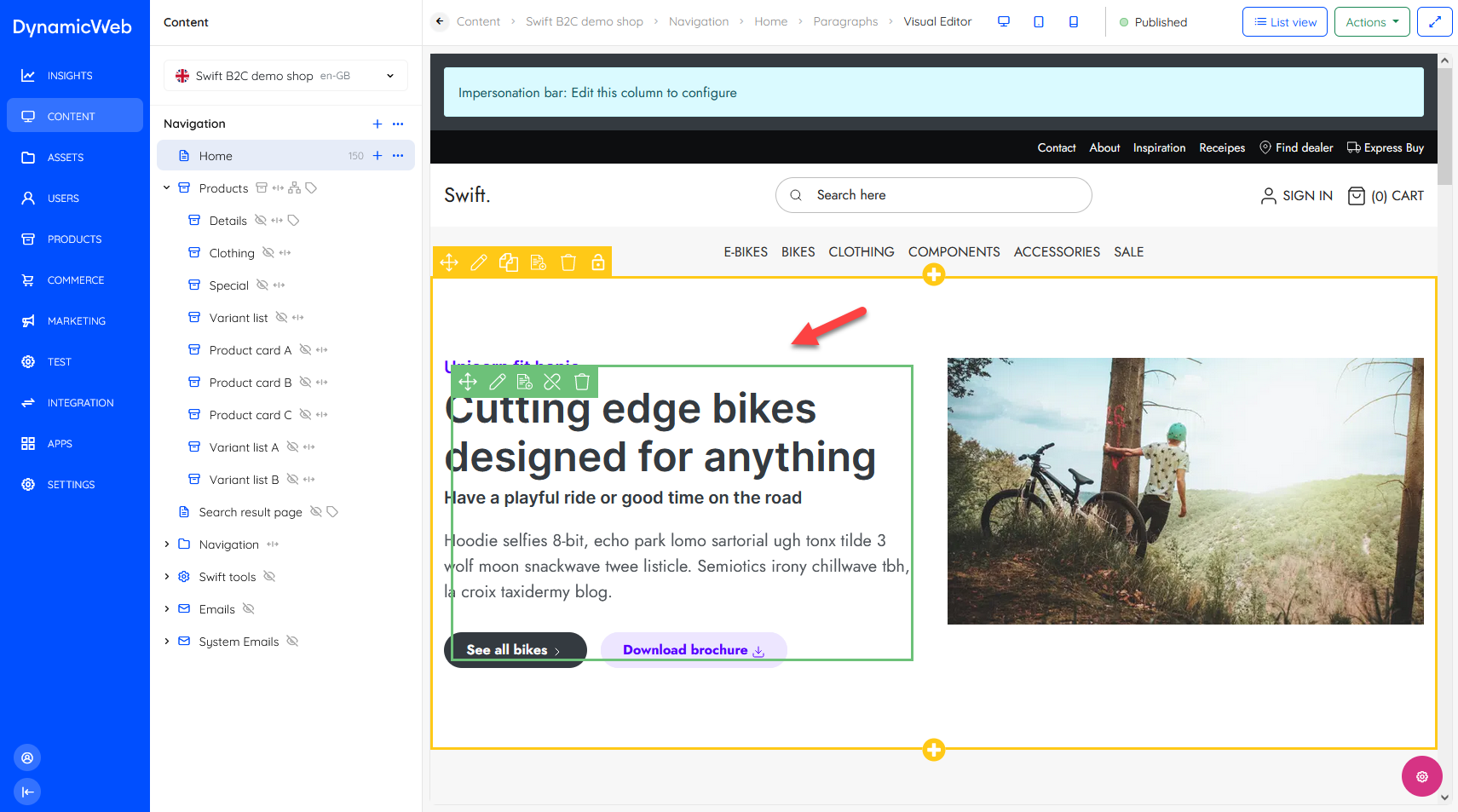 In List View mode paragraphs are shown as white-coloured list items, either alone or under a row:

Like pages, paragraphs can be paired with an item type with additional fields for storing content or settings. In fact, almost all modern solutions (including Swift) use paragraphs with various types of item types added to create content.
Paragraph content & settings
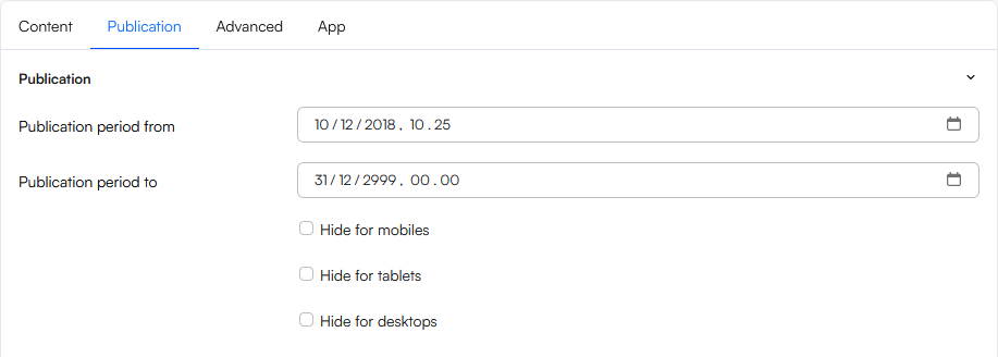
When you add or edit a paragraph (from either List View or Visual Editor view) you will see a number of tabs with input fields and various settings. Each tab is described below.
The Content-tab contains the fields used to add content to the paragraphs - which fields are available here depends on the paragraph type.
- A standard paragraph simply has a title field, a text field, an image selector, and some image settings.
- An item-based paragraph has a list of fields defined on the item type
This is a standard paragraph:
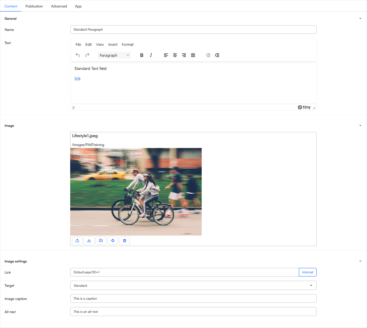 Basically, this is where you write text, select images, and use whichever settings are available to further style content, and then hit Save and close. To see some examples of different item-based paragraphs check out the Swift content columns and ecommerce columns.
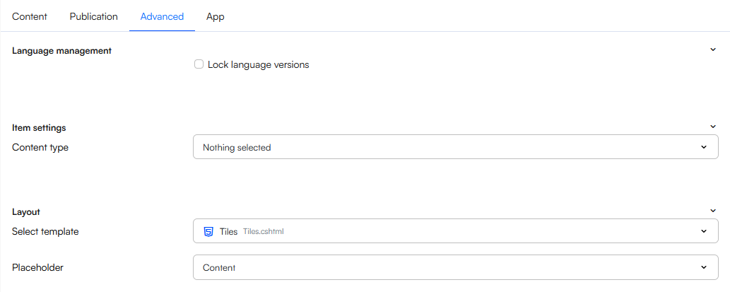
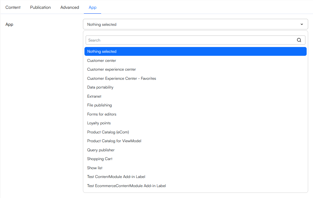 Apps are content-modules which are used to e.g. render a product catalog, display a form, show a list of orders, and so one. Please note that this tab is only available on item-based paragraphs if Allow module attachment is set for the item type.