Welcome to the fifth guide in the Swift Design Tutorial, which aims to get you familiar with using Swift and its features to create beautiful websites.
In these guides we focus on what is possible to do with Swift without any customizations, as we believe this is the best way to learn what Swift is all about; simplifying the process of website-building to the point where you can create high-quality prototypes in the fraction of the time it usually takes.
As you know, a product list page serves as the gateway for shoppers to discover and browse through a collection of products. It offers a snapshot of multiple products, showcasing brief details like name, image, and price. This is where people go to see what's for sale and choose products they wish to purchase or learn more about.
In this guide we cover:
- Creating and configuring a product list page
- Giving the product list page a visually appealing and user-friendly layout
- Creating a Product Components tool to handle dynamic product information on the list
We will construct the following product list page from the ground up:
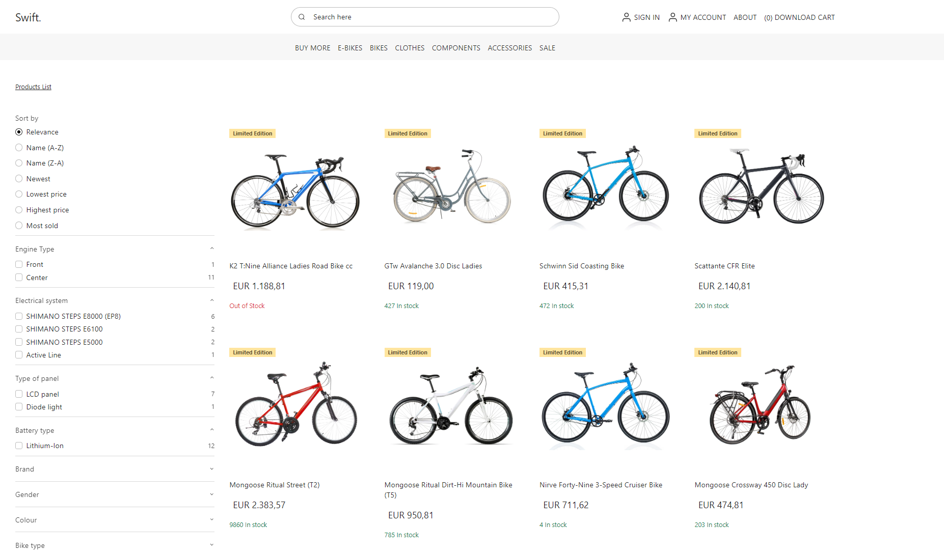
Exercise 1: Creating the Page
Let’s start from the beginning. First, you’ll start by creating the actual page.
To create the page:
- Navigate to Content > Navigation
- Click the three vertical dots next to Navigation and select New Page
- Under 'Empty Items', select Product List
Note
As you might have noticed, Swift comes with a set of preconfigured Product List templates. If one of them suits your needs, you're welcome to choose it. However, in this guide, we’ll create a page from scratch so you know how and what you can do with product lists.
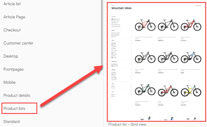
Selecting ‘just’ the Product list will create an empty page:

Add content to it:
- Start by adding an empty 1 column row by clicking the yellow ‘plus' symbol and selecting 1 Column under Empty rows
- Now add the Product catalog app to the empty row, by clicking the green ‘plus' symbol
- Give the Product catalog app the fitting title: ‘Product Catalog App’
- Switch to the App tab and attach a Product Catalog for ViewModel app to it. This opens a lot of possible configurations. However, for this example, we only have to focus on a few of them
- In the Index section, in the Query dropdown menu, select SwiftProducts – Products.query - this query determines the displayed products and responds to factors like search parameters and selected facets
- In the Facets groups, select any facets which should be available on this page. In our example, we’ve chosen Electricals and Products.facets
- In the Display section, set the Products per page to 12
- In the Templates section, in the List dropdown menu, select ProductViewList.cshtml
- Hit Save
Next, we need to set up Navigation and urls:
- Head to the Page settings by clicking the pink gear button in the bottom right corner
- Give the page a fitting title, for example: ‘Product List’
- Switch to the Advanced tab and add the Navigation tag Shop
- Next, switch to the Ecommerce tab and enable Ecommerce navigation
- Under Parent group, select Shops & channels
- In the Channel dropdown menu, select the appropriate shop, in our example we’ve chosen BIKES
- Set a Max level - BIKES has a max level of 3, so set it to that
- Set the Product page to the product list page we’re creating now, i.e. ‘Product List’
- Switch to the SEO tab, head to the very last section: the URL Provider and set it to Ecommerce
- This opens up for some configuration of parameters. In our example, we'll choose the standard configuration:
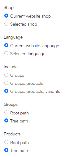
- This opens up for some configuration of parameters. In our example, we'll choose the standard configuration:
- Hit Save
The blue bar now shows, that you've attached a product catalog to your page.

Exercise 2: Designing the page
Now that the page have been created and the technical configurations has been completed, we can begin with the fun stuff – Designing the page!
Let's revisit the Product List page we wanted to create, but this time, we'll divide the page into rows and columns. When designing any page with Swift, it helps to visualize the layout in terms of the rows and columns that make up its structure. This approach gives you a clearer overview and simplifies the creation process. If you are unsure of how rows and columns work in Swift, please check out guide 1.
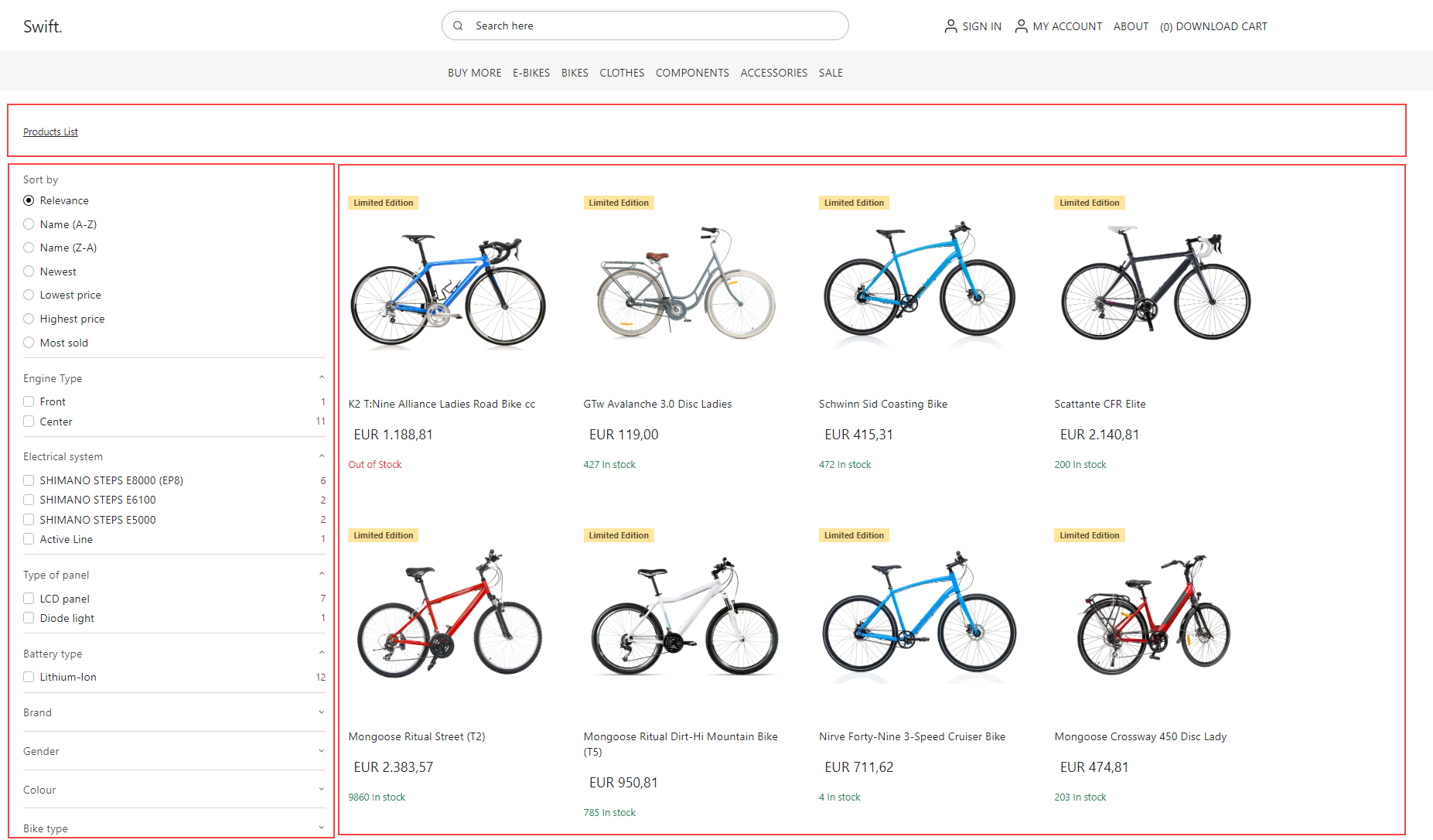
As we can see, the page actually only consists of two rows:
- 1 One column row
- 1 Two column 3/9 row
Let’s add them by clicking the yellow ‘plus’ symbol and select the required columns.
Now, your page should look like this:

Breadcrumb Navigation
To the first row, add the Breadcrumb navigation and give it a fitting title, for example: ‘Breadcrumb navigation’ and hit Save.
A breadcrumb navigation is a form of website navigation that shows the user's path from the home page to their current location on the site. It's displayed as horizontal links and helps users understand their site location and easily navigate back to previous sections.

Facets
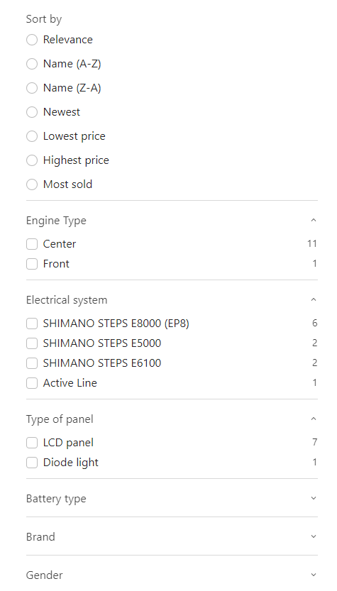
To the Second row, left column, add Facets and name it: ‘Facets’. Facets are specific categories or attributes used to filter and refine search results on a website. They help users navigate and pinpoint desired items in a large dataset or product collection.
To configure the facets column:
- Set the group navigation's start and stop levels to 1
- Activate all the sorting options for the facet
- Designate the facet groups to expand in increments of 3
This should create a facets column that looks something like this:
Exercise 3: Creating a Component
In the column next to Facets we need to add a Component. Components in Swift are not just a design element; a Component is a versatile tool designed to help you personalize the details displayed on your product page, allowing for customized product information.
Swift provides a selection of pre-configured Components for convenience.
To view these:
- Click the green 'plus' symbol and select Component
- Select one of the pre-configured components
Product list area component
However, to truly understand the workings and potential of the Component tool, we'll construct one from scratch to give you an in-depth understanding of what Components can do. So, for now, do NOT select a component.
Instead:
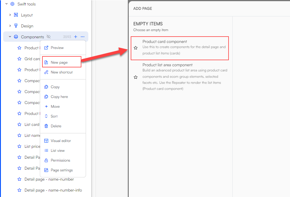
- Go to Content > Swift Tools > Components, click the three vertical dots and select New page
- Select the Product list area component - this will create an empty page
Now you need to configure the page. Open the page settings by clicking the pink gear button in the lower right corner - then do the following:
- Give the product component a fitting title. Since we’re making a product list page for the shop BIKES, let’s call it Product List Component – BIKES
- Under dummy product group, select a product group. In our example, we’re creating a Product List page for the BIKES shop, so let’s pick BIKES > Bikes > Classic bikes
- The page settings allow you to select different styling options, but for the sake of simplicity, just choose No theme
- Click Save
Product list item component repeater
Now, we need to add a Product list item component repeater - this involves a slightly complex hierarchy of components.
Here's a breakdown to simplify it:
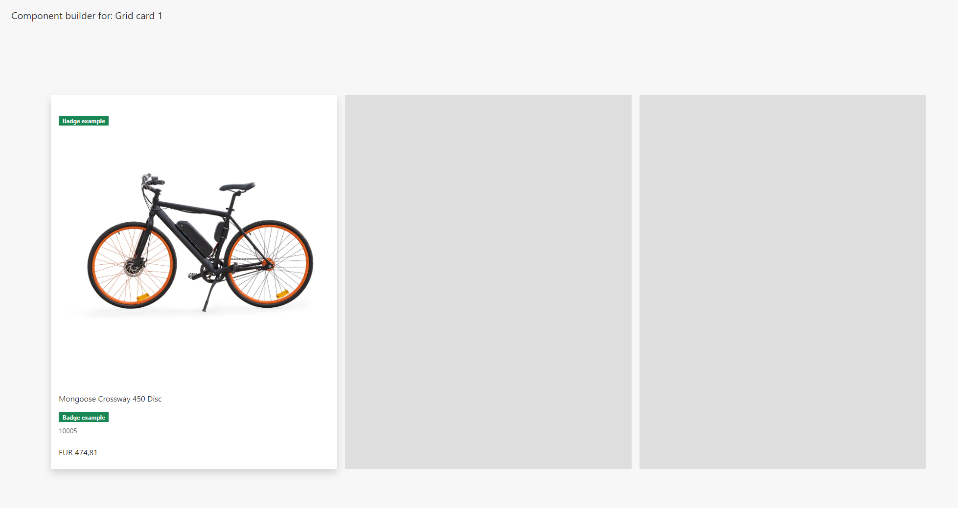
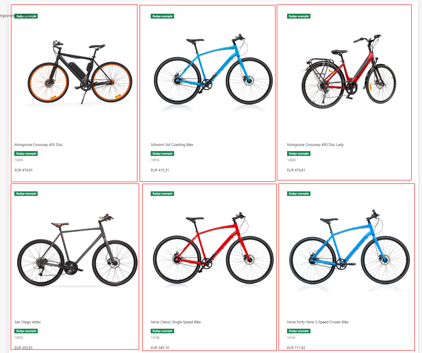
Currently, we're configuring a component that shows a list of products. Within this component, we'll add another component focused on showcasing the individual products. The Product list item component repeater will repeat the display the component that displays the individual products. This way, each product's details will be presented in a uniform 'grid' layout.
Here we can see the item component repeater in action. It repeats a component, e.g. 'Grid card 1' ...
... Multiple times:
Product card component
In this tutorial you will create your own component for the individual products. This allows you to tailor what information is displayed for the product as well as the design.
So, right click on Components and create another New page and select the Product card component.
This creates an empty page that looks like this:

Start by heading to the page settings by clicking the pink gear button in the lower right corner.
- Give the product component a fitting title. Since we’re making a product component for the BIKES shop, let’s give it the name ‘BIKES component for Product List Page’
- Under dummy product, you can select any product from the BIKES channel. However, in this example, let's stick to the classic bike: ‘Moongoose Crossway 450 Disc’
- Set the Styling to Light to ensure a consistency in the layout
- Click Save
Before we start building the component, let’s have a look at the Product List page we wanted to create in the first place and see how we would go about building the component:
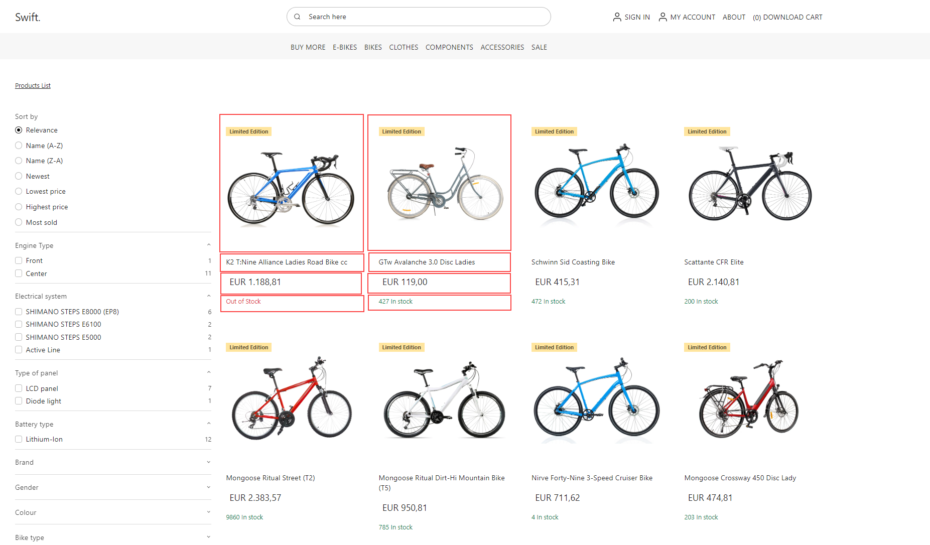
In the image above, we can see that the component is made from just 4 one column rows.
When you’ve added the rows, your page should look like this:

Building the component is straightforward. Below, we'll show you some example configurations to get you started. However, we encourage you to experiment with the settings to understand how each one affects the component's behaviour and appearance.
To the first row, add the Default product image and configure it
- Set the Image aspect ratio to 1:1
- Set the Image resized and fit to fit
- Choose whatever badges you want to display. We won't go into Badges in this tutorial, but if it’s relevant to you, check out our guide on Badges
- In Styling, select Light to ensure a consistent layout
- Click Save
To the second row, add Name. In our example we’ve configured it like this:
- Set the display to H6
- Set the heading level to h2
- Set the horizontal alignment to left
To the third row, add Price and configure it:
- Set the theme to light
- Select the middle option for space around
- Select FS-5 for the font size
- Set the horizontal alignment to left
To the fourth row, add stock
- Give it a title, e.g. 'Stock'
- Set the horizontal alignment to left
Now you page should look something like this:
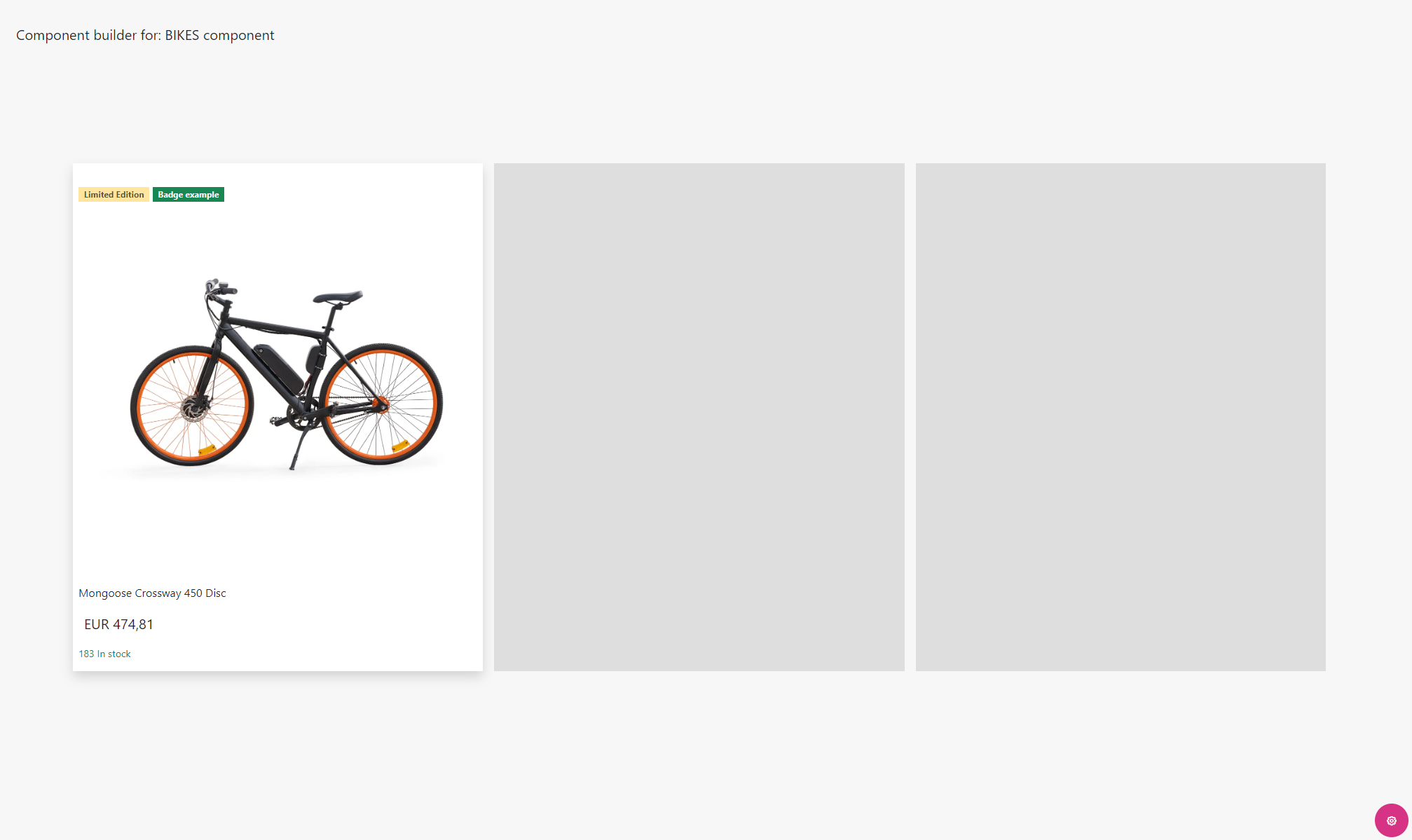
That’s it for the BIKES component!
Attaching the product card component to the product list area component
Now we need to integrate the product card component into our product list area component.
Head back to the Product List Component – BIKES and attach this design to our Product list item component repeater
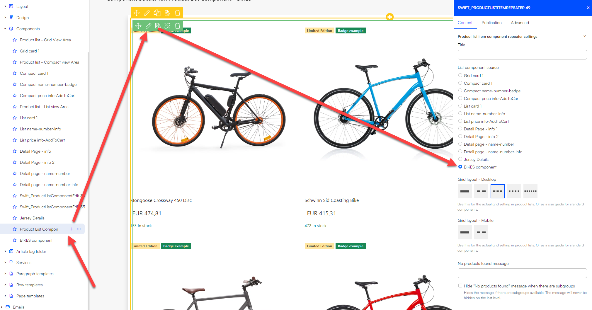
Now your page should look something like this:
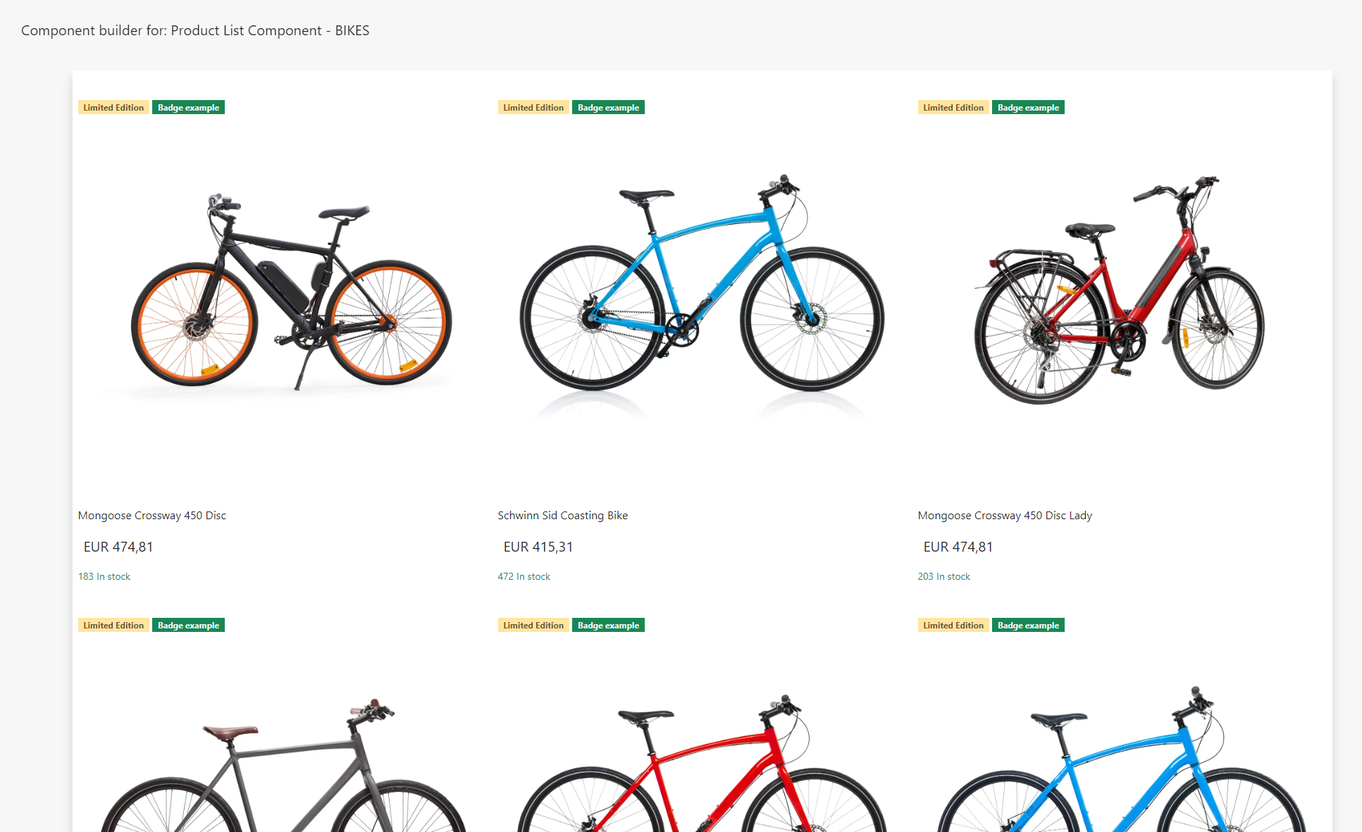
And that’s it! You’ve successfully created a simple but effective Product List component! Feel free to tweak the design as you please.
This tutorial has not explored all available product components. For a comprehensive list and guidance on their use, please visit our documentation
Attaching the product list area component to the product list page
Now that the Product Component is complete, we need to add it to our Products List Page.
Navigate back to Content > YourProductsListPage and click the green symbol to the right of the Facets. Select Components and choose the Product Component you've just created:

Now your page should look like this:
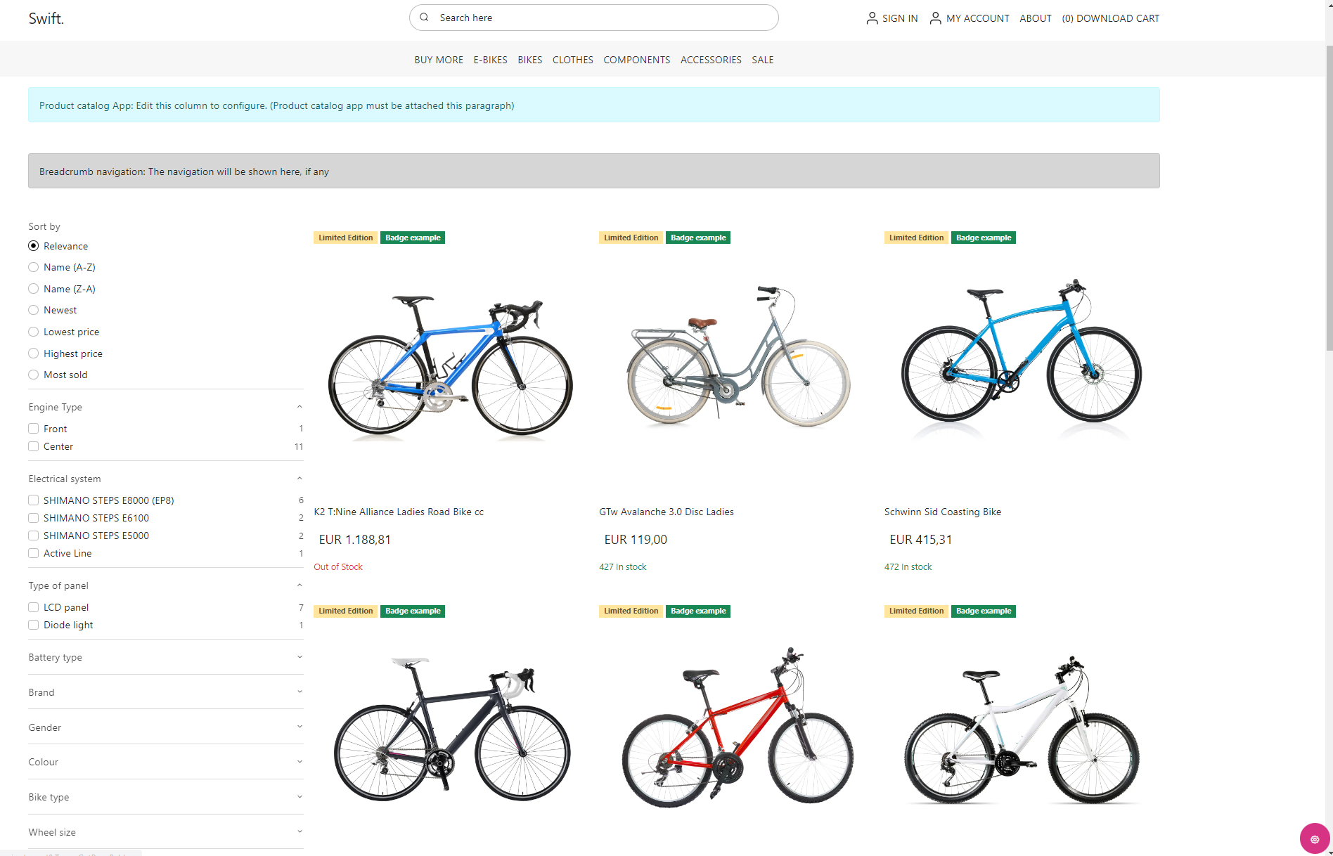
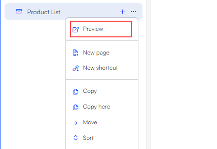
Congratulations! You've successfully built a simple Product List page from scratch. To view it in frontend, simply click the three vertical dots next to the page and select Preview.
Keep in mind that this tutorial only highlights the fundamental steps. To delve into all the attributes of the product list page, please visit our documentation