Welcome to the sixth guide in the Swift Design Tutorial, which aims to get you familiar with using Swift and its features to create beautiful websites.
In these guides we focus on what is possible to do with Swift without any customizations, as we believe this is the best way to learn what Swift is all about; simplifying the process of website-building to the point where you can create high-quality prototypes in the fraction of the time it usually takes.
As you know, a product details page provides comprehensive information about a single product, including its features, price, images, reviews, and purchasing options. It's the page, shoppers visit to learn more about an item before deciding to purchase.
In this guide we cover:
- Creating a product details page
- Adding elements to the product details page to give it a visually appealing and user-friendly layout
- Creating a Product Components tool to handle dynamic product information on the details page
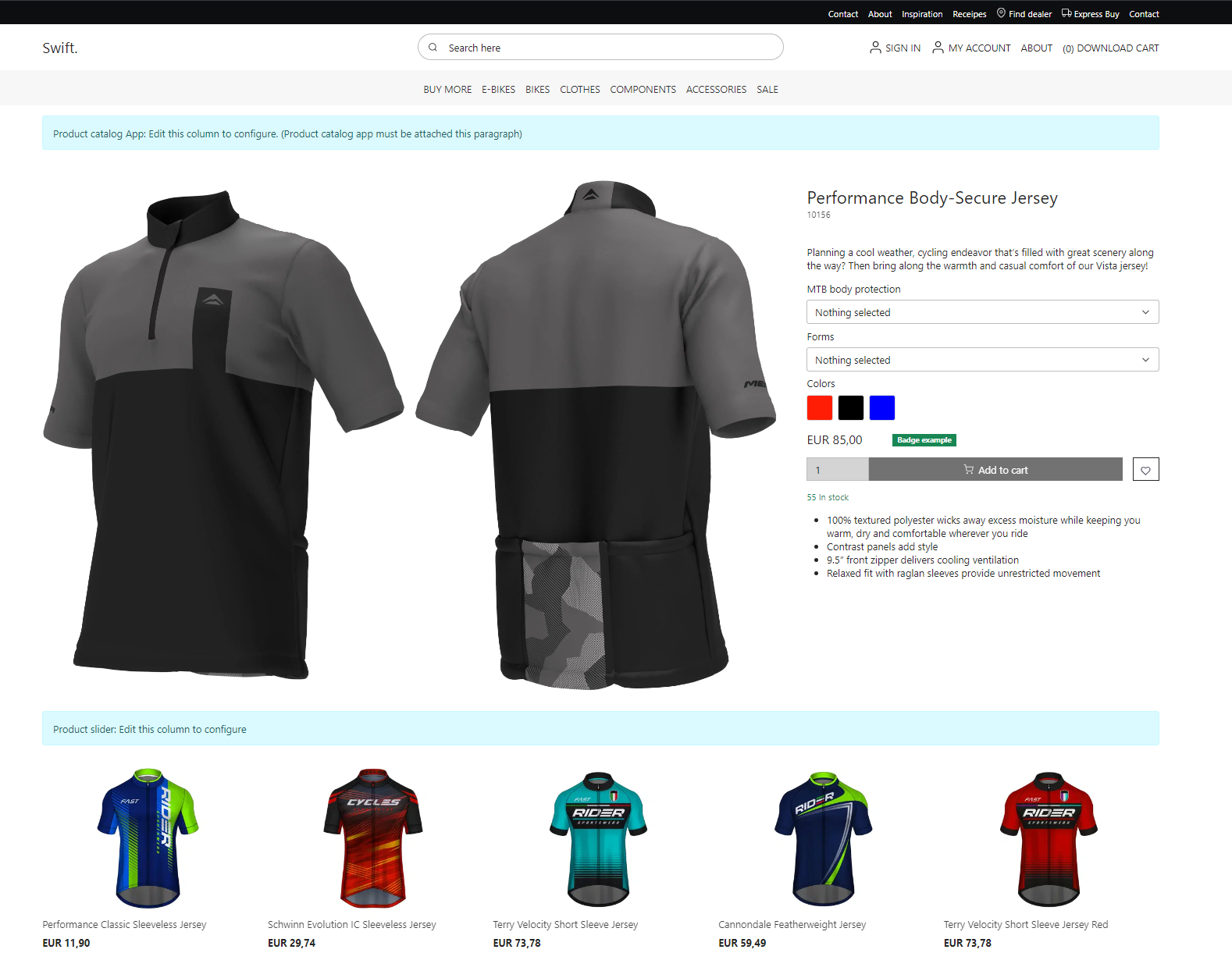
We’ll create this specific product details page from scratch:
Note
When building a product details page remember its distinctive purpose: to dynamically display product information within a consistent design template. This means, rather than constructing individual pages for each product, you design one adaptable page that pulls and presents data based on the specific product being viewed. As a result, the approach to crafting a product details page is distinct from creating traditional static web pages. Every piece of information on this page is directly sourced from the product's attributes. If you want to learn more, check out our general documentation on Product details here
Exercise 1: Creating the Page
Let’s start from the beginning. First, you’ll start by creating the actual page. To do this:
- Head to Content > Products
- Create a new page by clicking the three vertical dots next to Products and select New page and select Product details
Please note that Swift comes with a set of preconfigured product details pages (see below). If one of them suits your needs in the future, you're welcome to choose it. However, in this guide, we’ll create a page from scratch, allowing you to tailor your product details page to your exact needs.
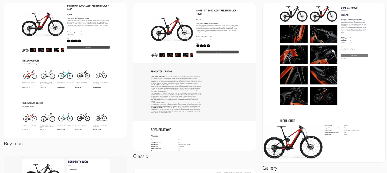
Selecting the Product details item will create an empty page:

Product Catalog Details App
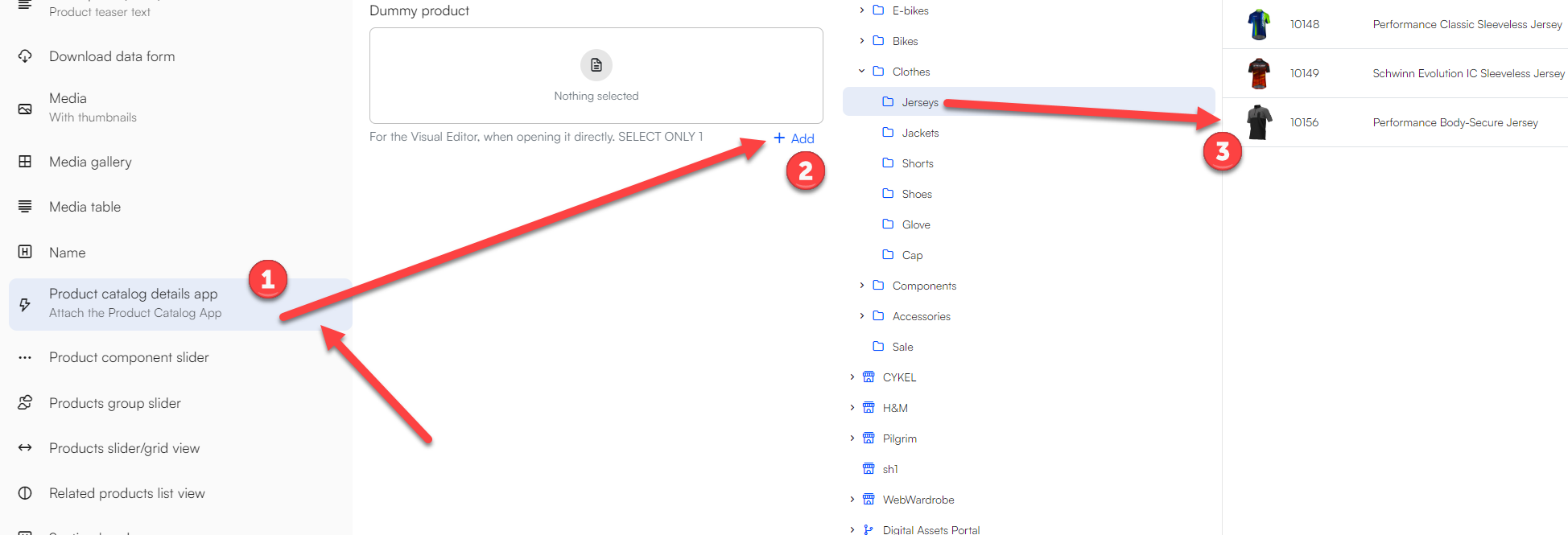
To make the page work, we need to add a product catalog details app to it. This app ensures the configuration of the page is as we want it.
- Start by adding an empty 1 column row by clicking the yellow ‘plus sign’ and selecting 1 Column under Empty rows
- Add the Product catalog details app to the empty row, by clicking the green ‘plus sign’
- Choose a Dummy Product. This is the product shown when the product details page is being edited using the visual editor. In this example we’ll choose the Performance Body-Secure Jersey
Product Catalog for ViewModel
Next, we’ll need to configure the Product catalog for details app.
To configure the app, do the following:
- Switch to the App tab and attach the Product catalog for ViewModel app.
- Under Query, select SwiftProducts – Products.query
- Scroll down to the Templates section and select the following templates:
- List: ProductViewList.cshtml
- Details: ProductViewDetails.cshtml
- Compare: CompareProducts.cshtml
- Click Save.
A blue bar should now appear on your page. This wont shown in frontend, it only serves to indicate that you've added a product catalog app to this page:

Page Settings
Next, we need to set up the navigation and URLs:
- Head to the Page settings by clicking the pink circular button in the bottom right corner.
- Switch to the Advanced tab and add the navigation tag ‘ProductDetailsPage' - Please note that this tag should only be used for the primary product details page. If this Product details page is not the primary, leave it empty.
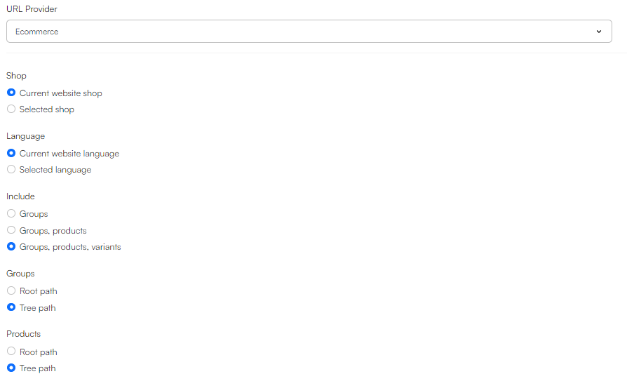
- Next, switch to the SEO tab. Scroll down to URL Provider and select Ecommerce - this enables further configuration. In this example, we’ve chosen this configuration:
- Click Save
Once the setup has been completed, we can start designing our product details page!
Exercise 2: Designing the Page
First, we’ll add a 2 Columns 8/4 row below the Product details app:

Media Gallery
In the left column, we’ll add a Media gallery column.
The Media gallery item lets you do a lot of configurations. Again, we encourage you to experiment with different settings to gain an even deeper understanding of how these configurations work.
- In our example, we want to keep it simple, so we only check the Images and Default images fallback. Under Image aspect ratio, we’ll select Fill.
- As you can see there’s a Video, Badges, and Styling section. In this concrete example, we’re not interested in the Video and Badges sections
- In the Styling section we’ll keep it super simple:
- Set the Theme and Image theme to light
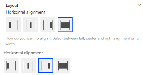
- In Layout, select the first option:

- In Spacing, select the second option:

- Click Save
Depending on what product you’ve chosen and your specific styling choices, your page should look something like this:
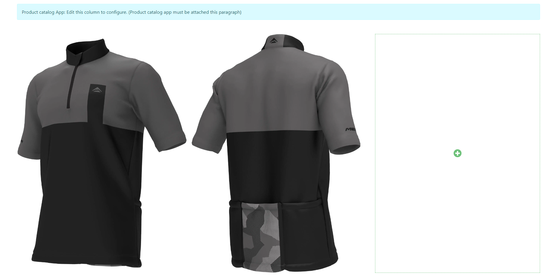
As you can see, we're not done with the design of the page yet, but the next part involves the use of a component.
Exercise 3: Creating a Product Component
As mentioned in the guide on product list pages, components in Swift are not just a design element; a Component is a versatile tool designed to help you personalize the details displayed on your product page, allowing for customized product information.
Now, add a Component to the right of the Media gallery column.
When you add a component, you'll notice that Swift comes with a variety of different preconfigured components. However, to truly understand the workings and potential of the Component tool, we'll construct one from scratch to give you an in-depth understanding of what Components can do. So, for now, do NOT select a component source.
Instead:
- Go to Content > Swift Tools > Components, click the three vertical dots and select New page
- Select the Product card component - this will create an empty page that looks like this:

Page settings for the Product Card Component
Next you need to configure the page. Start by heading to the page settings by clicking the pink gear button in the lower right corner - then do the following:
- Give the product component a fitting title. Since we’re making a product details page for a Jersey, let’s give it the name ‘Jersey details’
- Under dummy product, select the same product as the one we’re making a details page for. In this example, it’s the Performance Body-Secure Jersey
- In the Visual editor grid layout, select the 1 column grid
- The page settings allow you to select different styling options, but for the sake of simplicity, just choose No theme
- Click Save
Now your page should look like this:

Designing the Component
Before diving into building our product component, it's crucial to understand its purpose: to highlight essential product information for the customer, such as the Name, Variant, Price, and Stock.
Let’s have a look at the product details page we wanted to create in the first place and see how we would go about building the component:
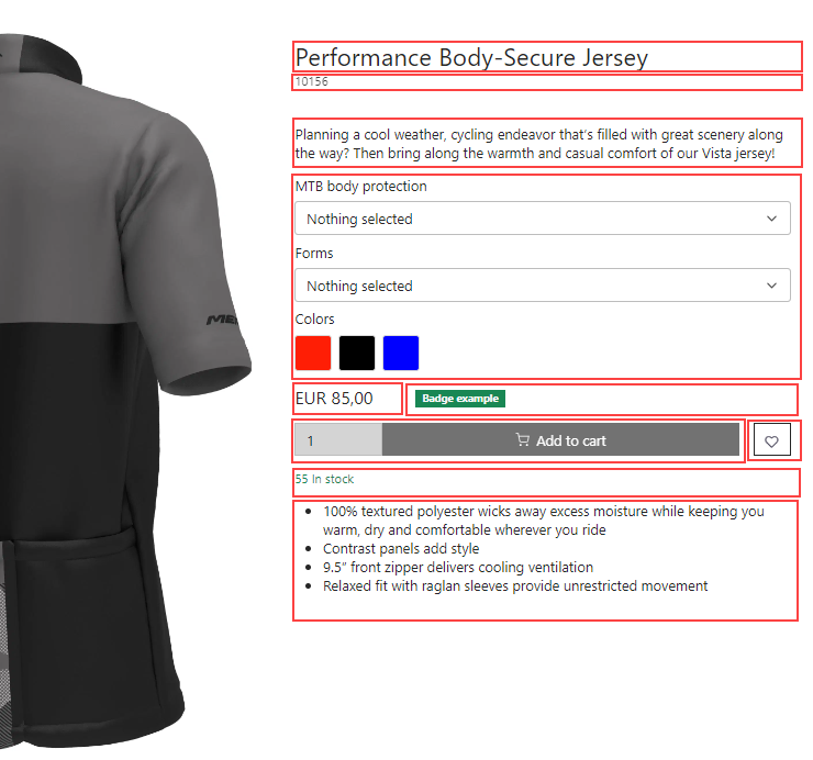
The red bars represent columns – more specific columns in rows. So, for our example, we can see that the component tool is built of the following:
- 4 x 1 column rows
- 2 x 2 column rows
- 2 x 1 column rows
Let’s create them! Click the yellow plus-sign and select the desired rows. Now your page should look like this:
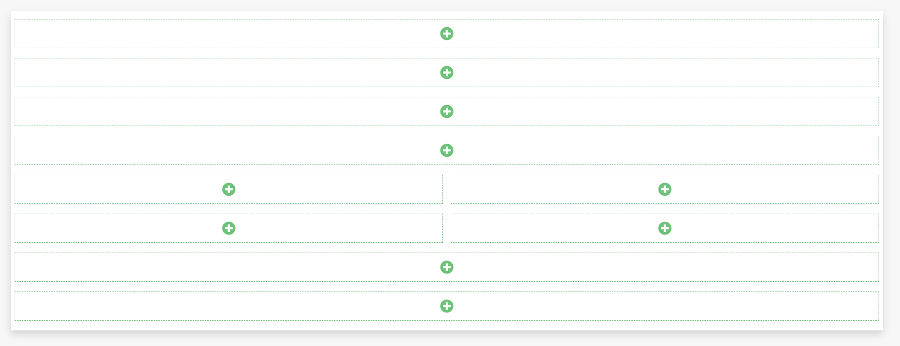
We can now start filling out the columns with content. This is pretty straightforward. Below, we'll show you some example configurations to get you started. However, we encourage you to experiment with the settings to understand how each one affects the component's behaviour and appearance.
Name
In the top row, we want to have the products Name. To add this:
- Click the green 'plus-sign' in the top column
- Under Empty paragraph, select Name
Next, customize its appearance by selecting a Title (please note that this will not affect the actual title of the product), Font size, Heading level, and Horizontal alignment. For our example, we've done this:
- Set the Display to H3
- Set the Heading level to h4
- Set the Horizontal alignment to the left
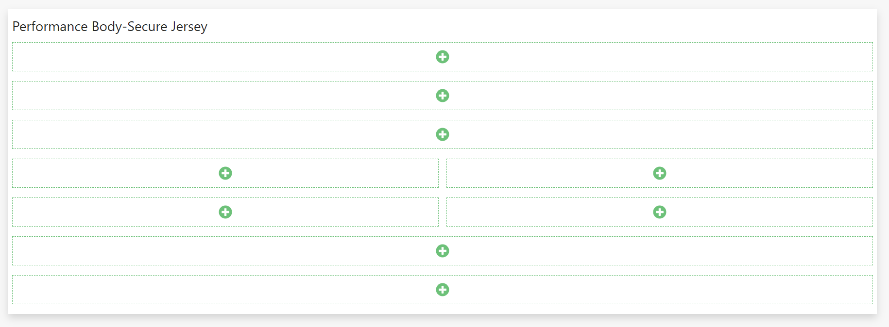
Now your page should look like this:
Number
In the realm of e-commerce, most items typically have a unique Number. To showcase this on our product page, we'll display it right beneath the product name.
So, for the next row, we want to add the product number:
- Again, just click the green plus-sign
- Under Empty paragraph, select Number
- Give the column a Title and select the preferred Horizontal alignment
Now the page should look like this:
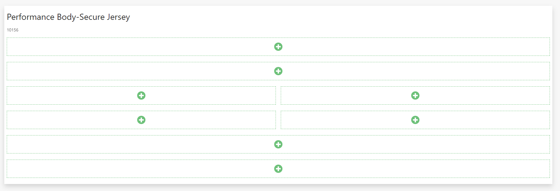
By now, my guess is you’ve figured out the system, so let’s quickly add the rest of the columns:
Description (short)
Here you can choose either the long or the short version depending on your needs. In our example, we'll choose the short version here, and the long version later.
To add the short description, simply:
- Add Description (short) to the third row
- Title: 'Description (short)
Selectable variant options
To the fourth row, add Selectable variant options. This has some configuration to do, so let’s have a look at it.
The concept of selectable variant options is to showcase the available variations of a product. For instance, our 'Performance Body-Secure Jersey' comes with options across three distinct categories: MTB Body Protection, Forms, and Colors, each offering a range of choices to customize your selection.
With this in mind, let’s begin:
- Title: 'Selectable Variant Options'
- For our example, we’ll show the group headers
- Under Layout, let’s select dropdown
But wait! As you might recall, not all variants were showcased by dropdown menus. The different colors were shown as buttons. To fix this, check Selected variant group and add a new Variant Group
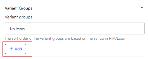
This will open a new window. In the new window:
- Click the Variant groups dropdown menu and select colors
- Under Layout, select Button
- This opens a new section where you can select the Button layout and Button horizontal alignment.
- In our example, we’ve chose the square button layout and the left horizontal alignment:
- Click OK
- Notice that the added variant group is now shown in Variant groups
- Click Save
If you wish, for example, to display various 'Forms' as buttons, you can easily achieve this by adding a new variant group. Follow the same procedures used for 'Colors,' but this time, choose 'Forms' instead. For a more in-depth understanding of how selectable variant groups function, please refer to our documentation
Note
Please note that the different variant options depend on the variant groups attached to the product. To check out the documentation for this, go here
Price & Badges
In the fifth row, we'll add two columns: Price and Badges
- In the first column, add Price and configure it. In this example, the Price has been configured like this:
- Title: 'Price'
- Theme has been set to light
- Space around has been set to the first option
- Font size has been set to FS-5
- Layout has been ignored
- Horizontal alignment has been set to left
- In the second column, add Badges and select the badges you want to display on the product:
- To see how to set up badges for a product, check out our documentation on it here
Add to cart & Add to favourites
In the sixth row, we'll also add two columns: Add to cart and Add to favourites
- In the first column, add Add to cart and configure it. In this example, the Add to cart has been configured like this:
- Title: 'Add to Cart'
- Check the Show quantity selector box
- When variants exist, select 'Disable add to cart'. This ensures that the user can't add anything to the cart unless they've chosen a specific variant
- Set the Horizontal alignment to fill the entire column. This will play an important role in the design of the component later
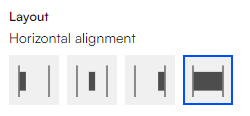
- Set the Icon as the cart icon
- Set the Button size to the second option

- In the second column, add Add to favourites
- Title: 'Add to favourites'
- Select 'Button secondary' as the Button style
- Check the Hide button text box
- Set the Button size to the second option
- Set the horizontal alignment to the right. Again, the horizontal alignment will play an important role later in the design of the component

Stock
In the seventh row, we'll add Stock
To add this, simply:
- Add Stock
- Title: 'Stock'
- Set the horizontal alignment to left
Description (long)
As mentioned before, we can chose either the long or the short description. Now we'll add the long description.
To do this, simply:
- Add Description (long)
- Title: 'Description (long)'
- You can play around with the styling, but we'll in this example choose the default settings
Now, your page should look something like this:
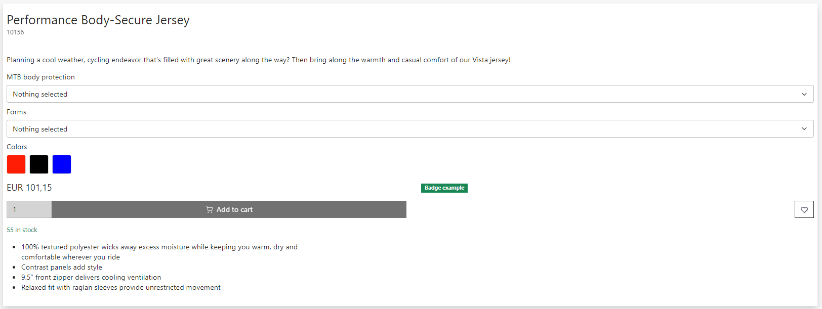
This is starting to look a lot like the component tool we’re after!
Row alignment
However, a few additional adjustments are necessary to achieve a crisp look. The required configuration for this is at the row level – i.e., the yellow configuration area:

Let’s start by clearly separating the Name and Number from the short description.
To do this:
- Click the yellow pencil of the Name row to open the Row settings
- In the Row height section, select the following option:
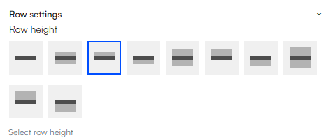
This will eliminate the space between the Name row and the Number row.
Now go to the Number row settings and select this option:
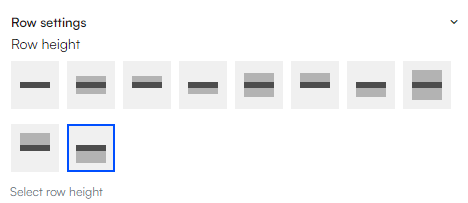
As you might have guessed, this adjustment removes the gap above the Number row and introduces additional spacing below it.
Next, let's have a look at the two rows containing two columns:

This looks far from optimal, but it’s simple to fix:
- Go to the fifth row settings
- Set Column 1 and 2 width to only take the required width
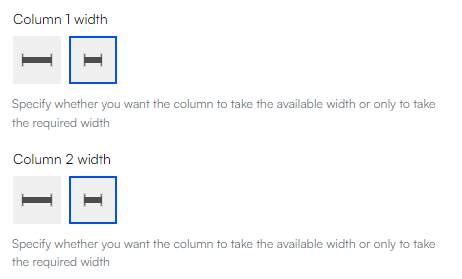
- To get space between the Price and the Badges, you can do this in the row settings:

Next, we want to do almost the same for the sixth row. However, here we only want the first column to fill as much as possible. We want the second column to only take the required width:
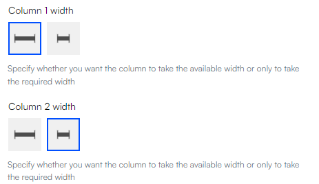
Please note that we have achieved the functionality described by configuring the column settings in the following manner: in the first column, the horizontal alignment is set to 'fill,' ensuring content spans the entire column width. In contrast, content in the second column is 'right-aligned,' keeping it aligned to the far right.
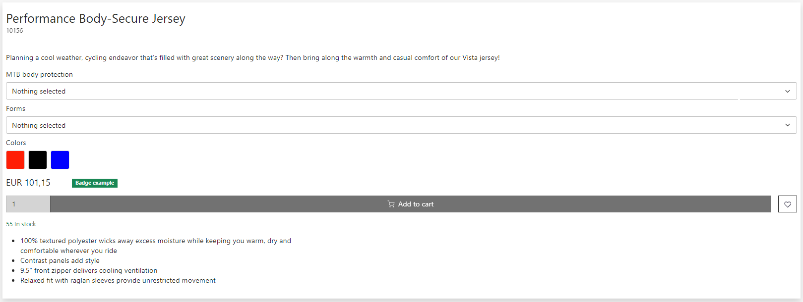
Now the Component should look like this:
And that’s it! You’ve successfully created a Product Component from scratch! Feel free to tweak the design and the specific components as you please. Please note that this tutorial has not explored all available product components. For a comprehensive list and guidance on their use, please visit our documentation
Adding the Component to the Product details page
Now that the Product Component is complete, we need to add it to our actual Products Details Page.
- Navigate back to Content > Products > YourProductsDetailsPage
- Click the green plus sign adjacent to your product image
- Select Components and choose the Product Component you've just created:
Now your Product Details Page should look like this:
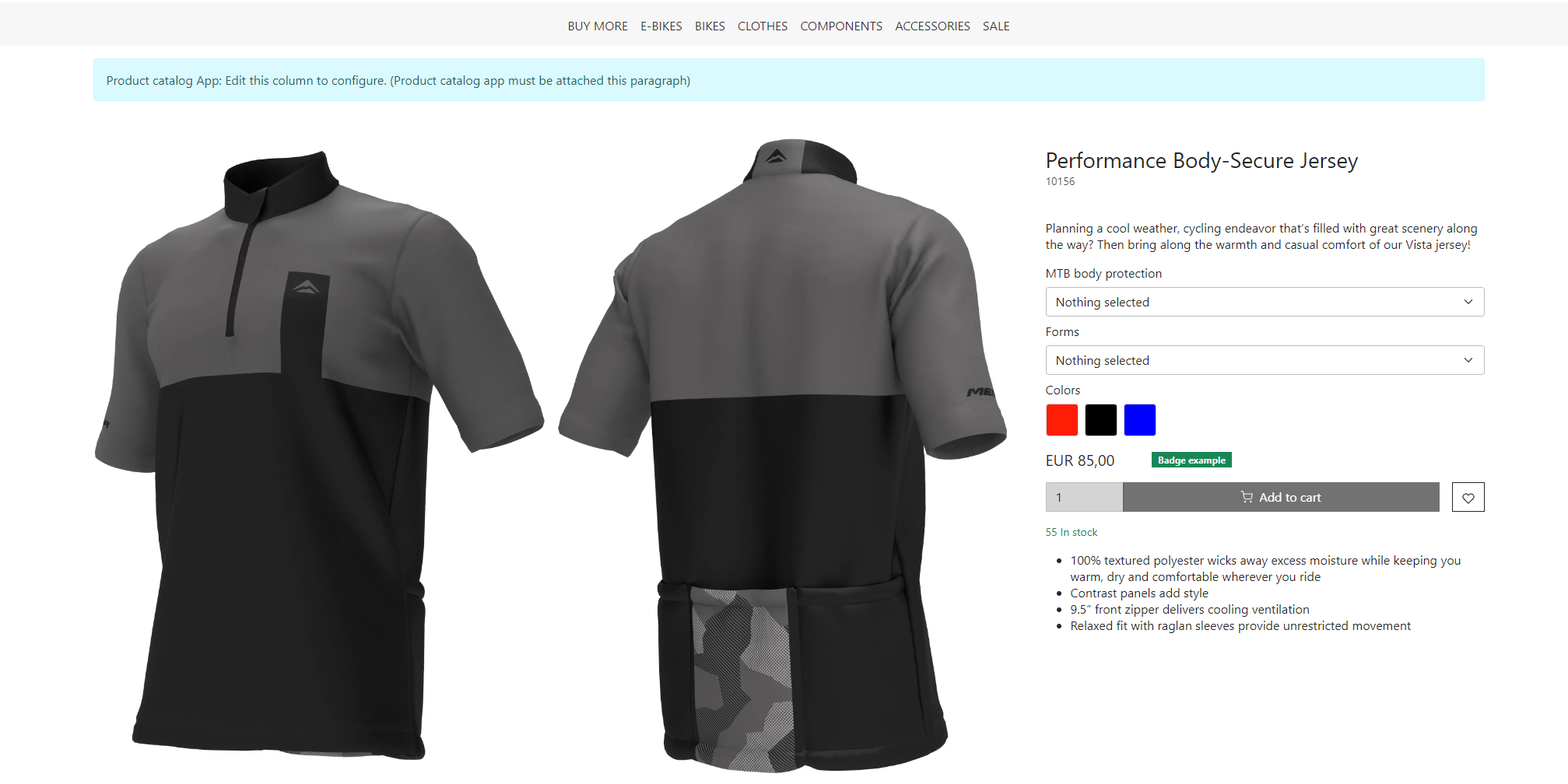
Products details slider
The last thing we want to do in this tutorial is attaching a Products Details Slider. This comes with a large number of available settings. Again. this tutorial gives examples of a simple configuration, but I encourage you to experiment with them on your own. By doing so, you'll gain a deeper understanding of how they work.
To add the slider:
- Add a 1 column row at the bottom of your Product Details page
- Add a Products slider/grid view to the column
- Configure the slider. In our example, we've configured it like this:
- Title: 'Products slider'
- Products count is set to 8
- Image aspect ratio is set to 'Original'
- Set the Layout to the third option

- Set the Type to 'Trending'
- We'll not select a relation group, but if you feel like it, check out our documentation on them here
- Set the Slider settings, Arrow style, Arrow placement, and Indicator style as you like
We’ve ignored the Advanced slider settings, Badges, Styling, and Advanced. For a complete guide to product slider checkout out our general documentation here
And now, finally, your page should look something like this:
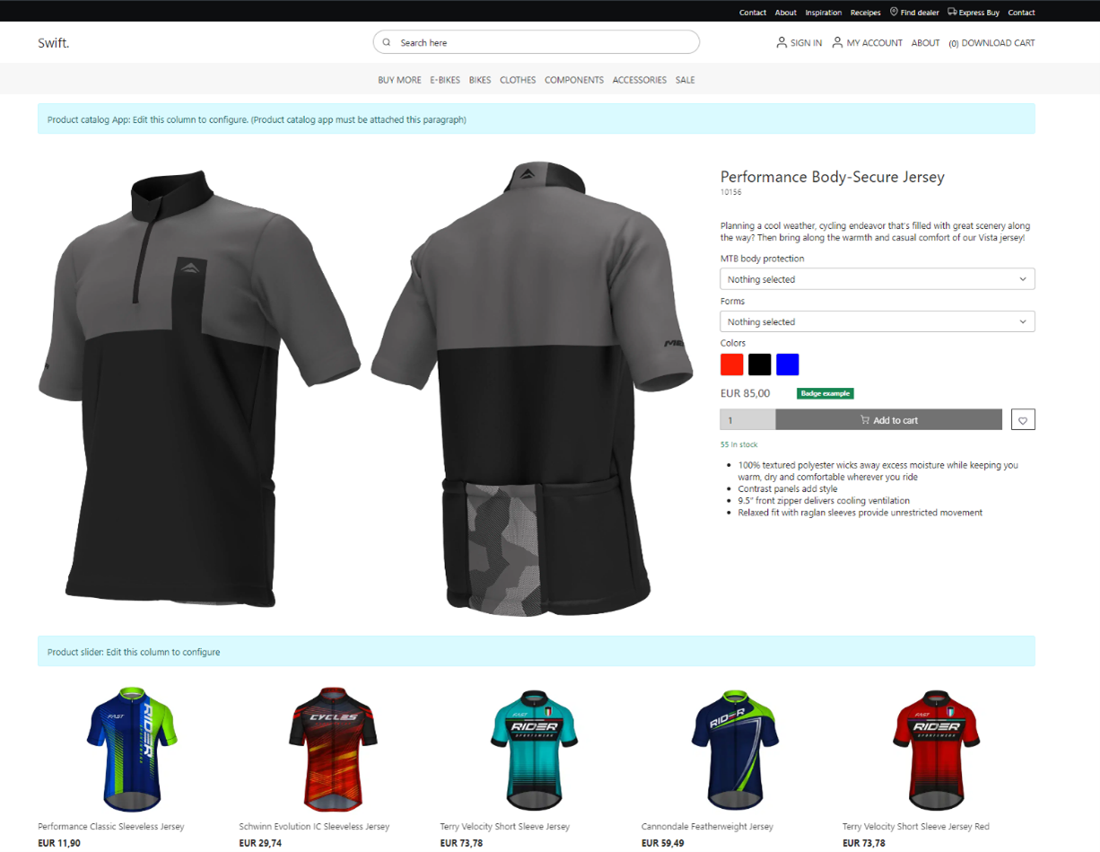
Congratulations! You've successfully built a simple Product Details page from scratch. Keep in mind that this tutorial only highlights the fundamental steps. To delve into all the attributes of the product details page, please visit our documentation
Linking Product Groups to the Details Page
Now, as a final step, let’s link the intended product group(s) with your new details page. To do this:
- Go to Products
- Under Channels, find the channel in which the product group is located – in our example, it’s the BIKES channel
- Since we’re creating a details page for a jersey, it makes sense to link it to the Clothes group. To do this, click the three vertical dots and select Edit
- Head to the Default values tab
- In the bottom, click the Primary page

- And set it to the product details page you just made under Products > YourProductsDetailsPage
- Do the same for the rest of the subgroups – in this example, these subgroups are Jerseys, Jackets, Shorts, Shoes, Gloves, and Cap
If the products still use the default product details page, it might be because you haven’t set the default group on the products. To check this:
- Head to Products
- Locate the specific product where the product details page has not been attached
- In the Channels section, click Manage
- Set the Channel you use as the Primary
