To add content to a page you use paragraph types and rows - two of the fundamental building blocks in the Swift 2 design:
- Rows are used to create a content grid on the page and each row are divided in up to 6 columns which acts as slots for paragraph types - more in-depth information about rows can be found here.
- Each paragraph type represents a specific type of content or functionality, such as text, images, buttons, or a DynamicWeb paragraph app - see an overview of all types and their functionality here.
Rows
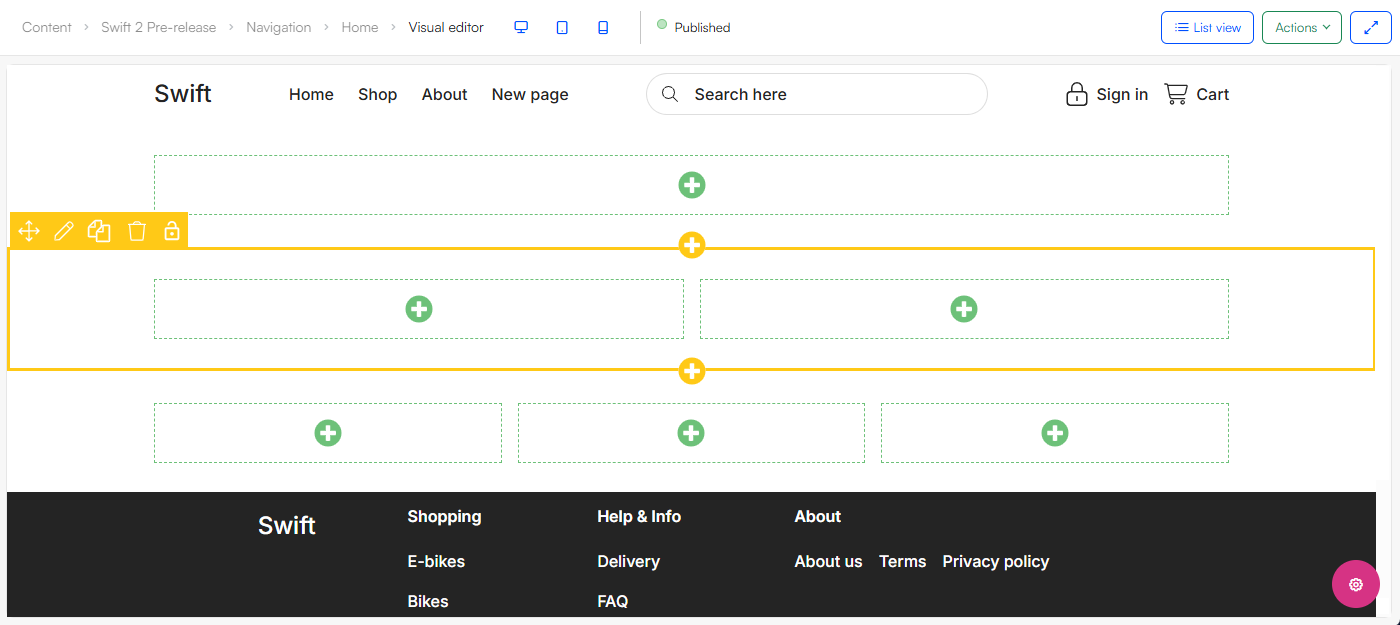
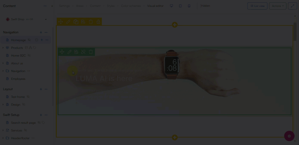
Rows are added in Visual Editor by clicking the yellow +- symbol. From the row selector different row types are available, from a row with a single column to six columns. When a row is created in the Visual Editor it is outlined with yellow and its columns outlined in green:
You can edit an existing row with the edit tool found when hovering over the row in Visual Editor. This opens up the row settings where you have the appearance section where you have several styling options:

You also have access to settings on mobile layout and publication.
Paragraph types
To add a paragraph type to a column in Visual Editor, you simply click the green +-symbol. This opens up our paragraph selector where you will find all the paragraph types available for that page. When a paragraph type is selected you configure it from the slide-over panel:
You can also edit an existing paragraph type by hovering over it in Visual Editor mode and select Edit paragraph, this opens up the slide-over panel from where you can make your changes. Here you also have access to publication settings.
Paragraph apps
The paragraph type App allows attaching a paragraph app in order to accomplish something specific, e.g. display a form.
When you have selected the App paragraph type, you navigate to the app-tab in the slide-over panel, this is where you can select the specific app. Read about all our paragraph apps here.

Tips and tricks
Creating well-structured and visually appealing content requires thoughtful organization and attention to detail. Below we have gathered three tips and tricks when using paragraph types.
Visual hierarchy
Many of the paragraph types can contain text elements, here it is important to make use of visual hierarchy. Use it to organize elements and guide the viewer’s eye in a logical order, otherwise it can result in chaotic designs where key details get lost.
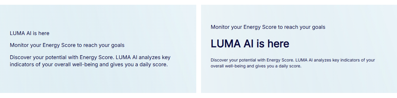
Most paragraph types has a title-, text- and a eyebrow- or subtitle editor alongside different header levels and fonts to structure the text. Use these different tools to create structured and easy-to-read designs:
White space
White space is the empty space around content and elements on your page. It can improve the visual experience for the user by creating spaces for better readability. When you throw too much content at users at once it can be too overwhelming, but balance is key too much white space is also not ideal.

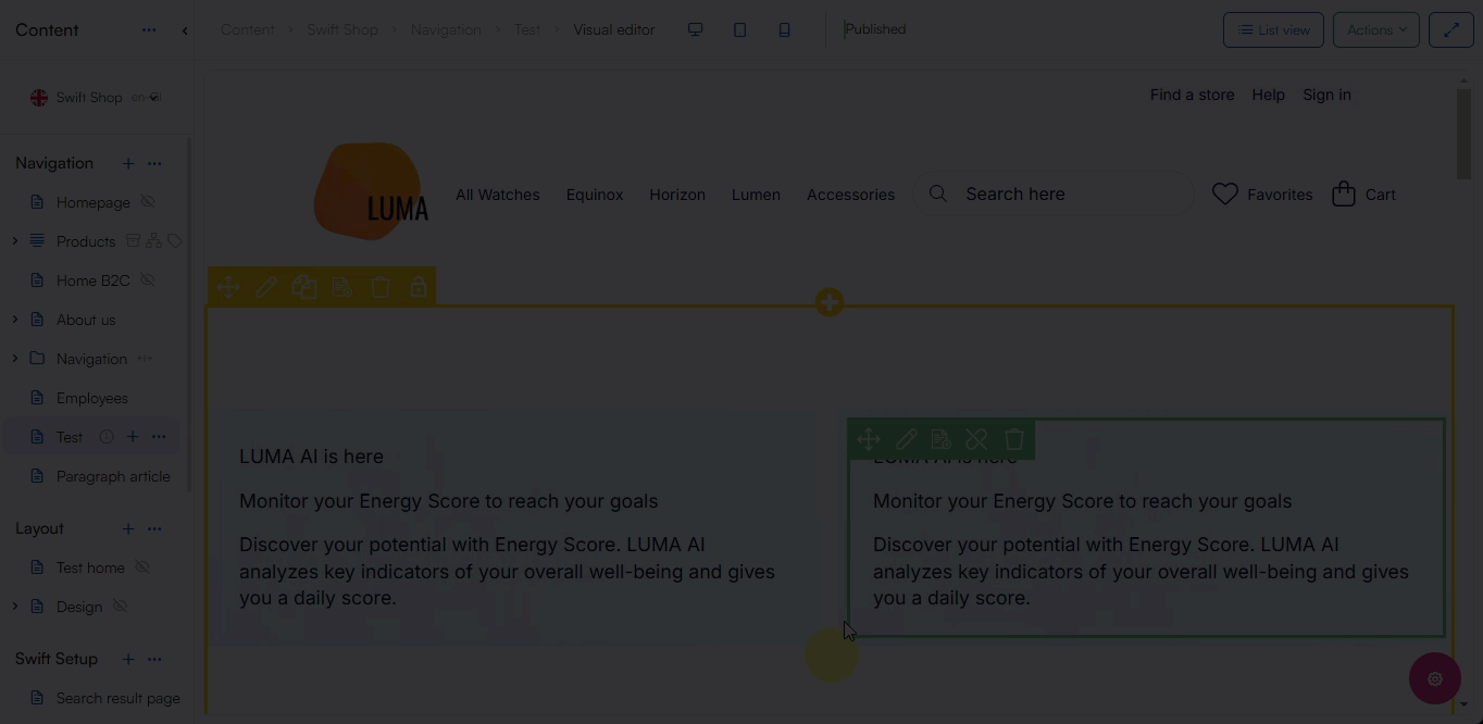
When using the paragraph types remember to balance out your elements with space, this can be done numerous ways, a simple solution can be to spread out the content on multiple rows:

Sufficient contrast
Poor contrast between text and its background makes reading harder, especially for individuals with low vision. The same applies to icons and hover states designed to draw attention.
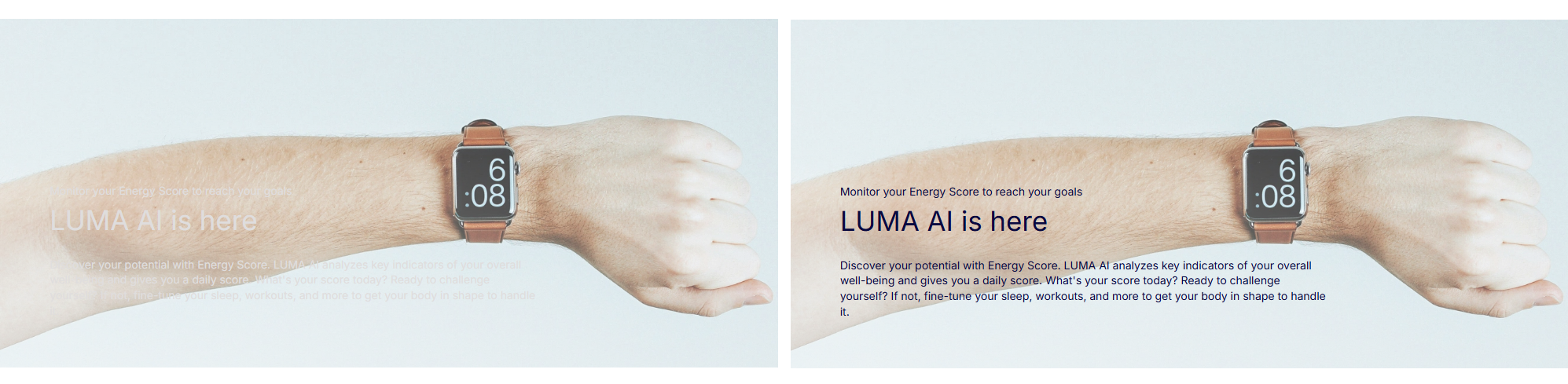 You can change background-, foreground- and button color by selecting a fitting color scheme on your paragraph type:
When you create content make sure that the contrast ratio between text color and background color is at least 4.5:1. You can make use of online color-contrast tools to help you test color pairs for contrast and adjust the values as necessary.